

We pay respect to the Traditional Custodians and First Peoples of NSW, and acknowledge their continued connection to their country and culture.
Verve Super
- Share


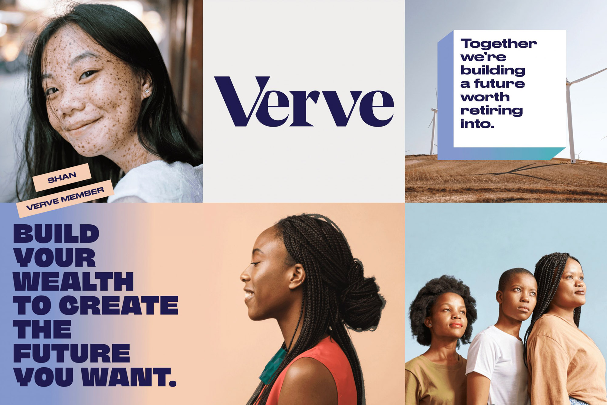
Verve Super is a purpose-driven superannuation fund, designed to support women to build wealth while investing in a better world.
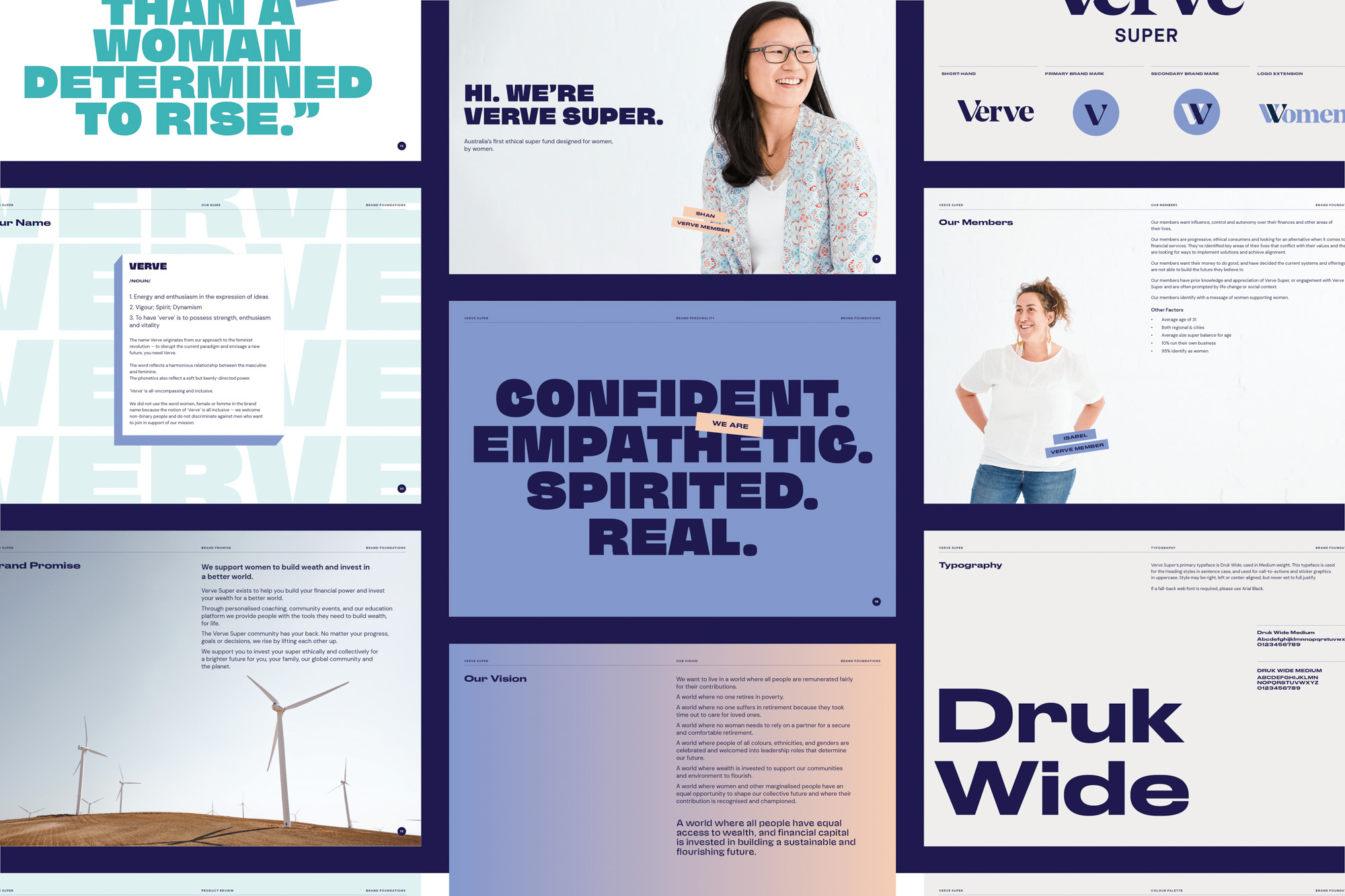
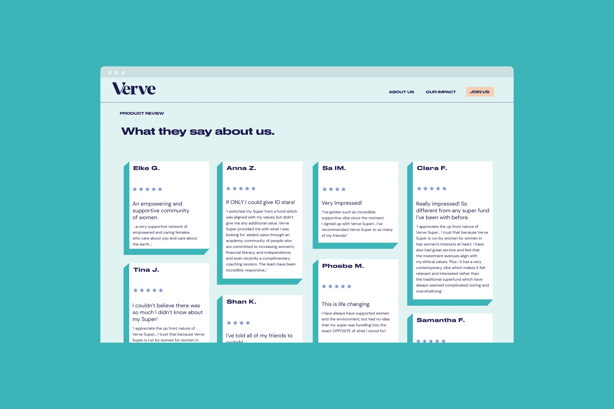
Since launching in 2018, Verve has grown a dedicated community through their progressive attitude and pragmatic approach towards financial wellbeing. Considering this, they approached us to redefine their brand positioning and refresh their visual identity in a way that inspires and includes their diverse member community.
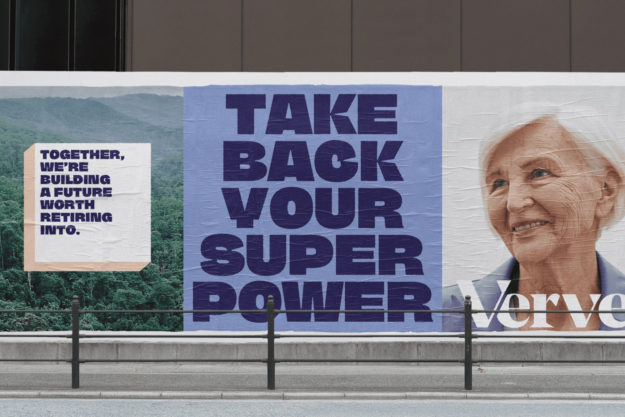
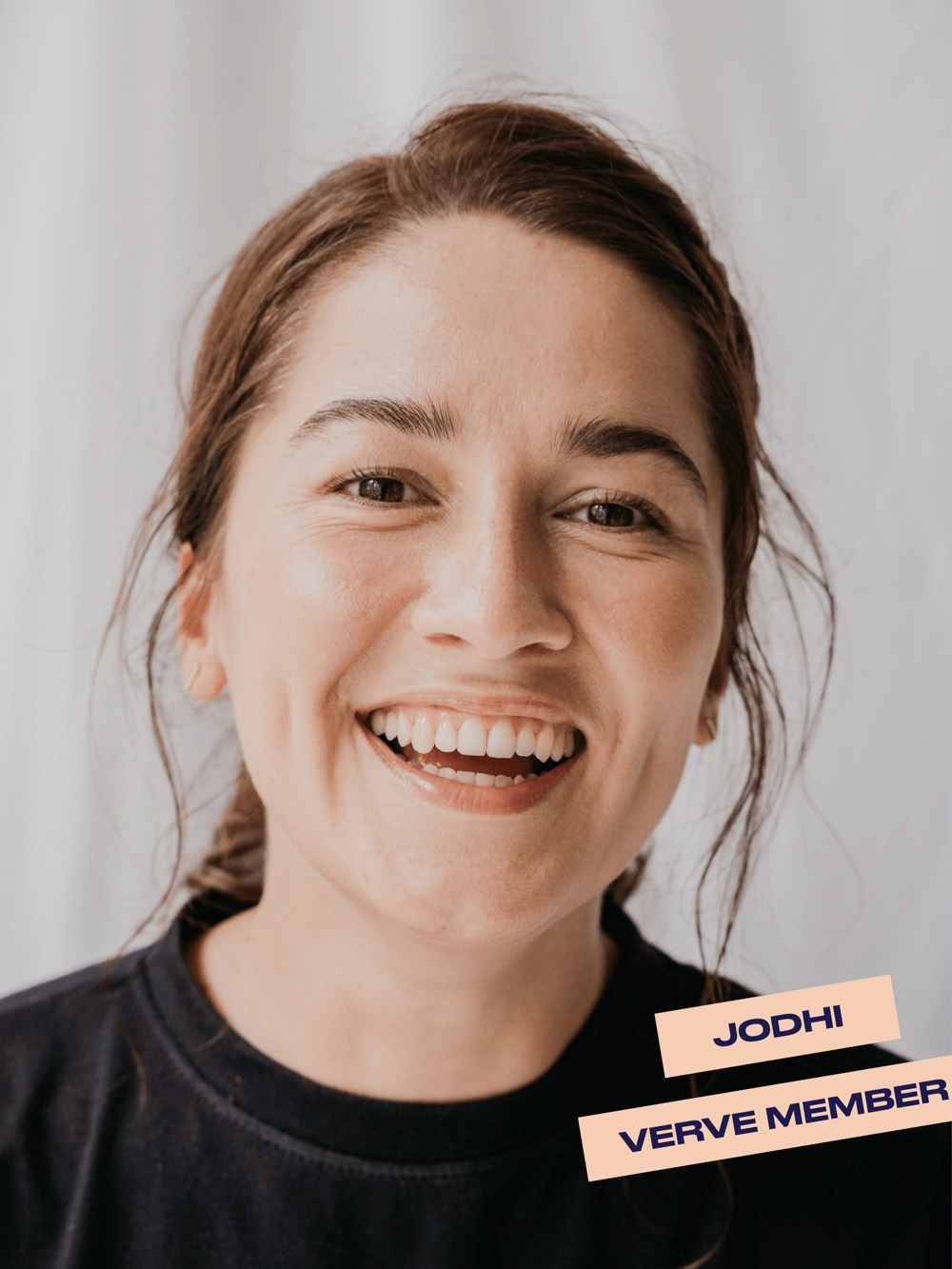
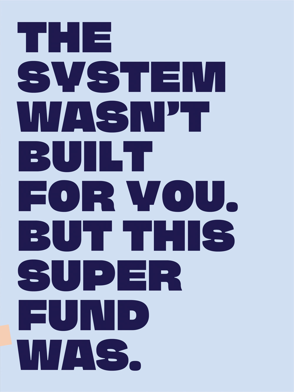
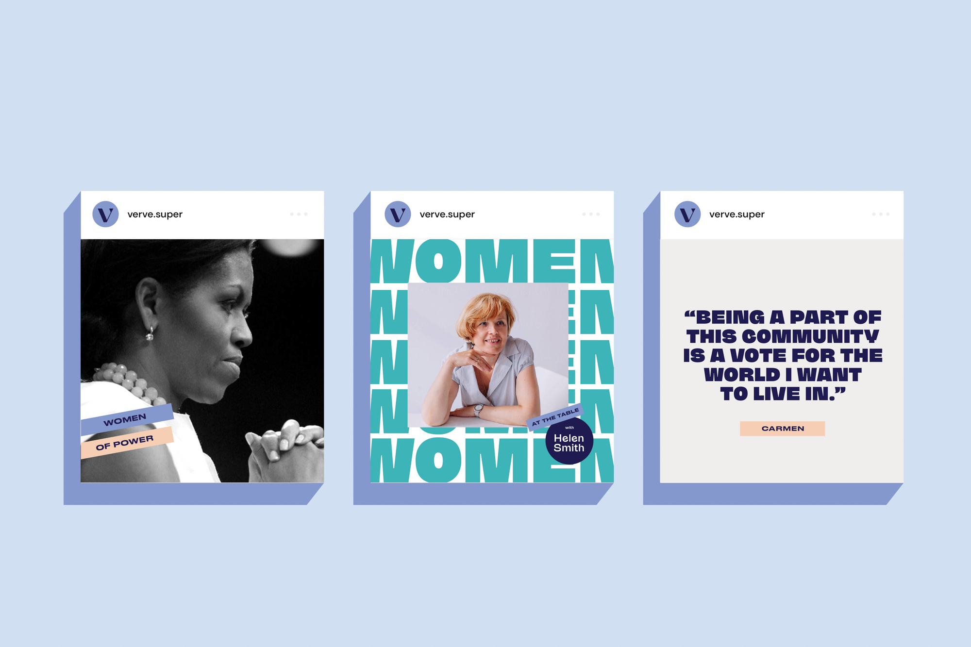
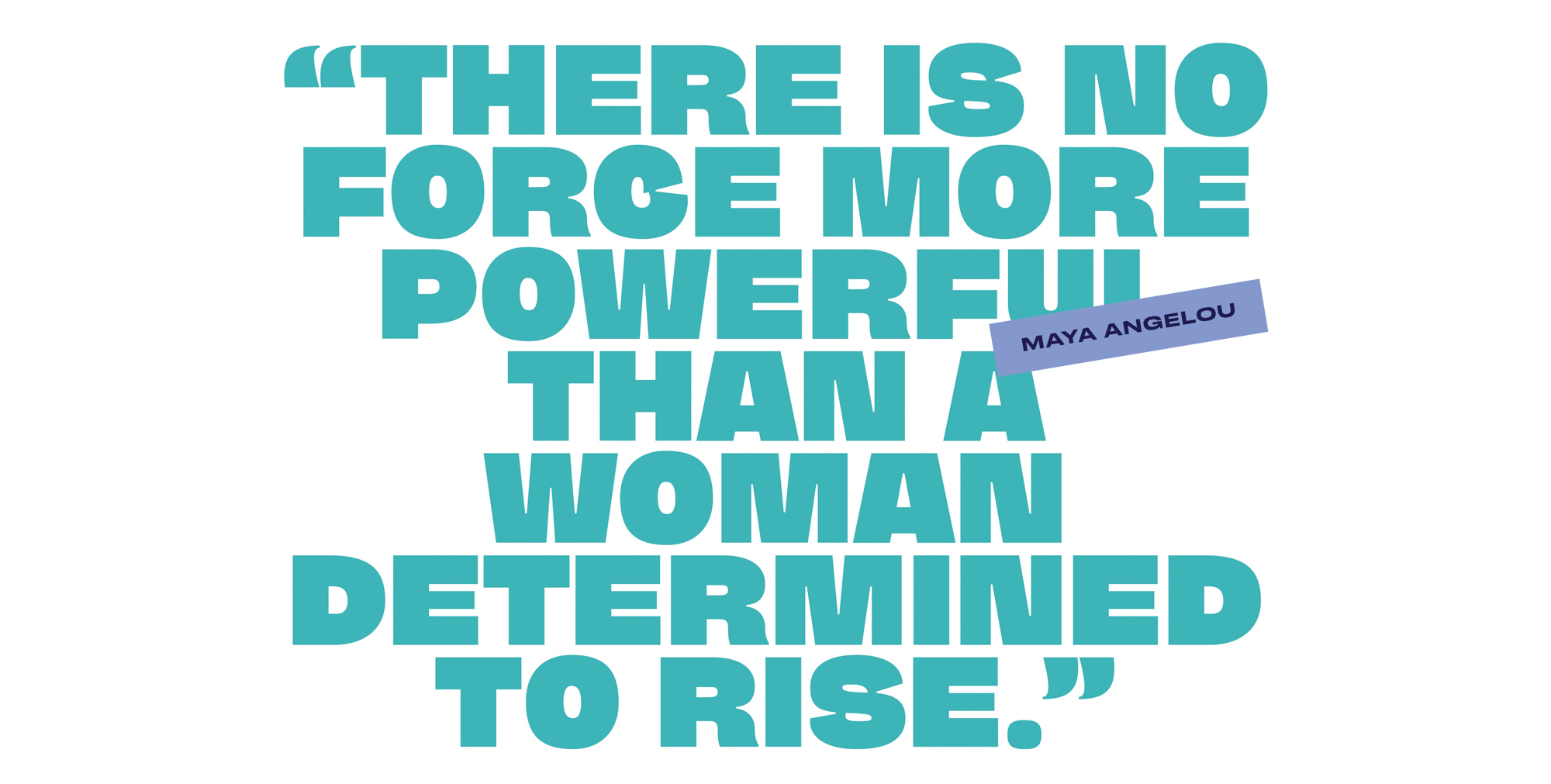
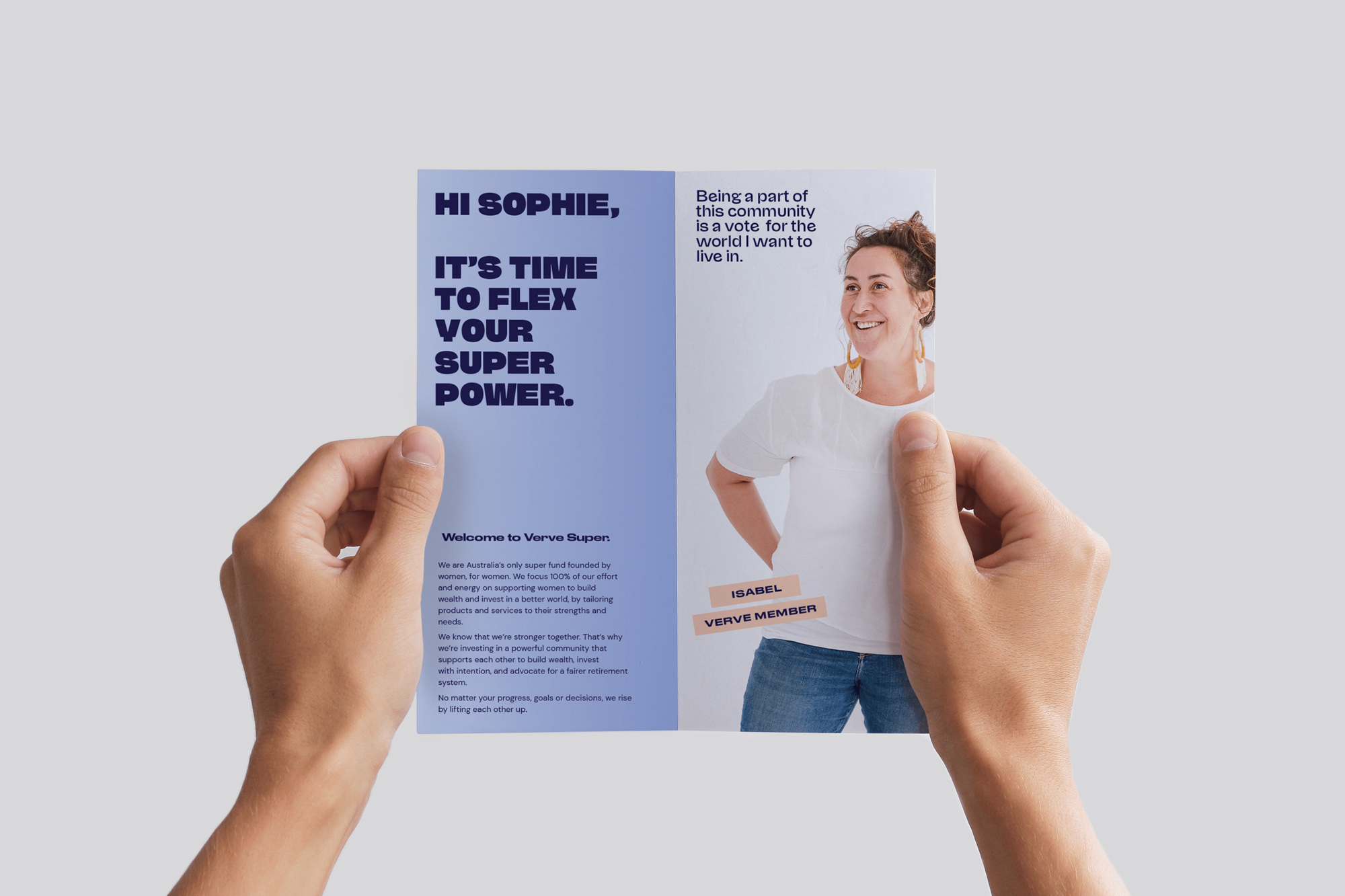
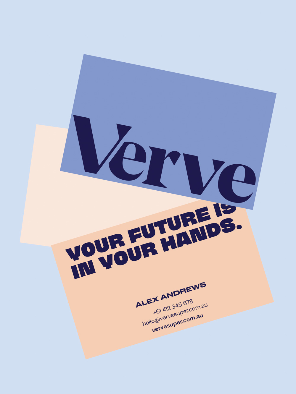
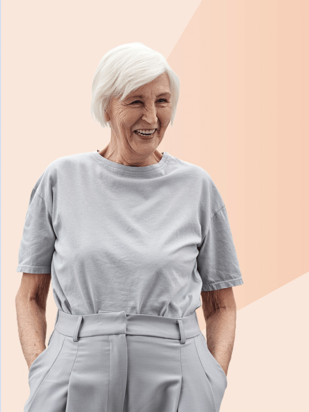
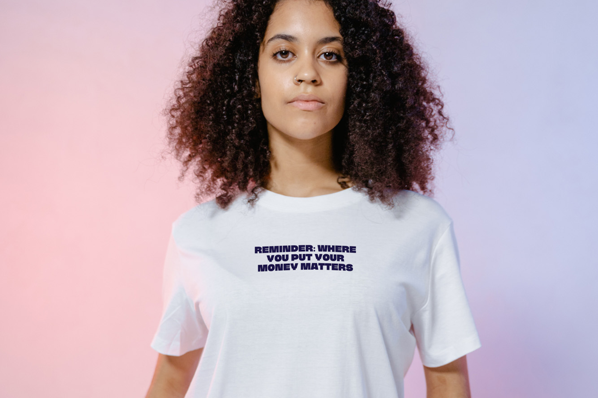
Individually and collectively, we hold the power to build a better, brighter future. Led by these notions of power and strength, we reimagined Verve’s branding and collateral to represent the spectrum of their customer base, introducing a distinctive aesthetic marked by bold typography, empowered imagery and a strong, feminine colour palette.
Our Brand Strategy and Campaign Concepts for Verve shine light on shared values of inclusivity, empathy and activism, with consistent, positive messaging that engages and uplifts. Across every touchpoint we’ve delivered Verve Super a brand that energetically transmits their vision for women’s economic empowerment – which in an industry of traditional and spiritless products, refuses to be ignored.
Read more about this case study here.
“A refreshing eye and creative spirit has been injected into our brand’s core — it’s feminine and powerful and we love the new energy Smack Bang have brought.”
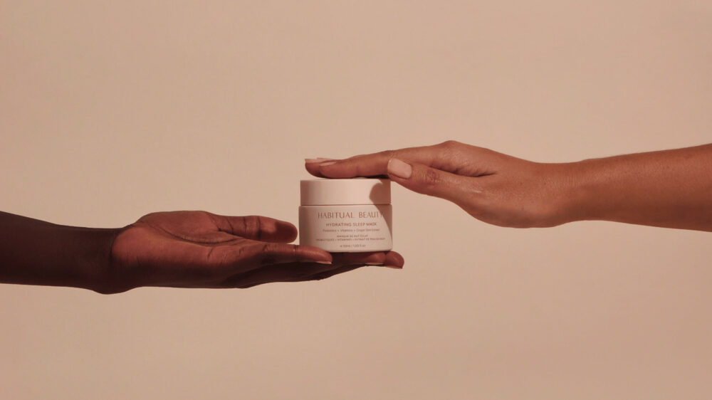
Honouring the power of ritual in experiential beauty.
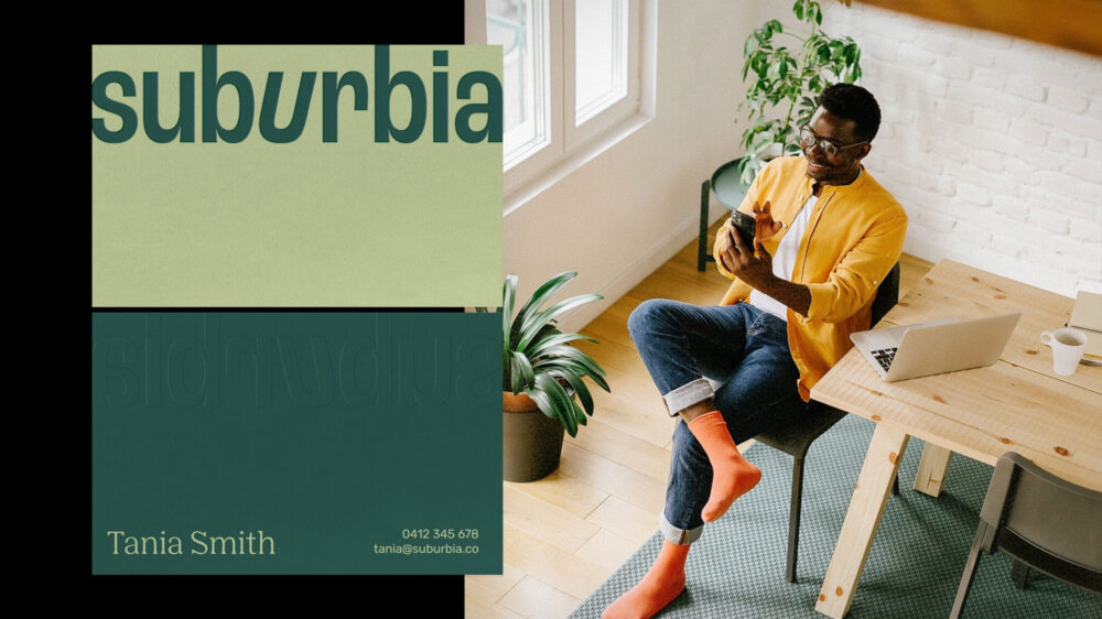
Real Estate that hits different.
© 2026 Smack Bang


We pay respect to the Traditional Custodians and First Peoples of NSW, and acknowledge their continued connection to their country and culture.