We pay respect to the Traditional Custodians and First Peoples of NSW, and acknowledge their continued connection to their country and culture.
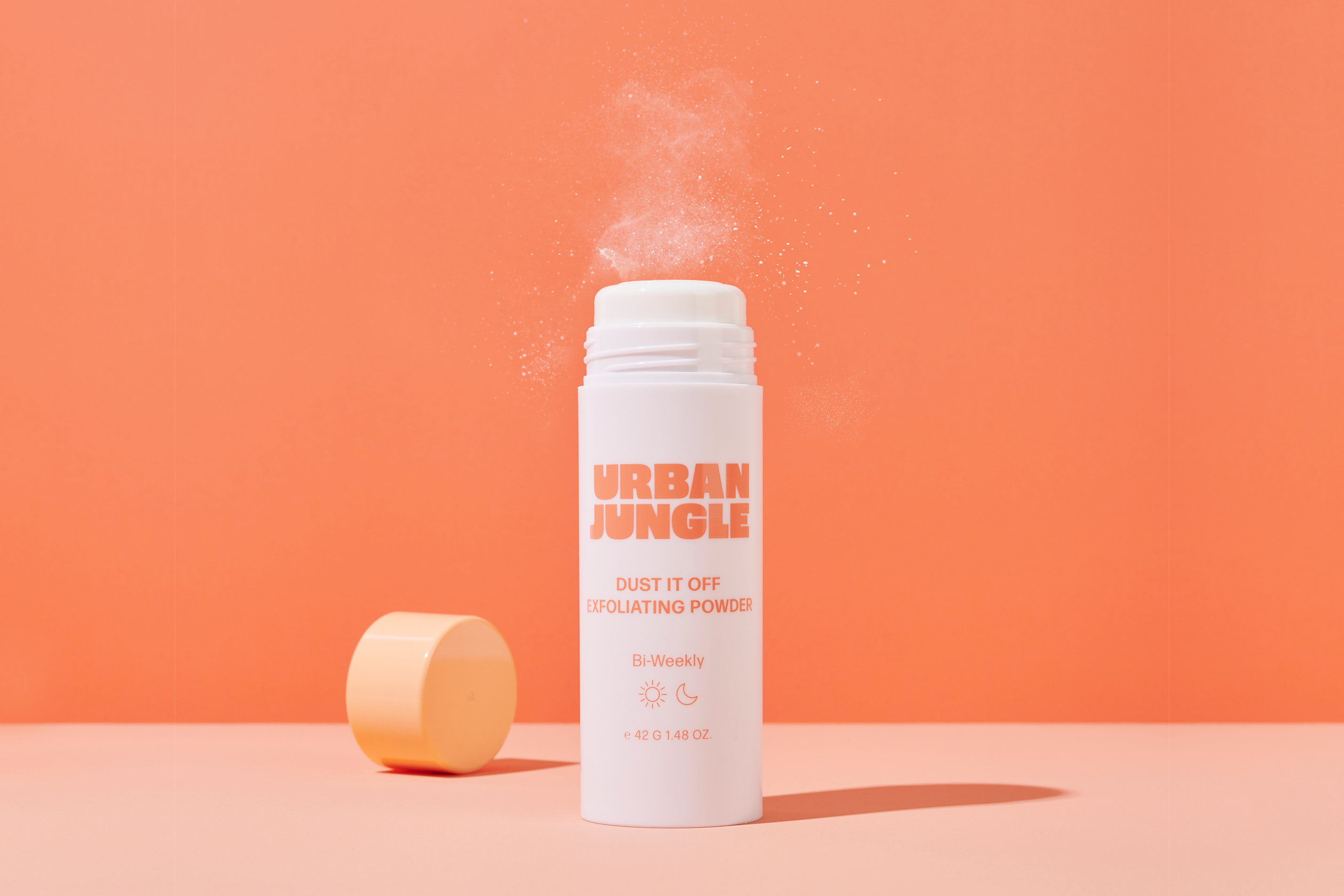
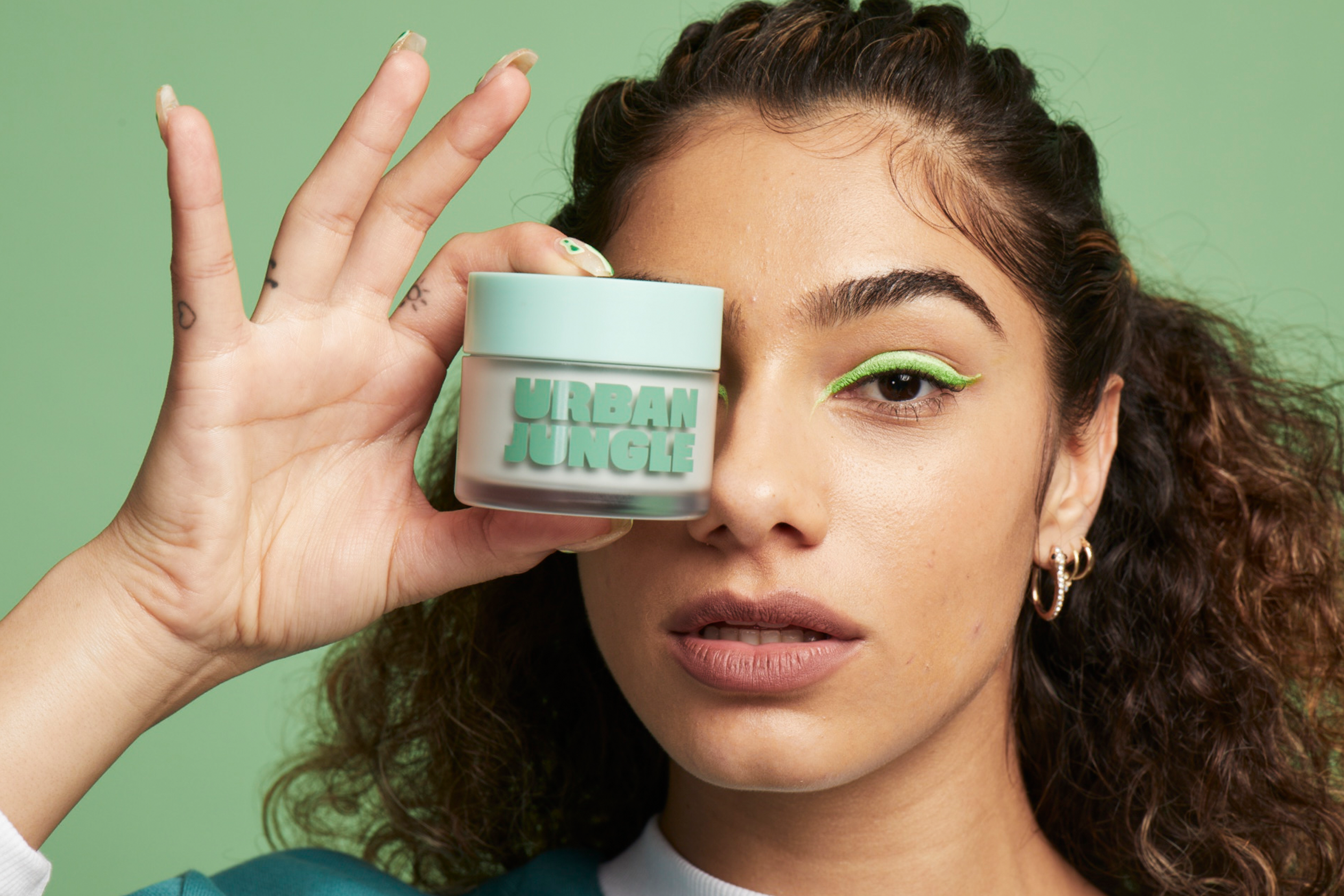
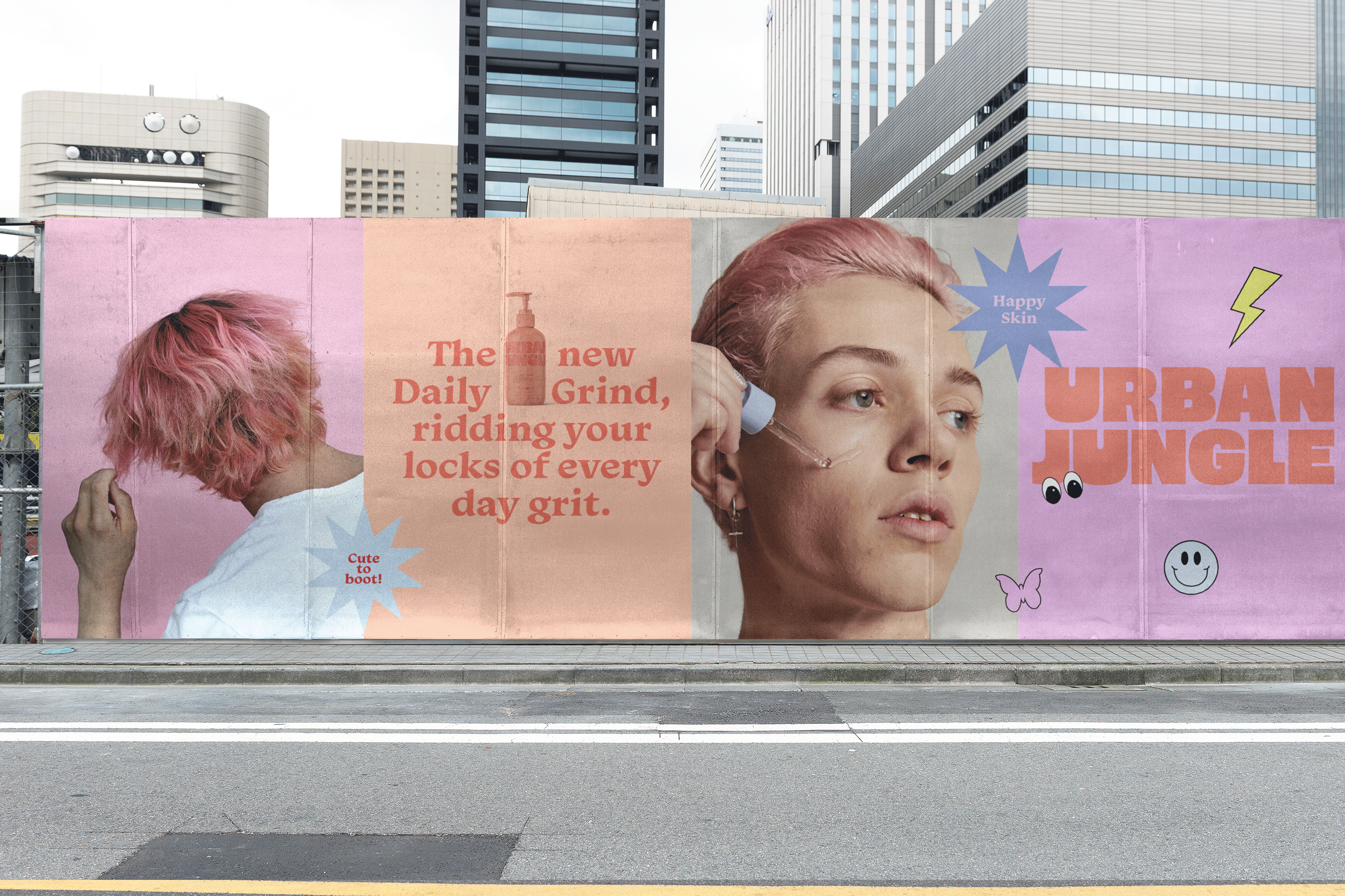
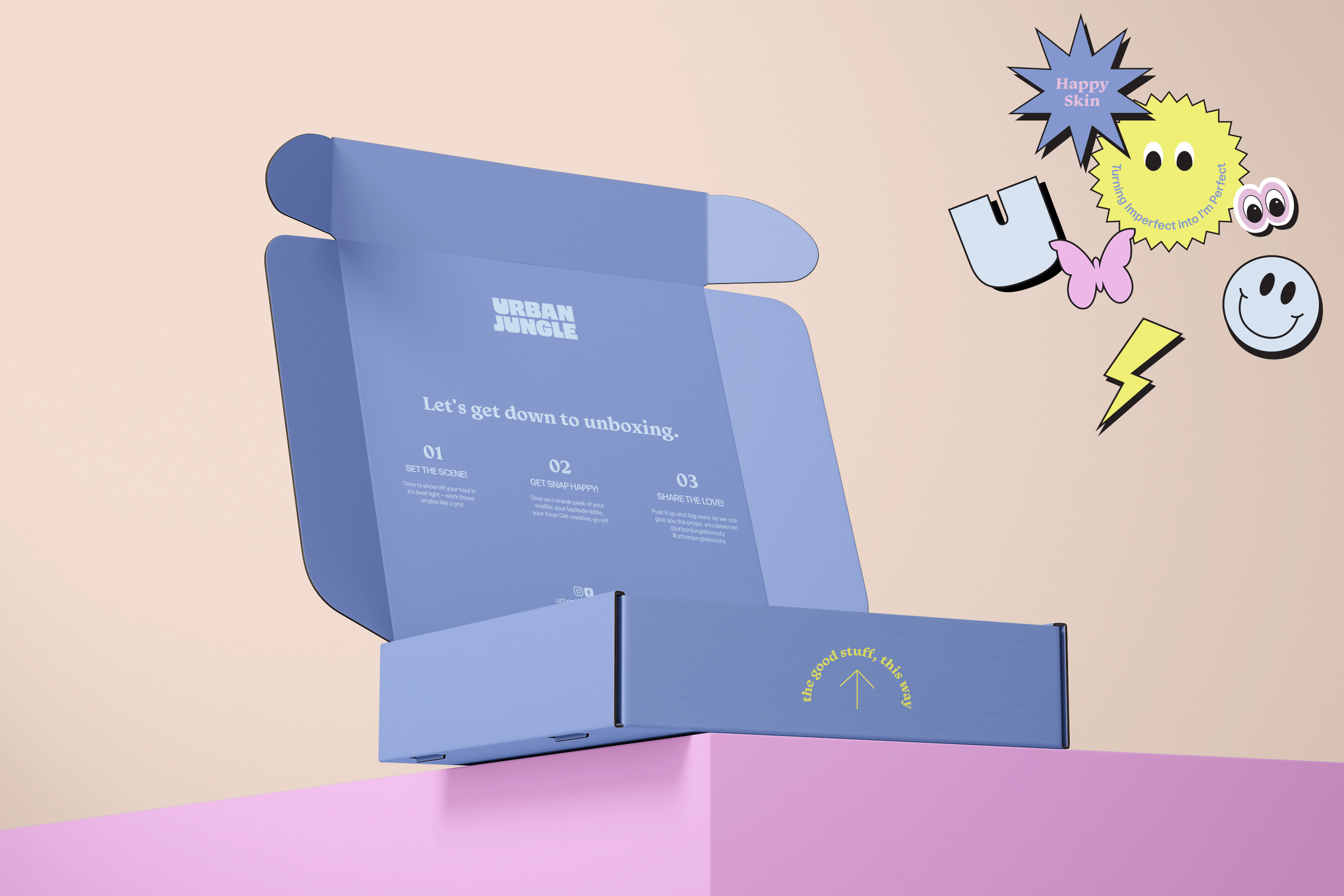
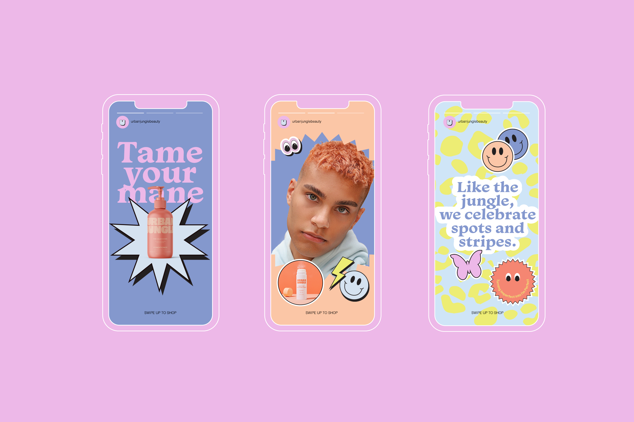
Urban Jungle is a new brand by an existing Australian beauty group who sought to create a simple and effective beauty product with a youthful spirit. As an established creative services company, they had an in-house design team of their own, but came to Smack Bang for higher creative and fresh conceptual thinking. We worked with their team to deliver a comprehensive brand experience through strategy, identity, digital and packaging design, copywriting and photography.
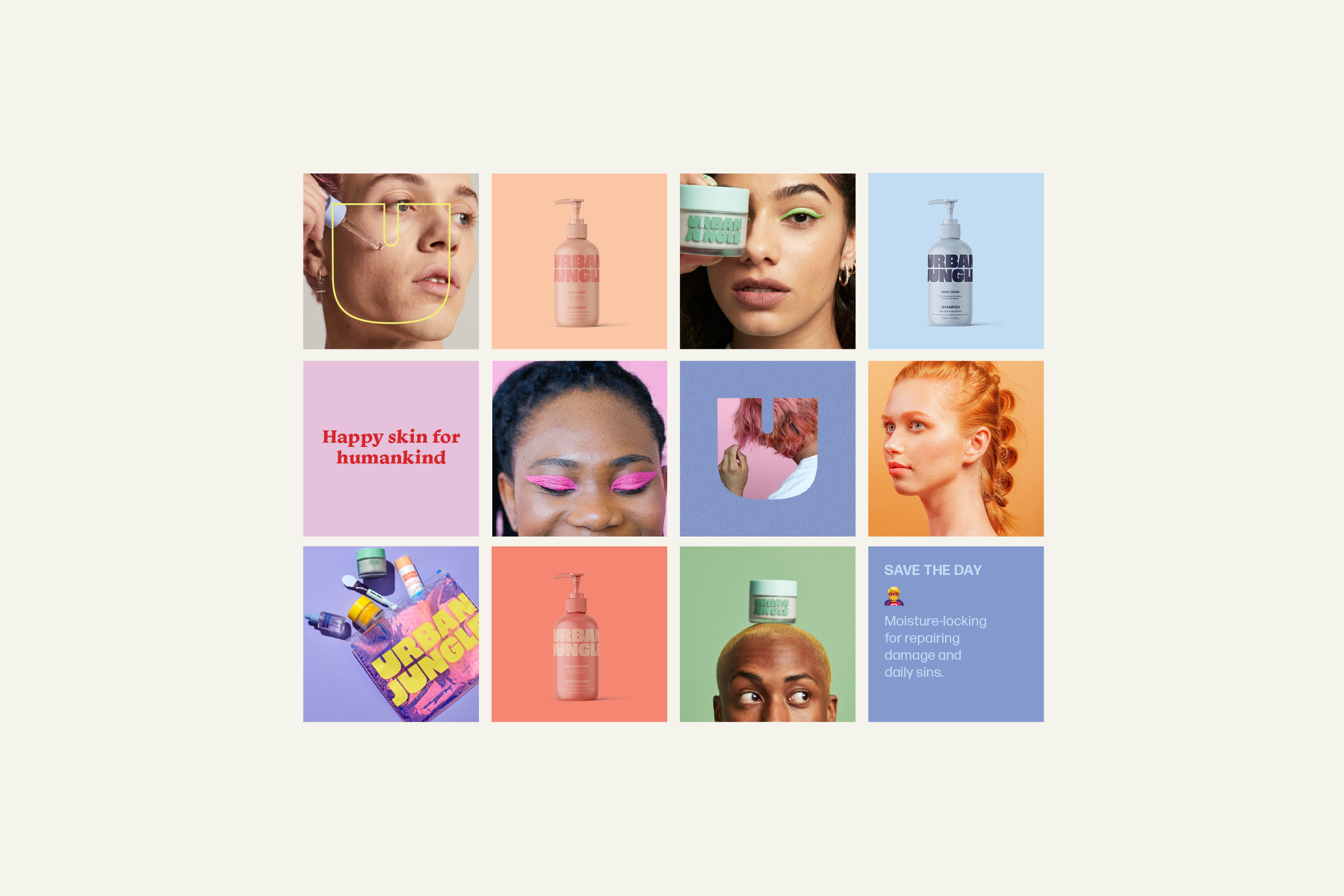
Born from the idea that self-reflection leads to self-confidence, we created the symbol of a mirror using the U as the Brand Icon. A mirror speaks of the application of the product, and of a time and place that requires true confidence. The U Icon has been incorporated through campaign imagery to represent this process of positive reflection and self-empowerment. The symbol of the mirror also led to our concept of the ‘theatrics of the reveal’, which we explored through interchangeable tones for product and mailer packaging and in the brand imagery which plays on contrasts and is bold and bright.
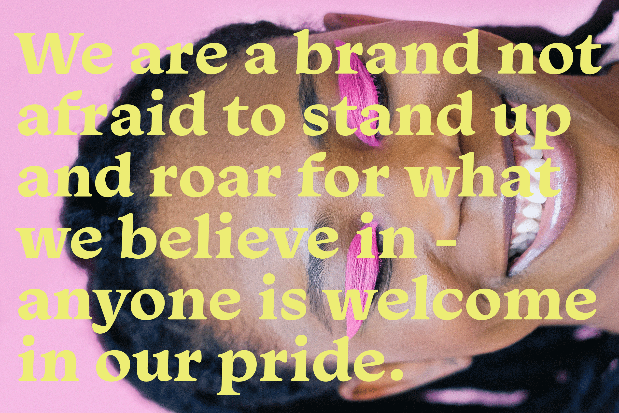
Just like the jungle, Urban Jungle is a place for scars, spots and stripes. With products that are fun and fresh, and a trail-blazing new brand that celebrates diversity and inclusivity, Urban Jungle serves an empowering vision of beauty to the next generation.

A story of sun-kissed skincare.
Supercharging the everyday.