

We pay respect to the Traditional Custodians and First Peoples of NSW, and acknowledge their continued connection to their country and culture.
The Fold
- Share


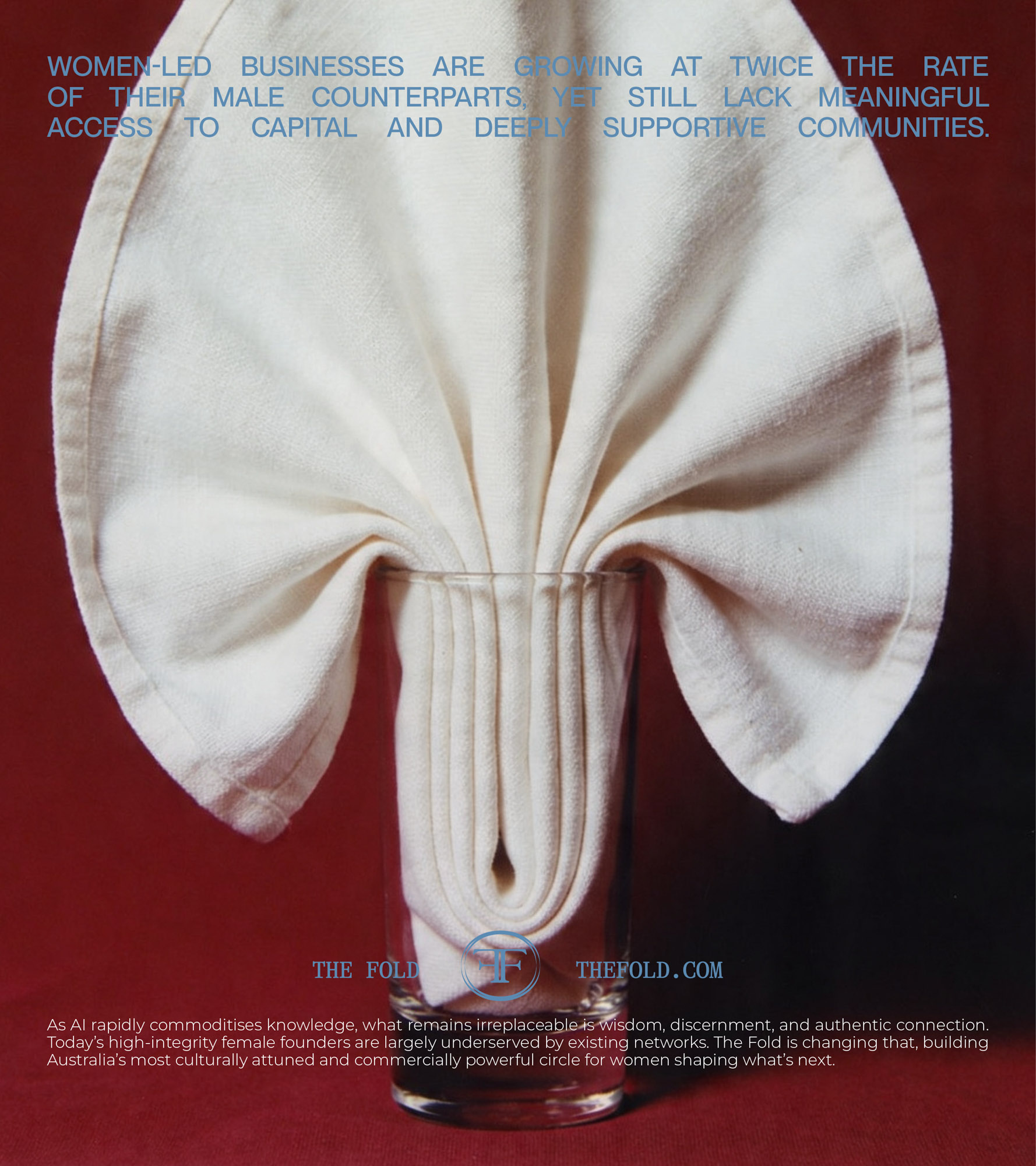
Somewhere between panels, pitch nights, and performative networking, something got lost: depth. The kind that sharpens ideas. The kind that holds ambition properly. The kind that only happens when the right people are in the room, and the door is quietly closed behind them.
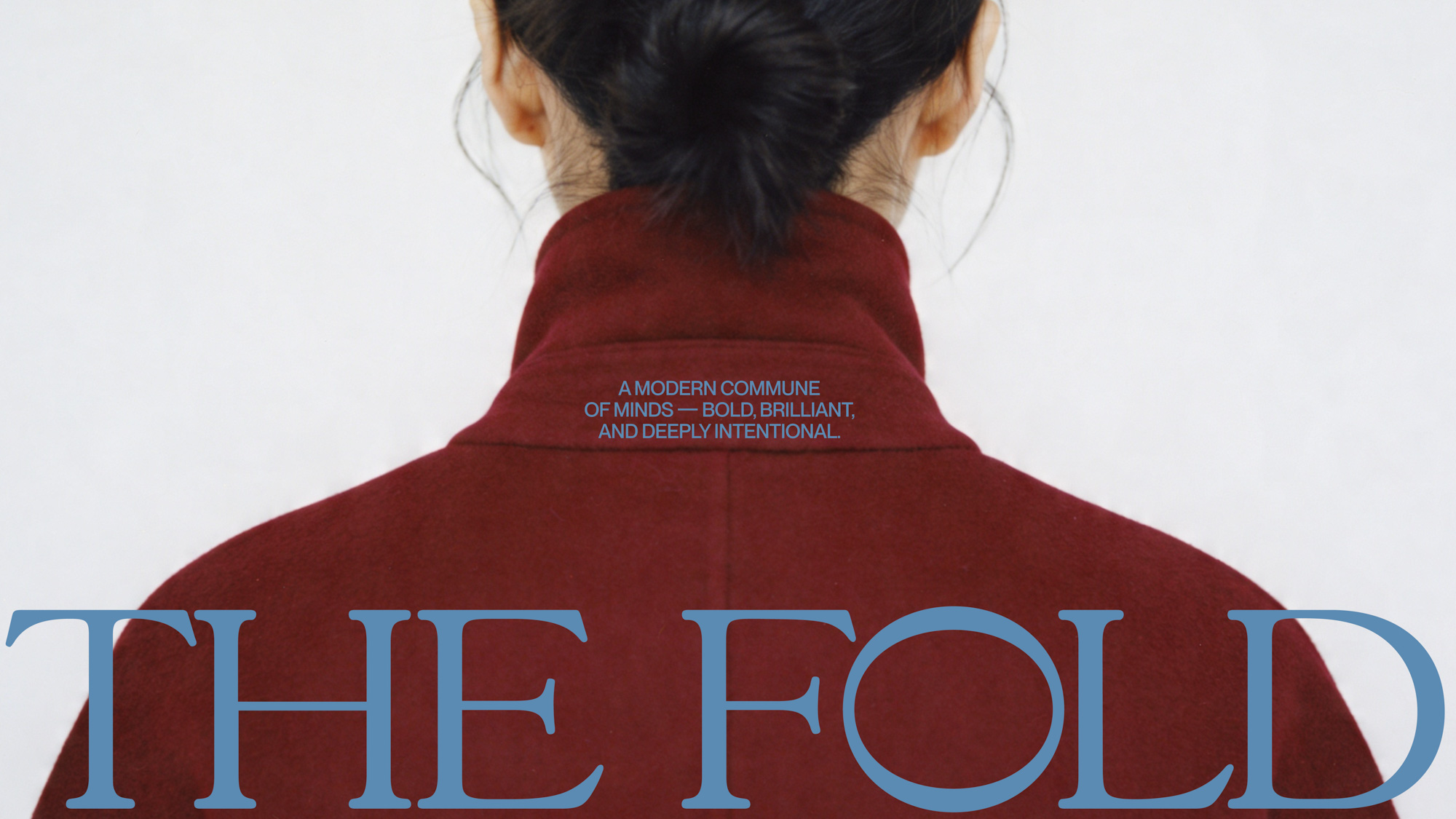
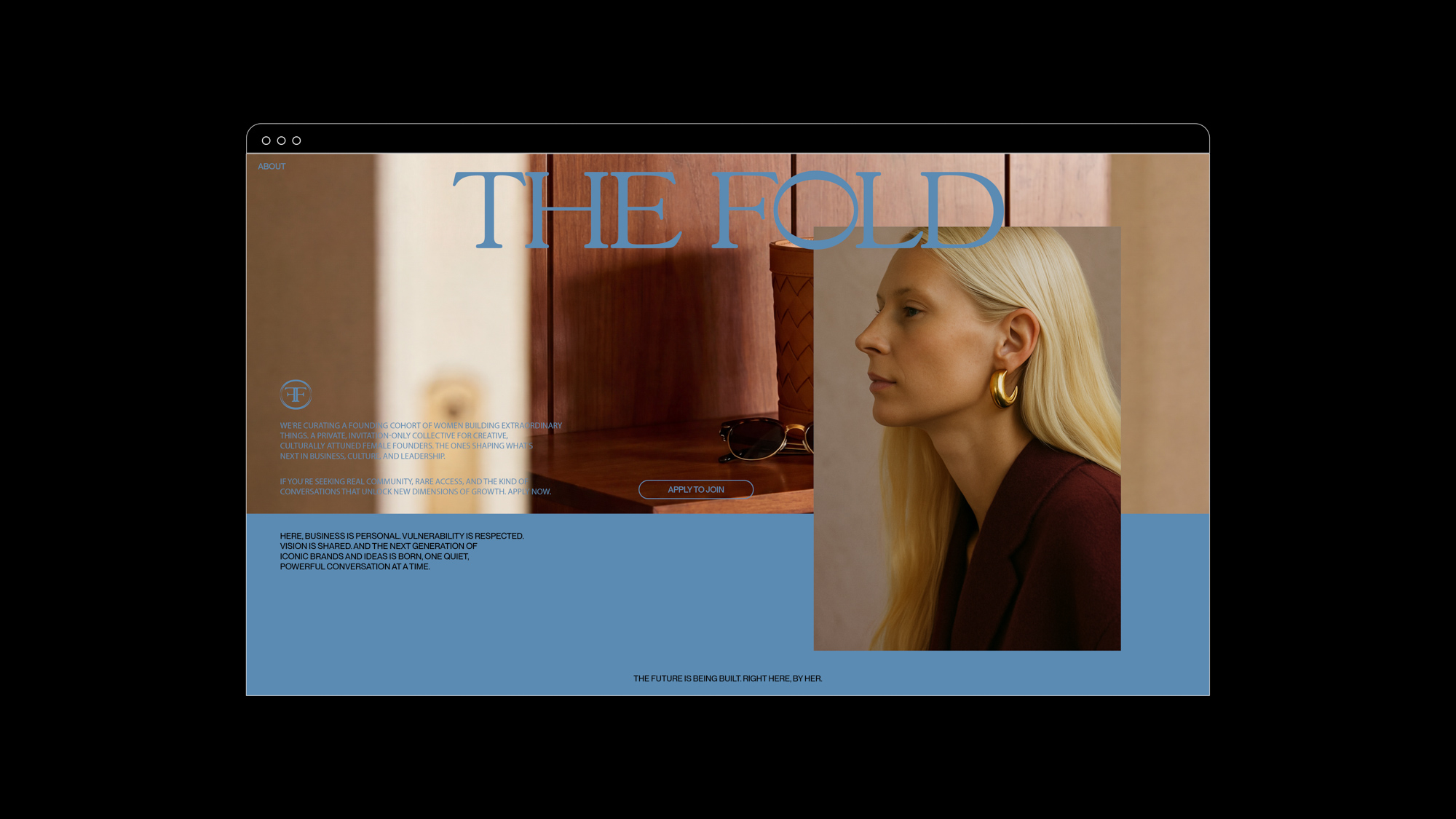
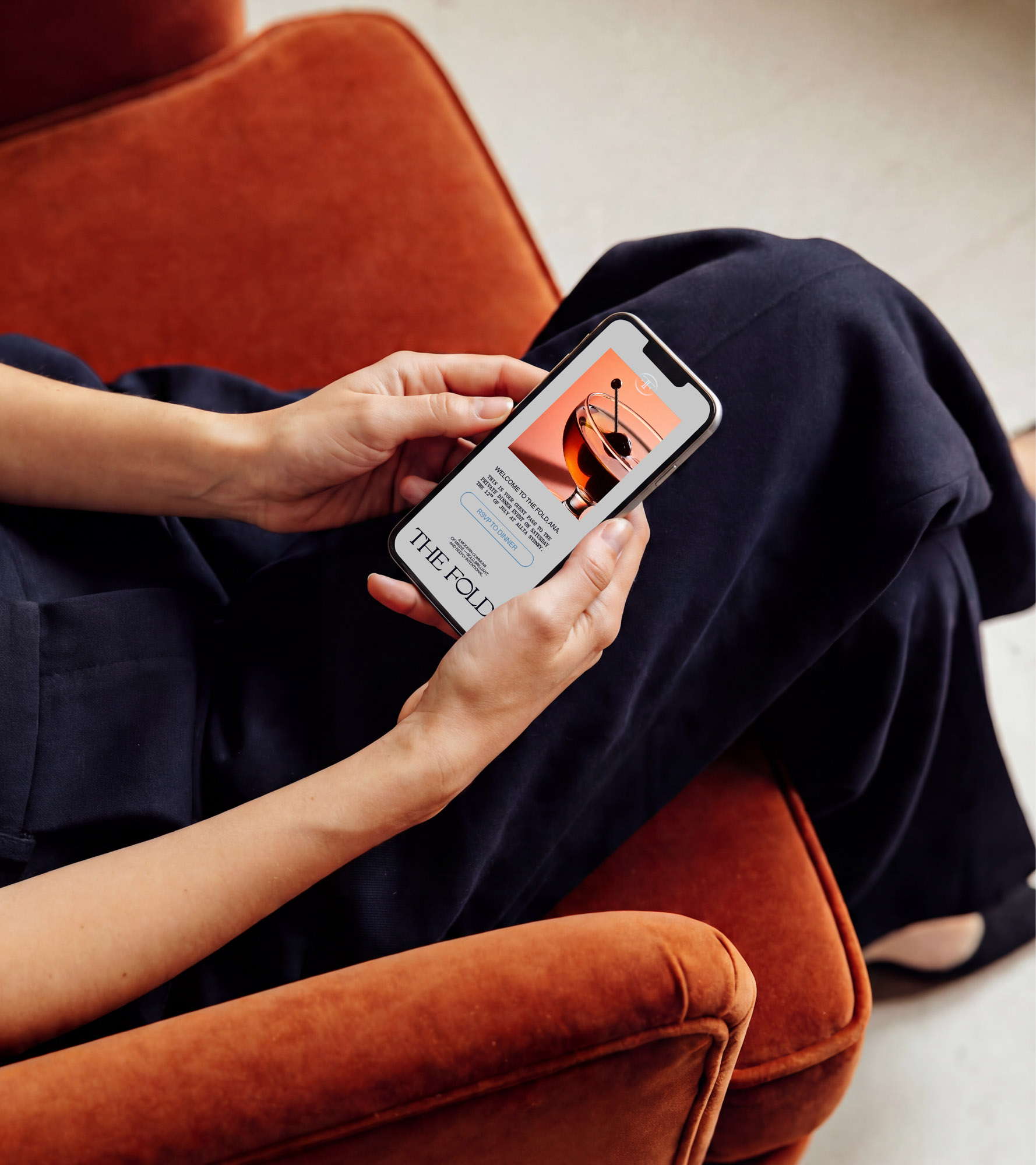
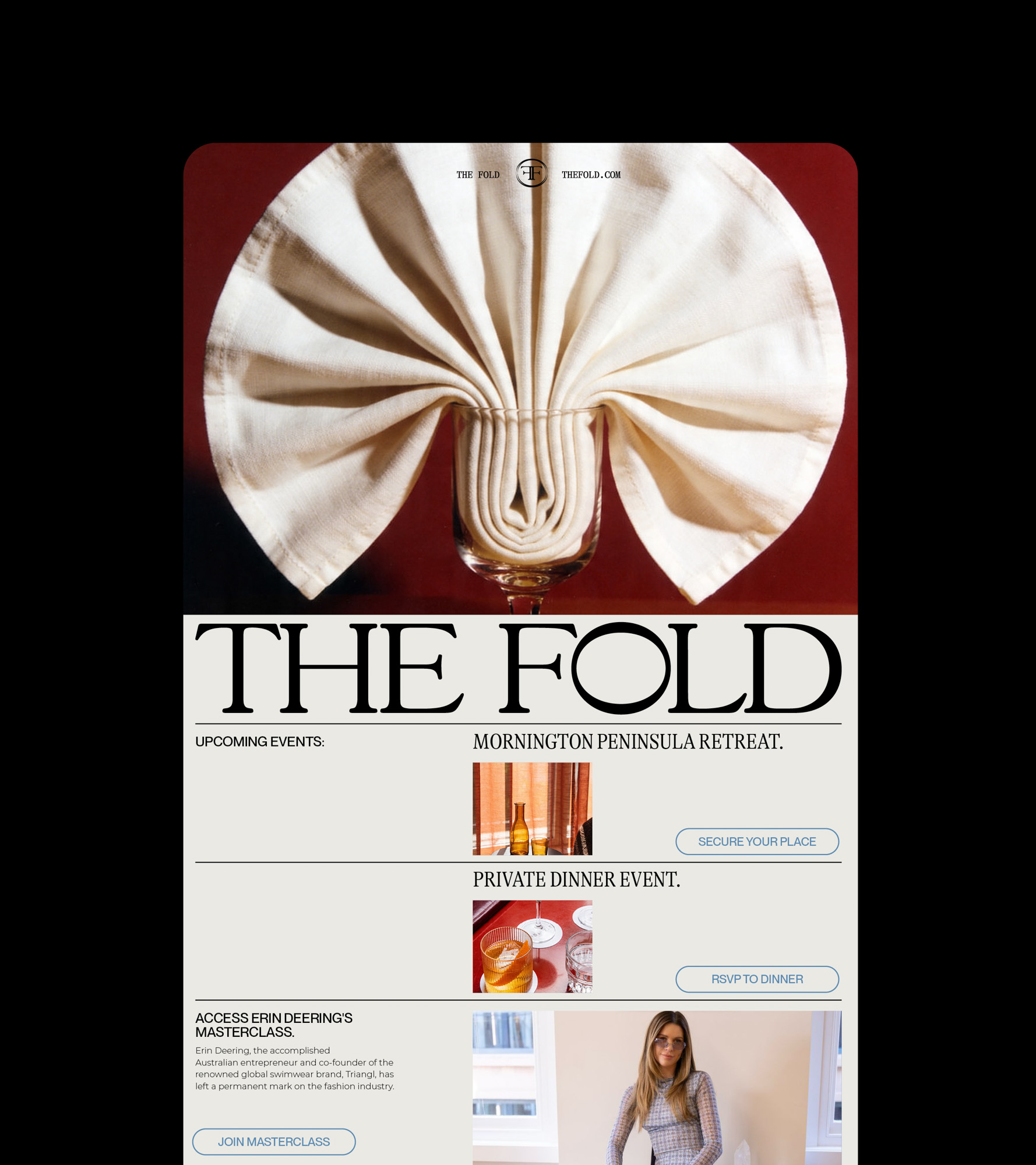
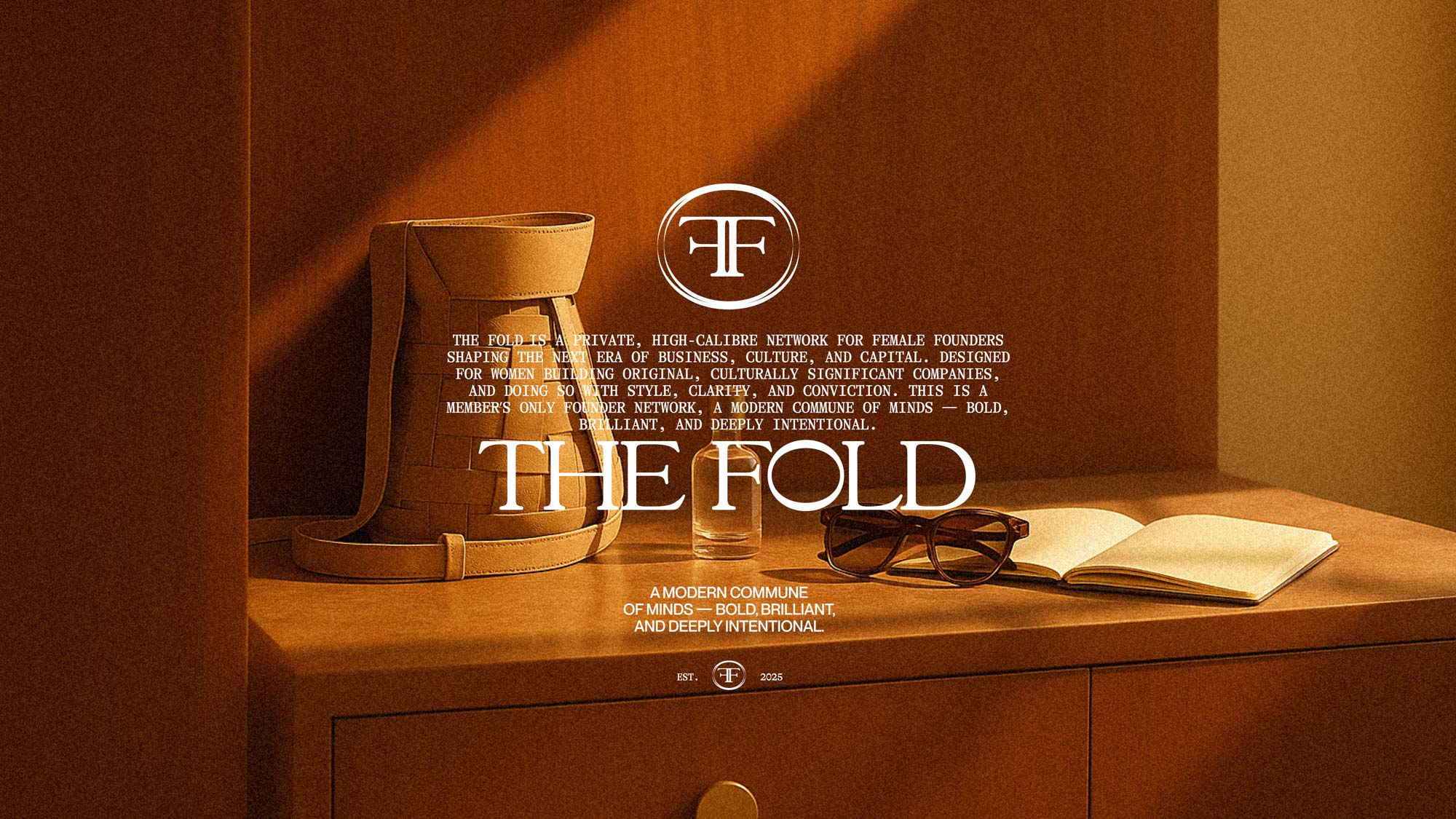
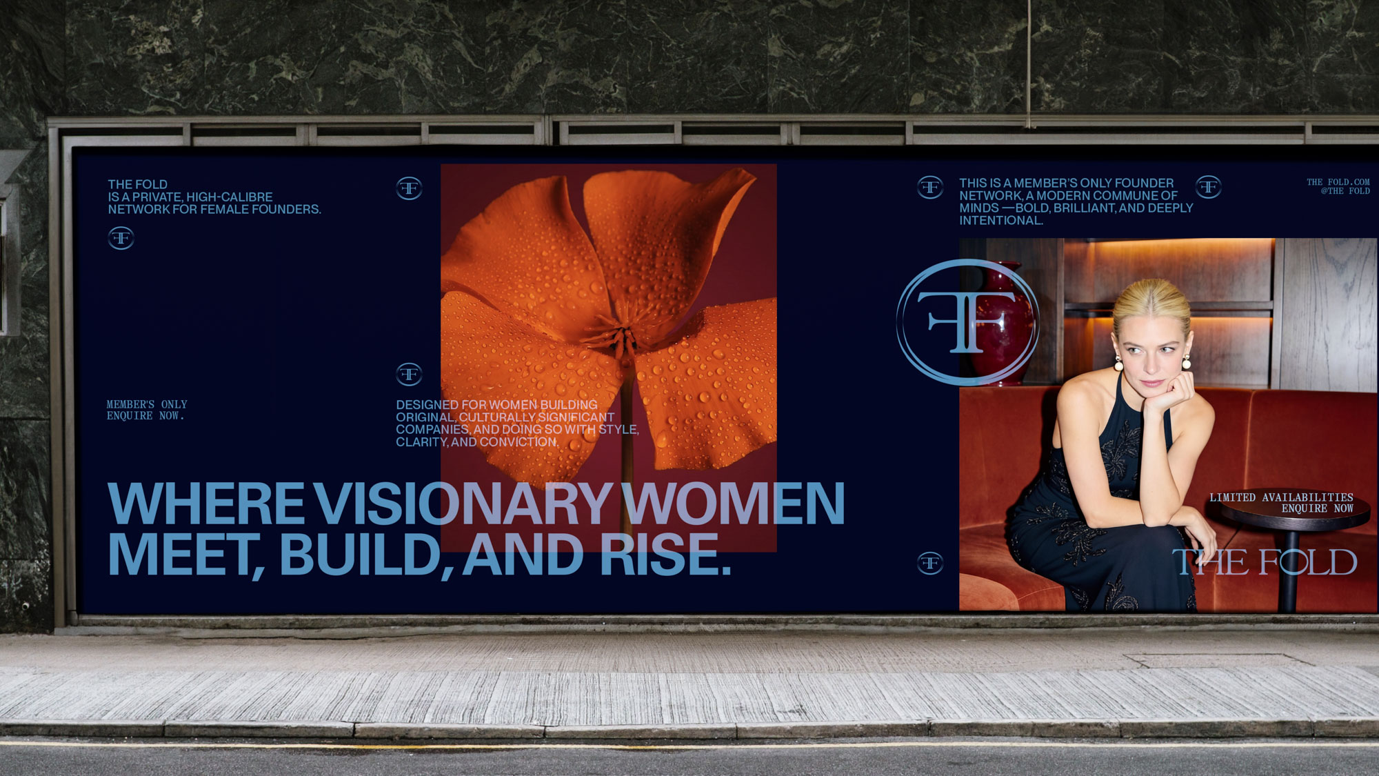
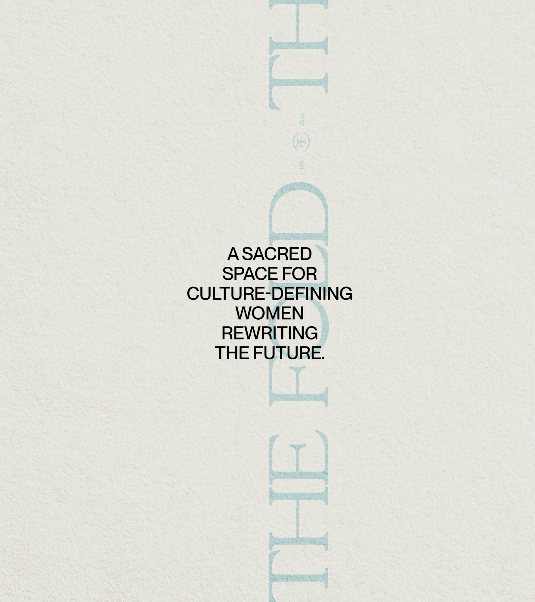
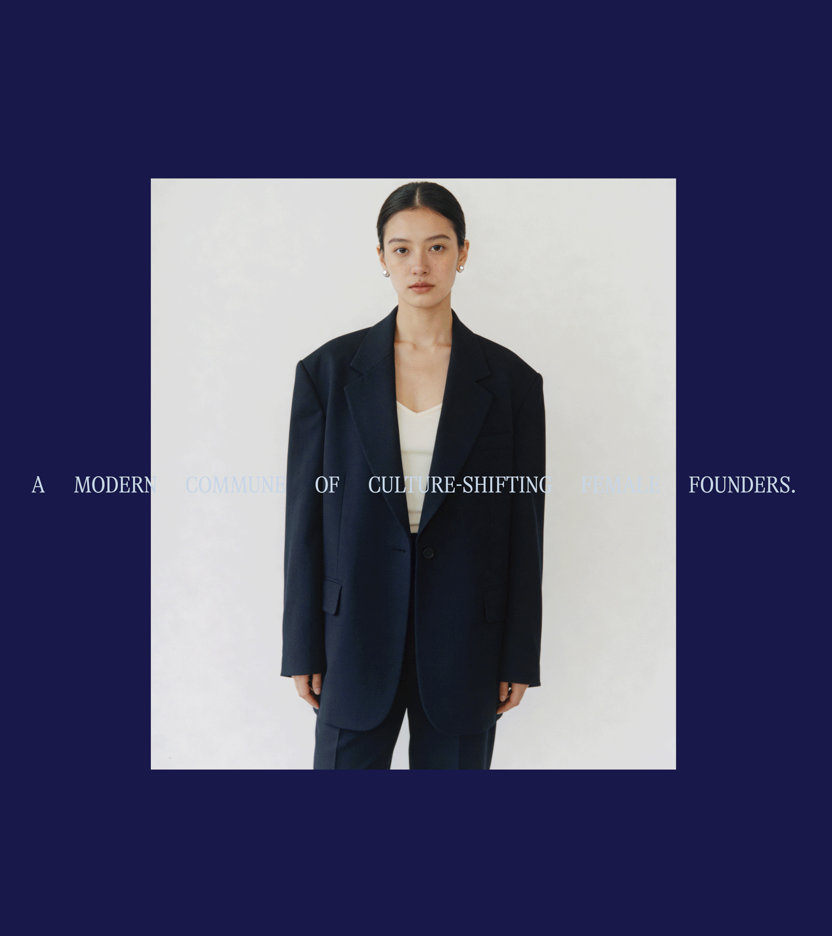
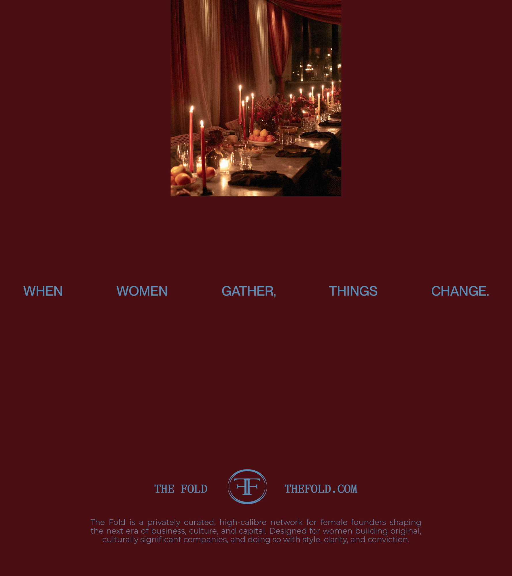
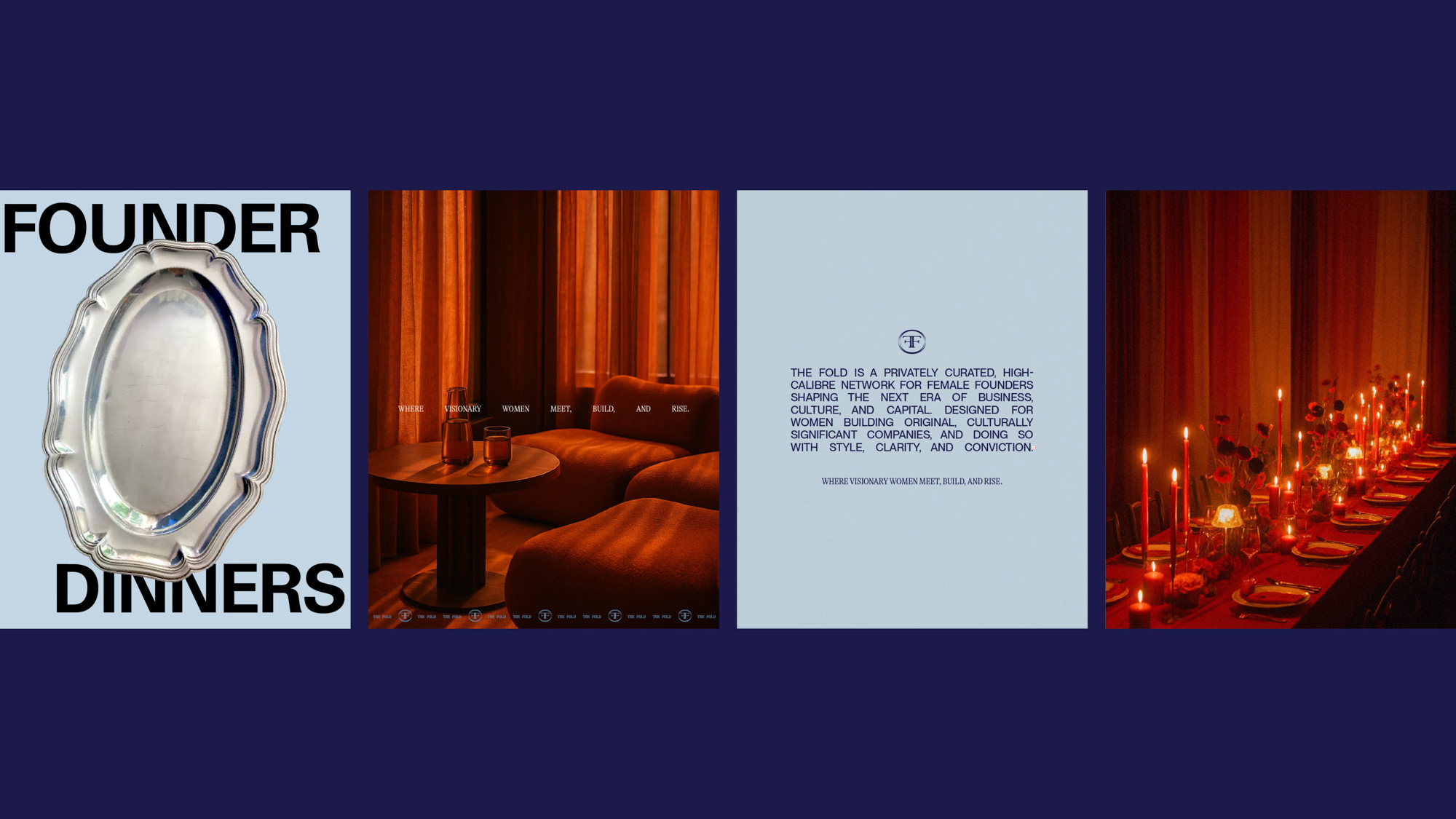
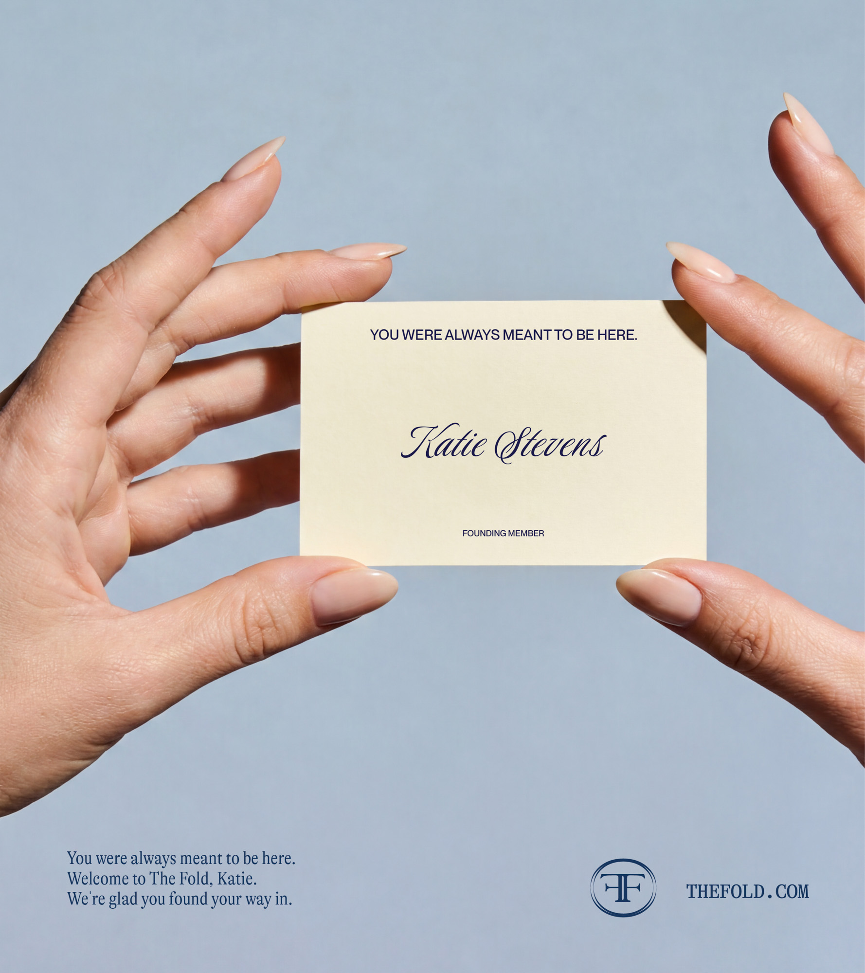
Enter The Fold. A private, high-calibre network designed for female founders shaping the next era of business, culture, and capital. Designed with intention, alignment, and depth at its core, The Fold offers a more considered kind of power.
We partnered with the founders to build a brand world that reflects that shift. One that moves away from visibility-for-visibility’s-sake, and toward something far more valuable: proximity, discernment, and depth.
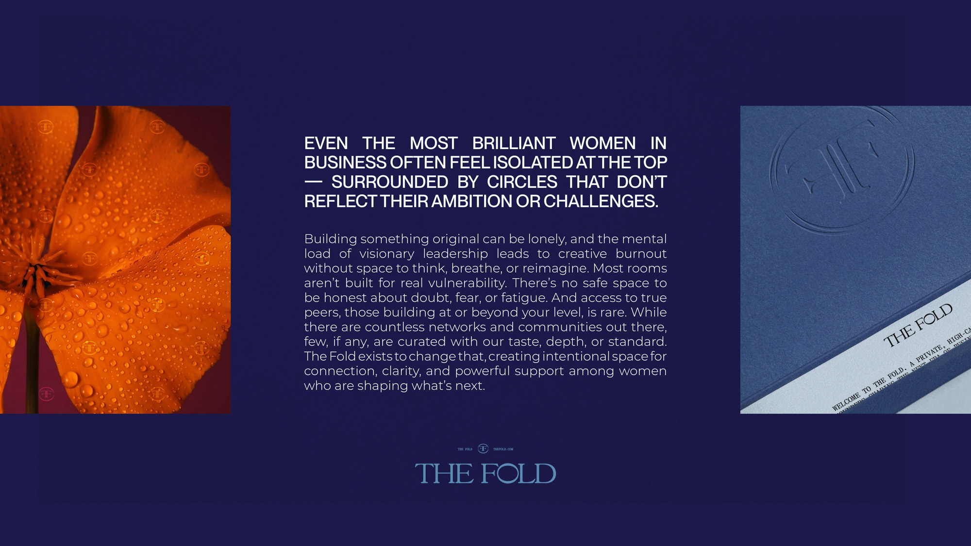
The Fold is not for everyone, and that’s precisely the point.
It’s a curated circle for women building original, culturally significant companies. The ones who have outgrown surface-level spaces and are ready for something more considered. More intelligent, and more real.
Here, ambition meets emotional intelligence. Strategy meets softness. And connection becomes a form of capital.
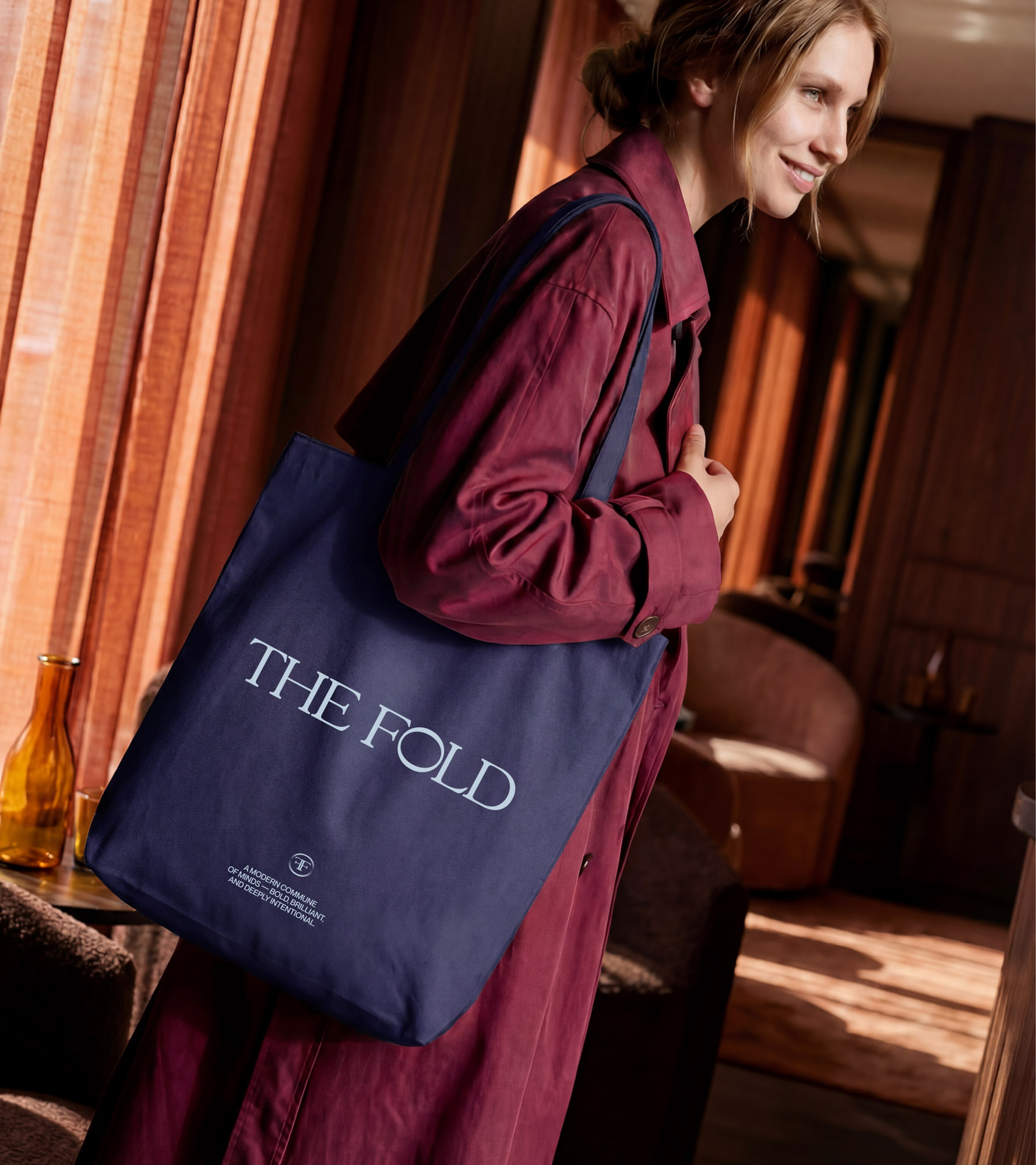
Built as a modern commune of minds: bold, brilliant, and deeply intentional, The Fold offers something rare: a space where business and being evolve in parallel. Where ideas are not broadcast, but exchanged. And where the next generation of iconic brands is shaped not on stages, but in rooms that feel equal parts strategic and sacred
We were tasked with translating this philosophy into a brand that feels as elevated and intentional as the experience itself. The challenge was to create something that signals exclusivity without ego, softness without losing strength.
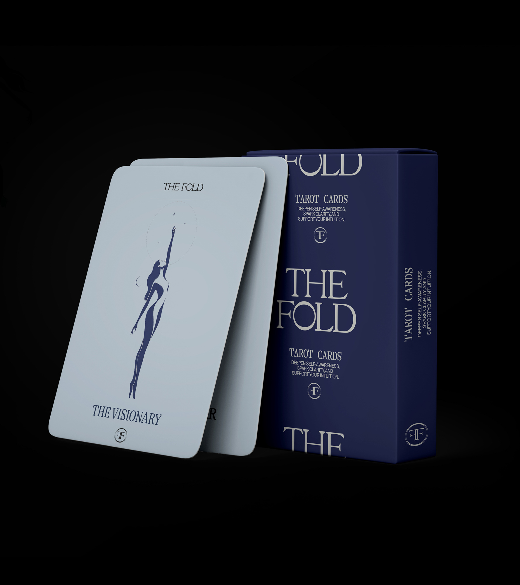
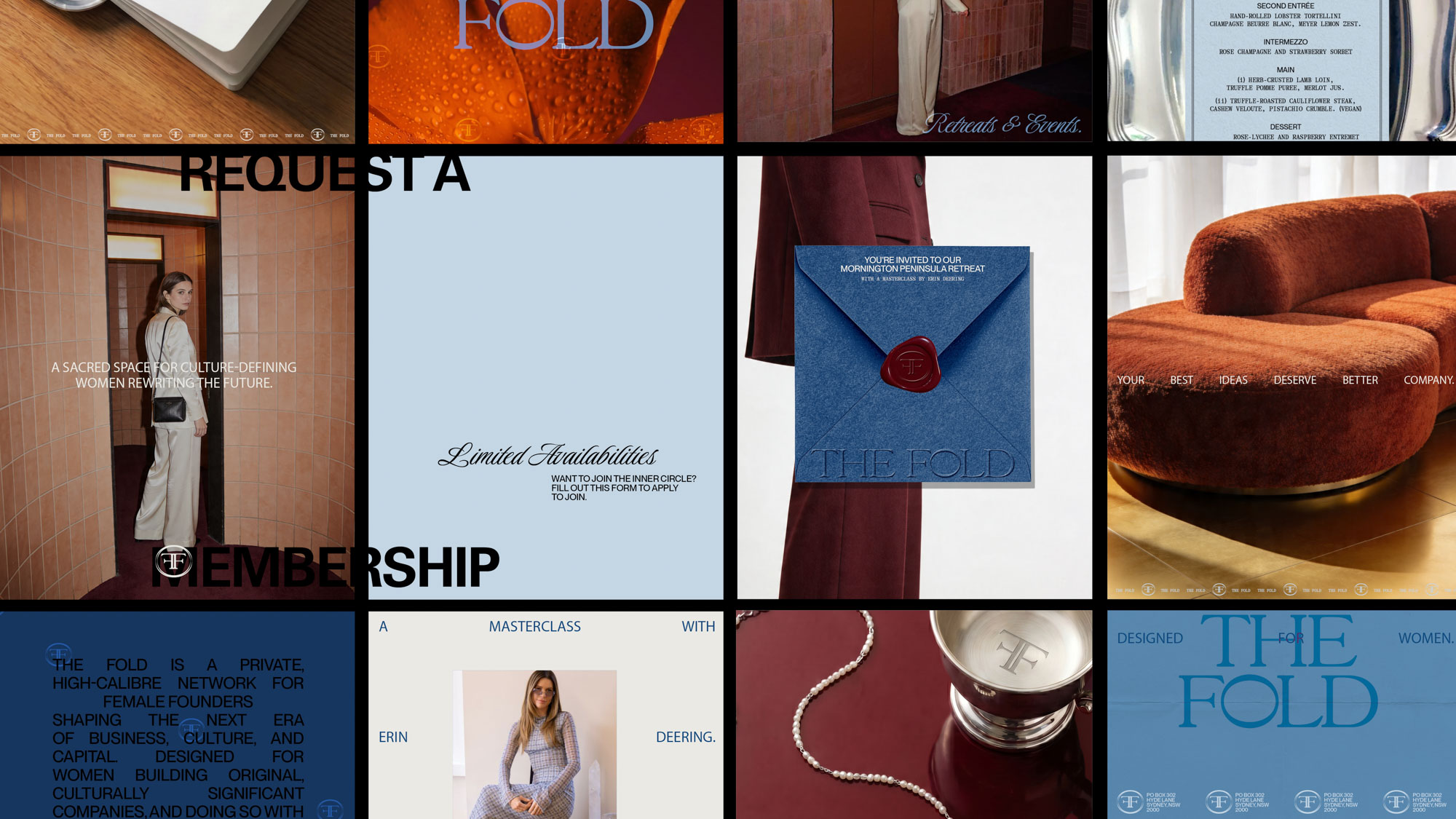
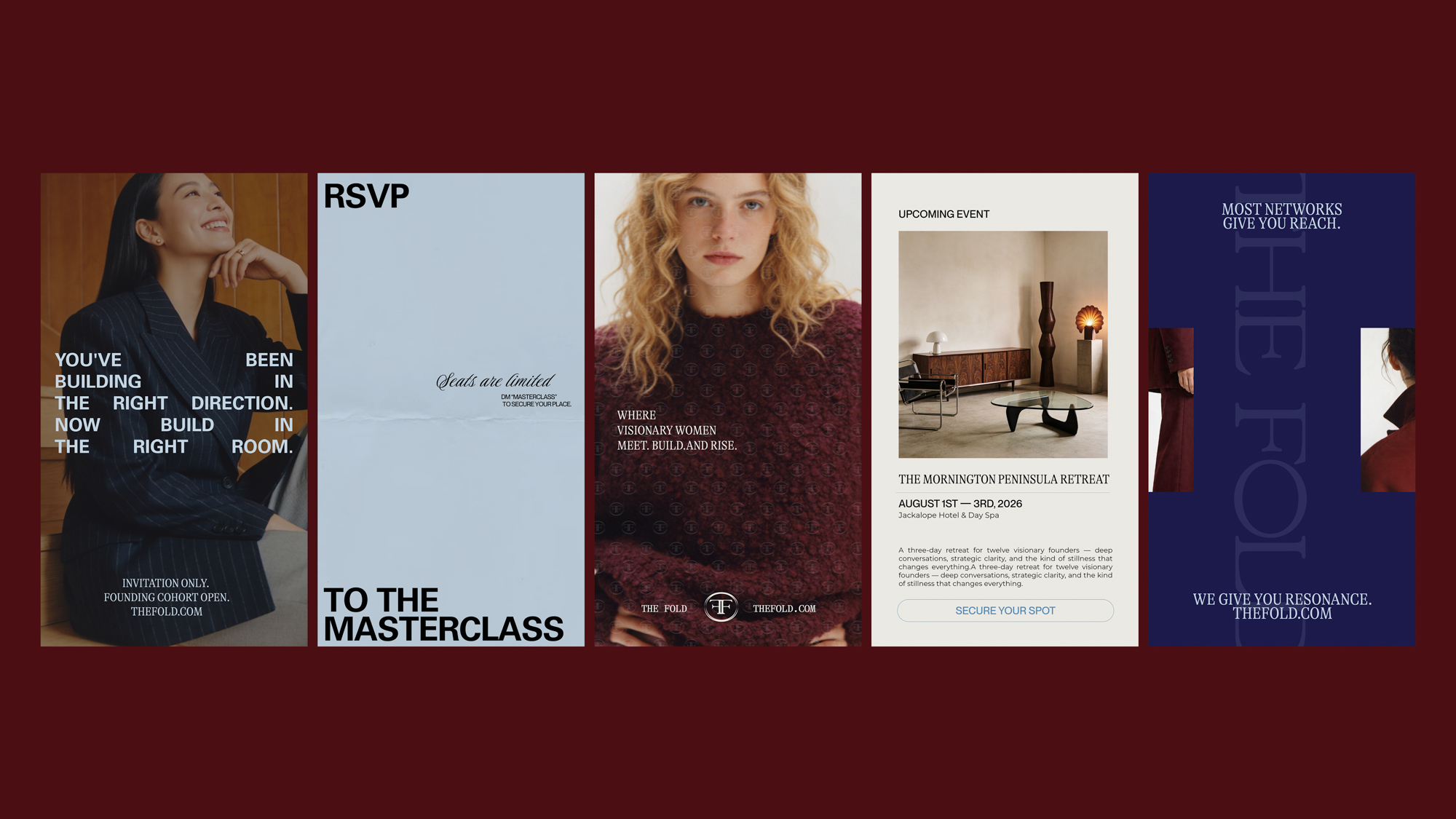
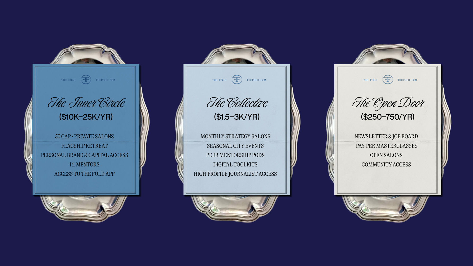
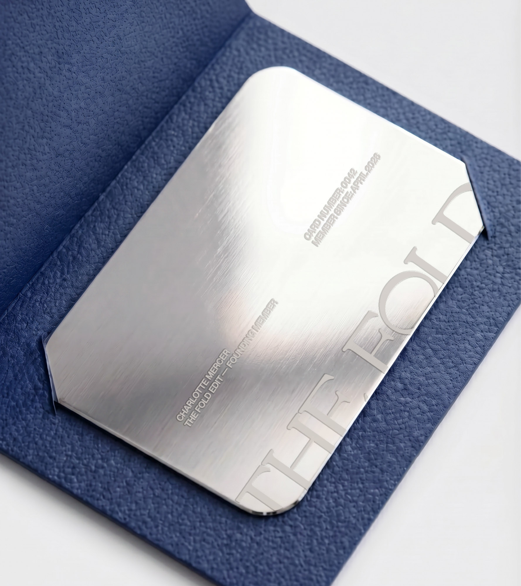
We anchored the identity in the idea of the inner circle, a visual and conceptual expression of being “inside.”
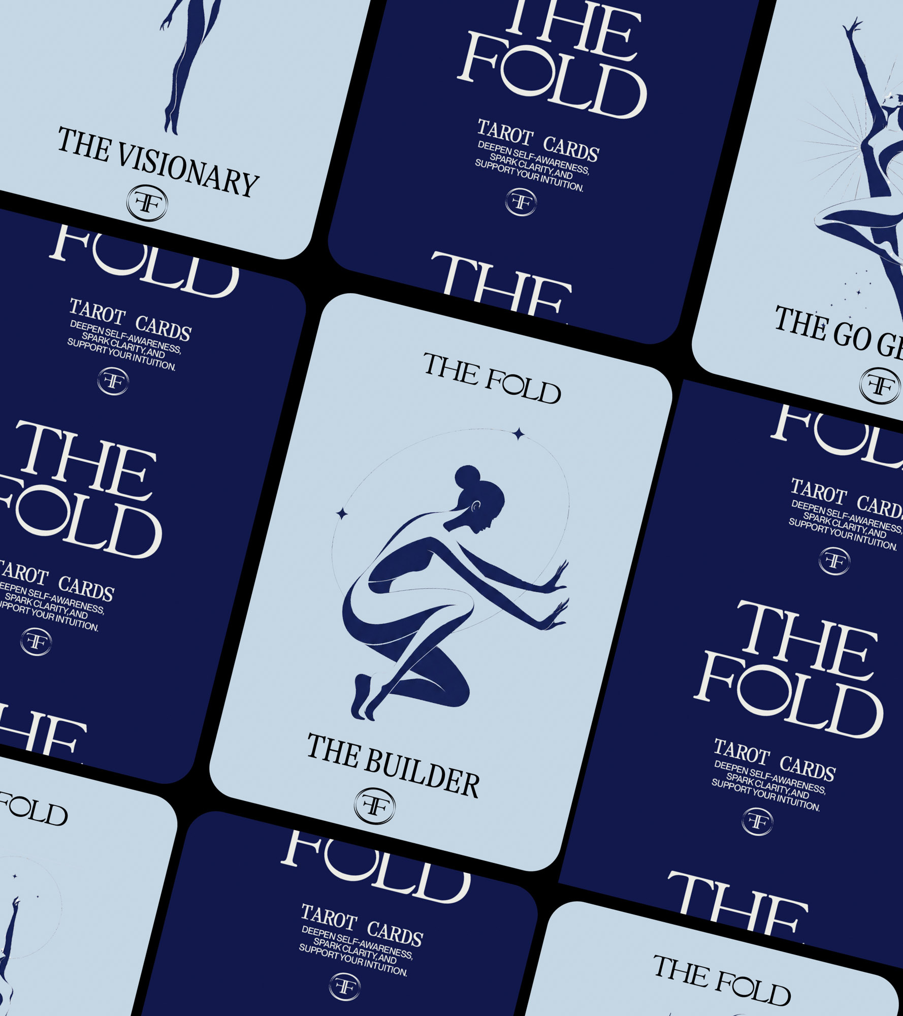
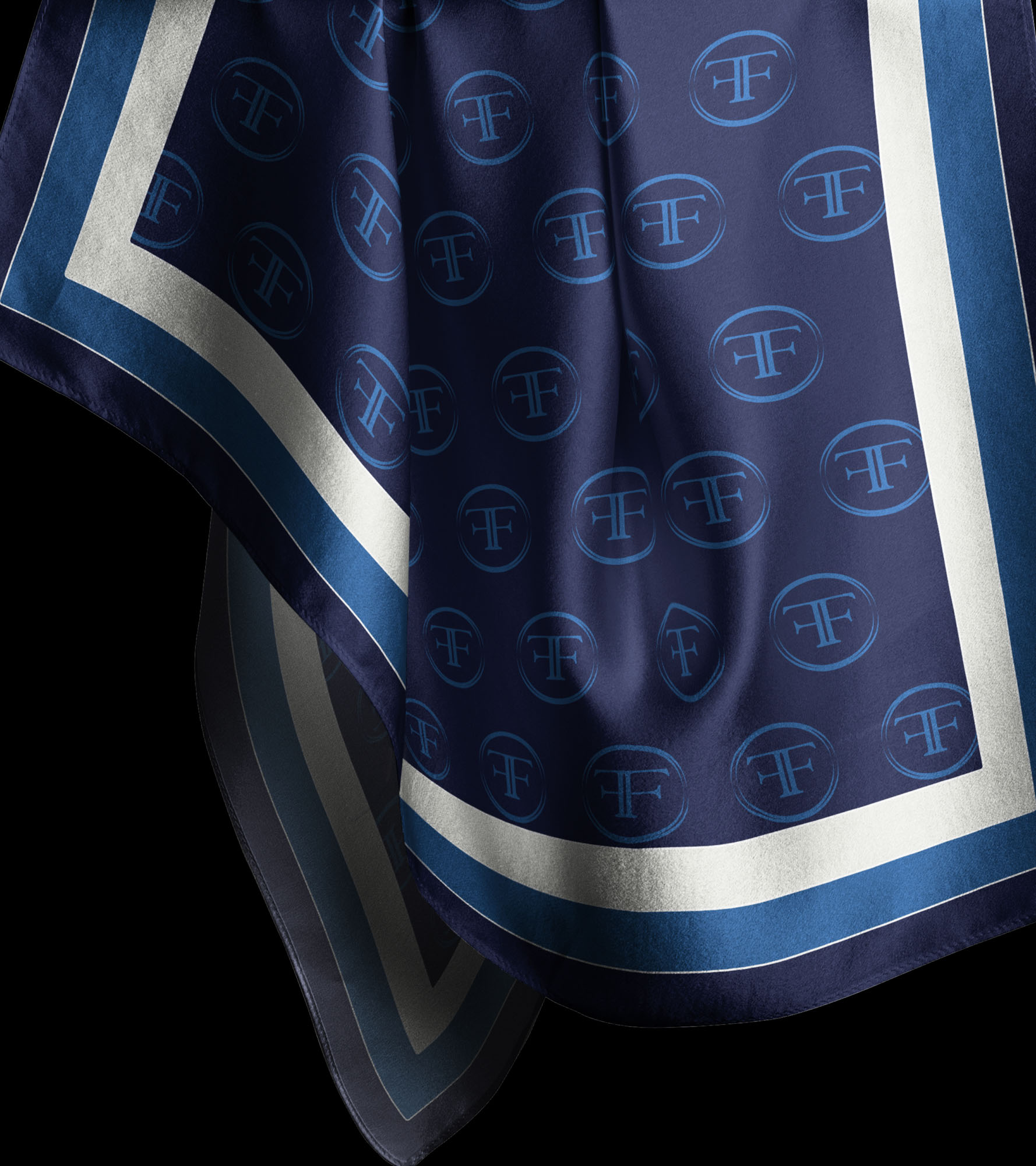
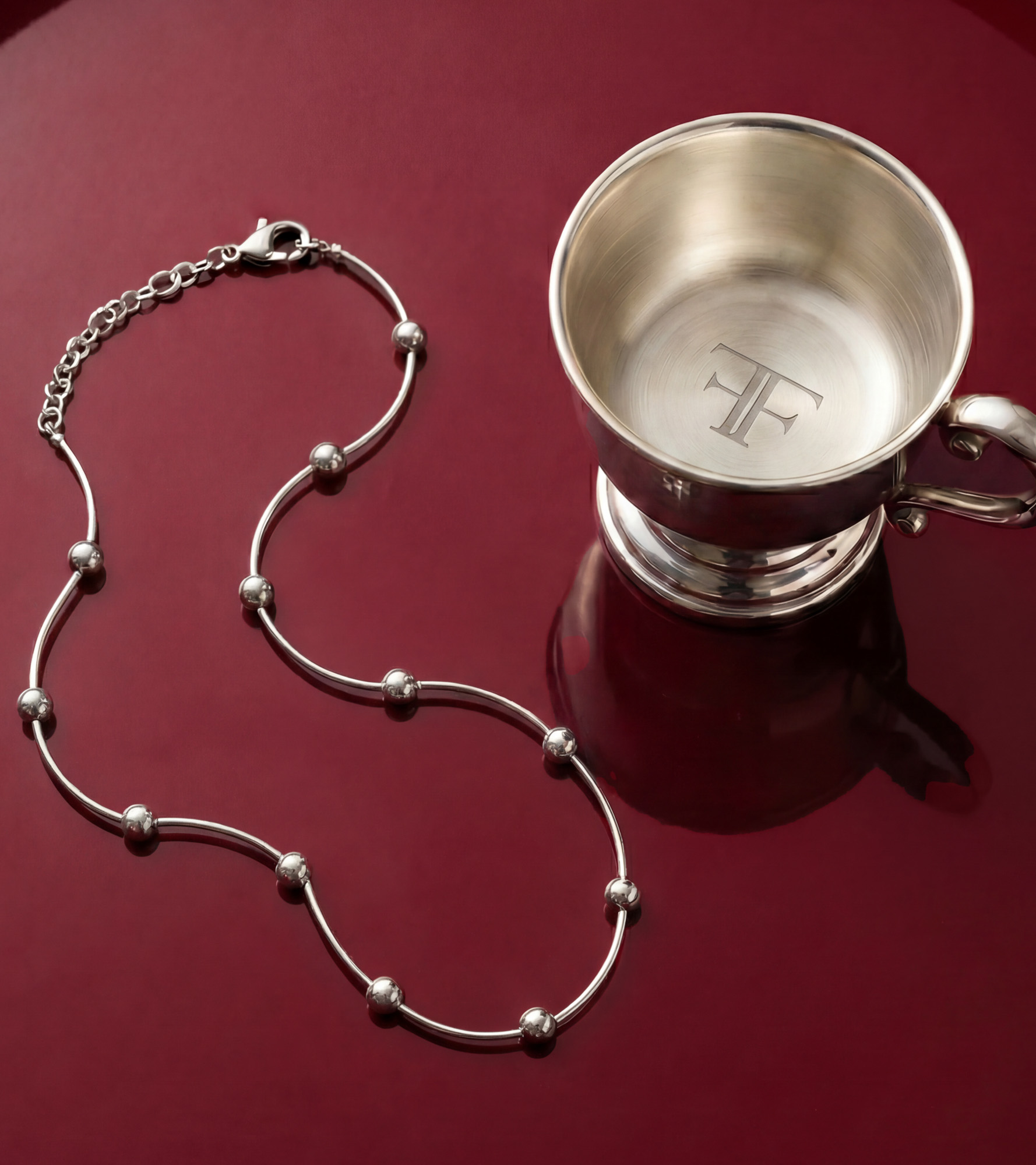
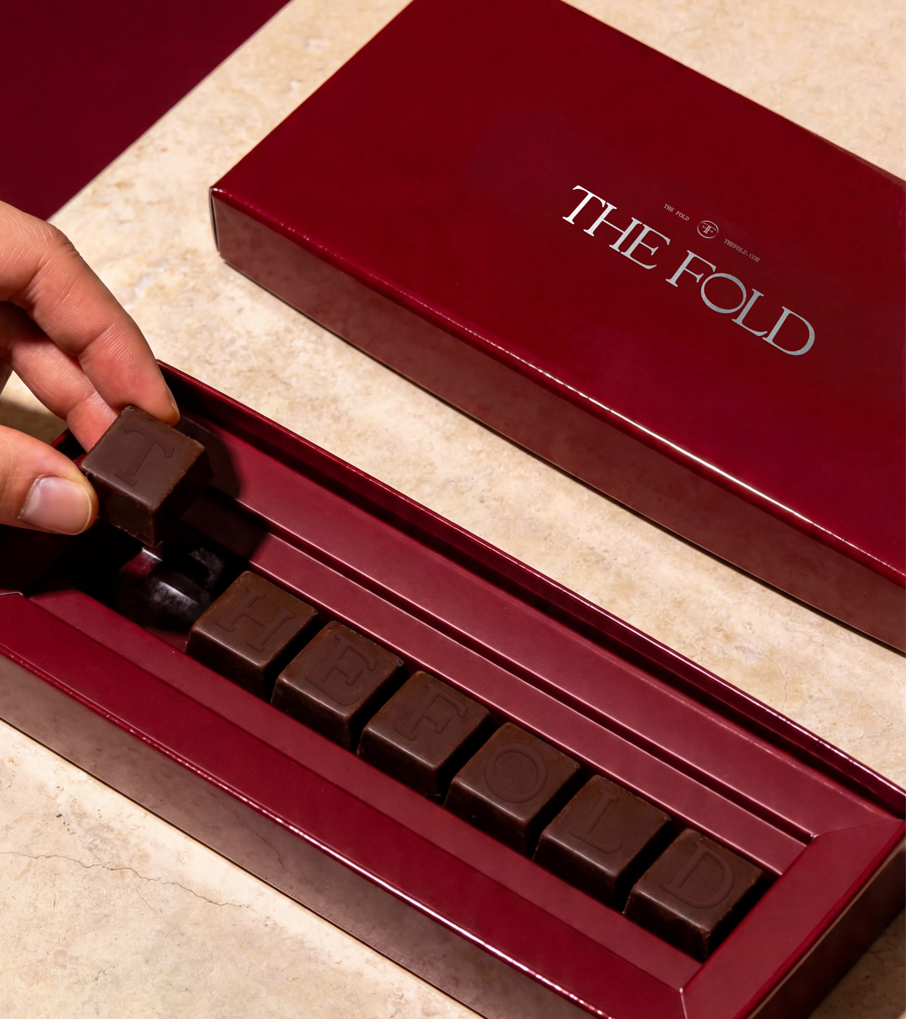
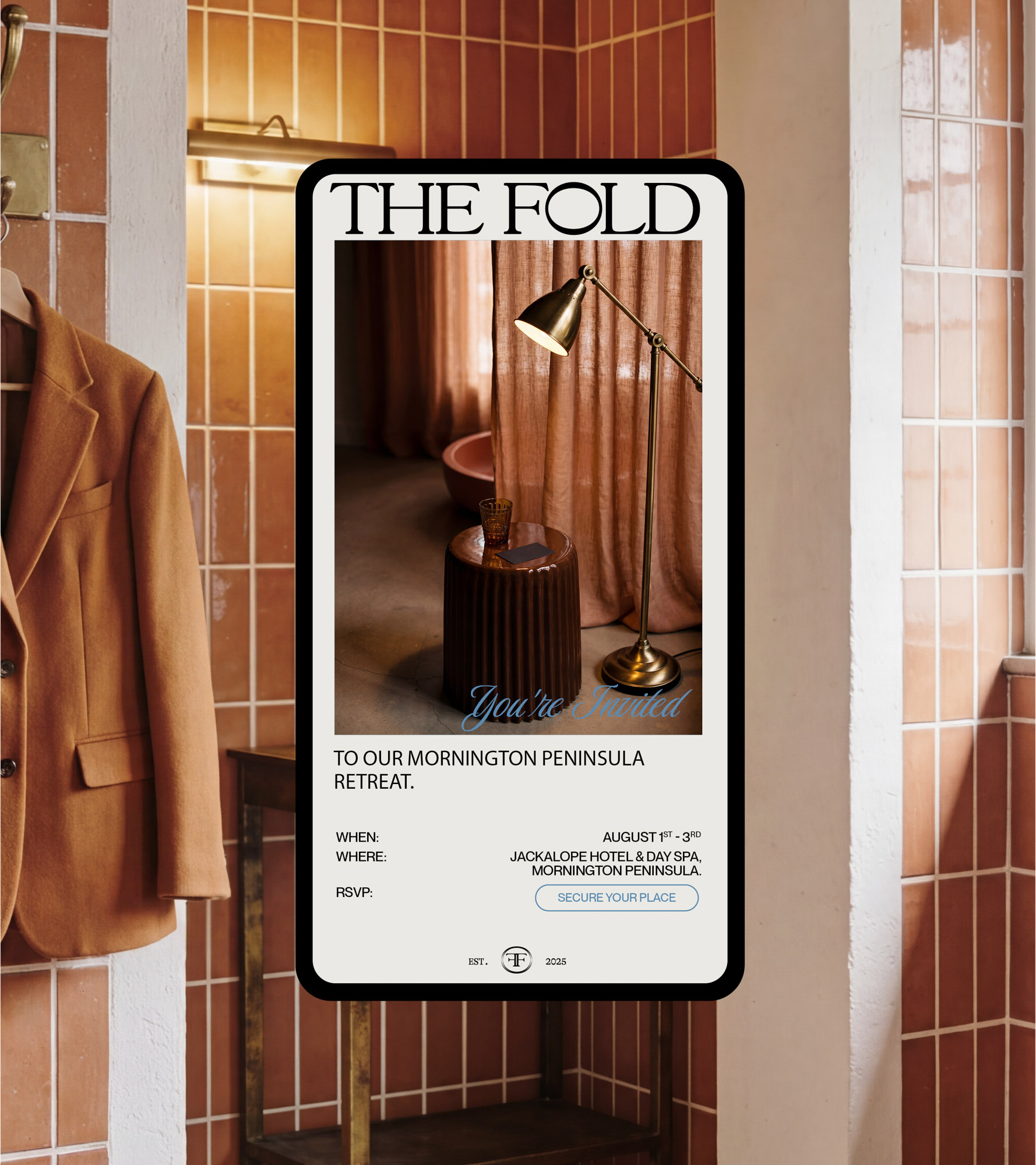
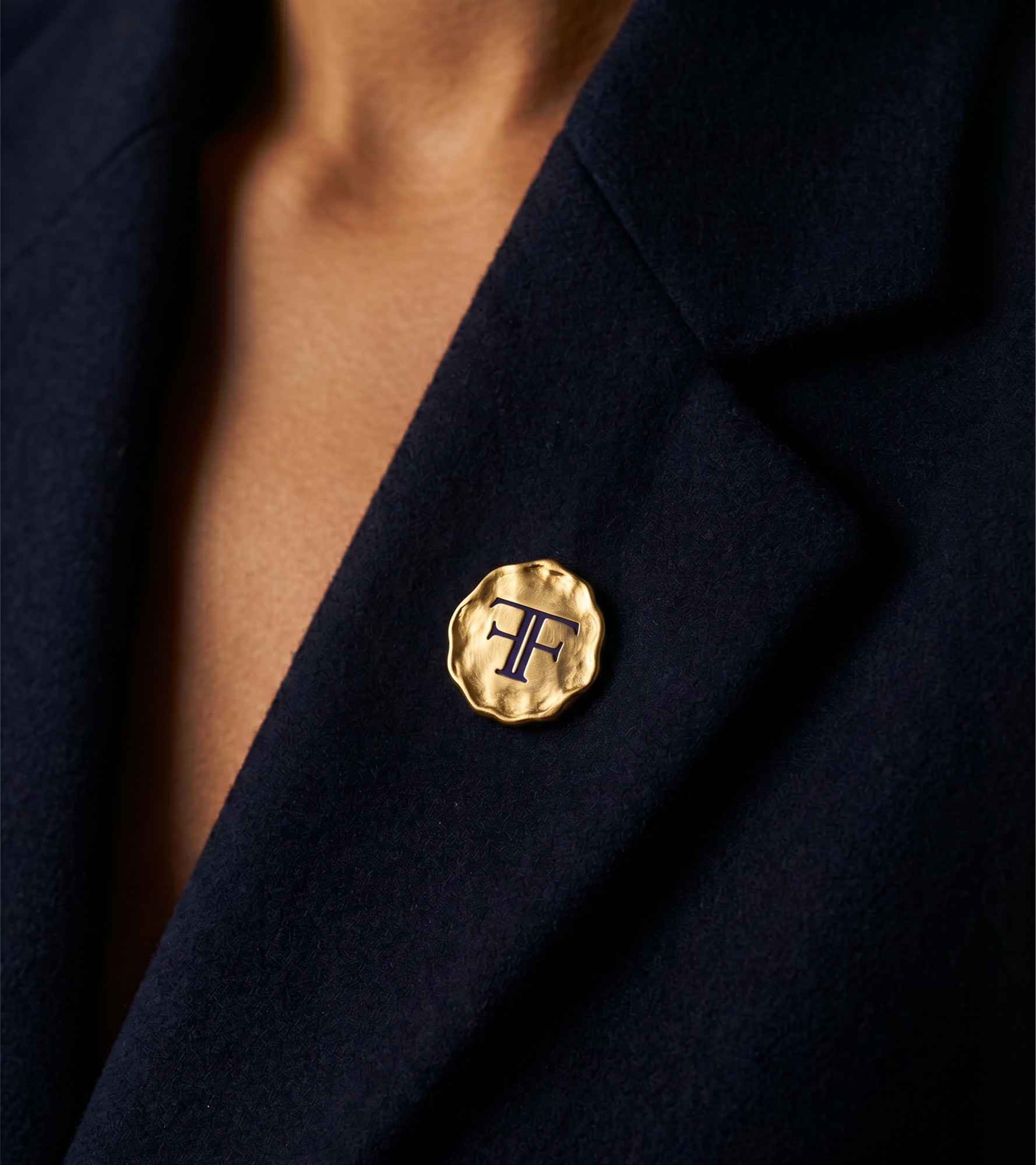
At the centre sits a refined logotype, built from a modern interpretation of a classic typeface. Elegant, composed, and quietly confident. The hero mark: a bespoke ‘O’ formed from two intersecting ovals, becomes the defining brand device. Delicate yet structured, it symbolises entry into the circle, a place of connection, alignment, and shared intelligence
This shape extends into a monogram, layering heritage with modernity, and reinforcing the idea of a system that holds meaning beneath the surface.
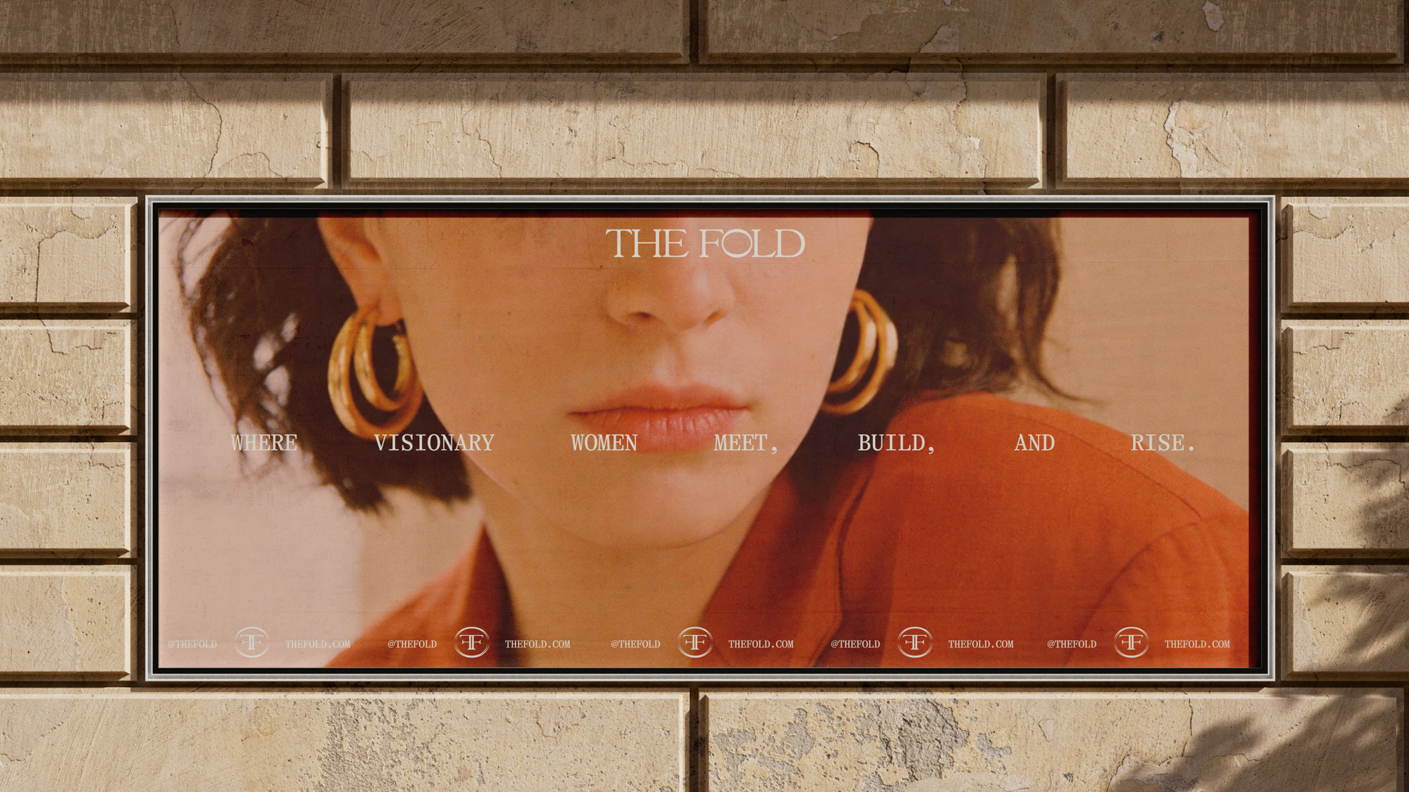
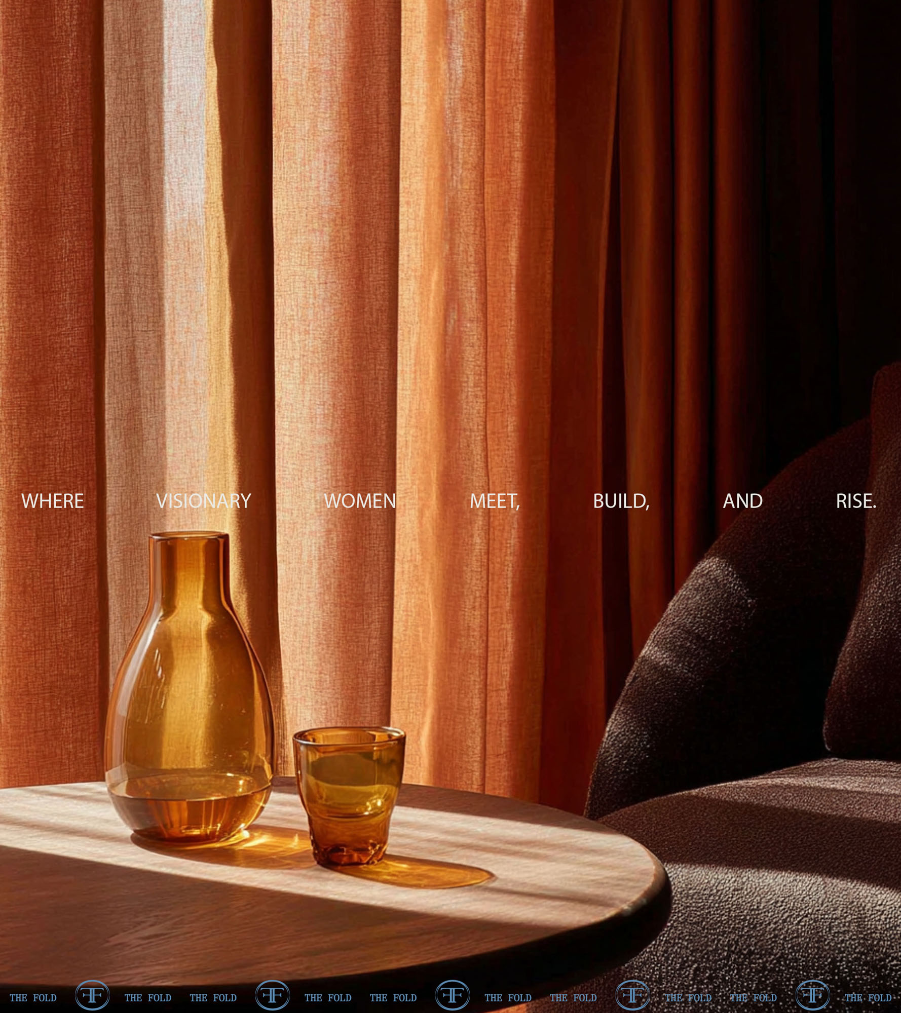
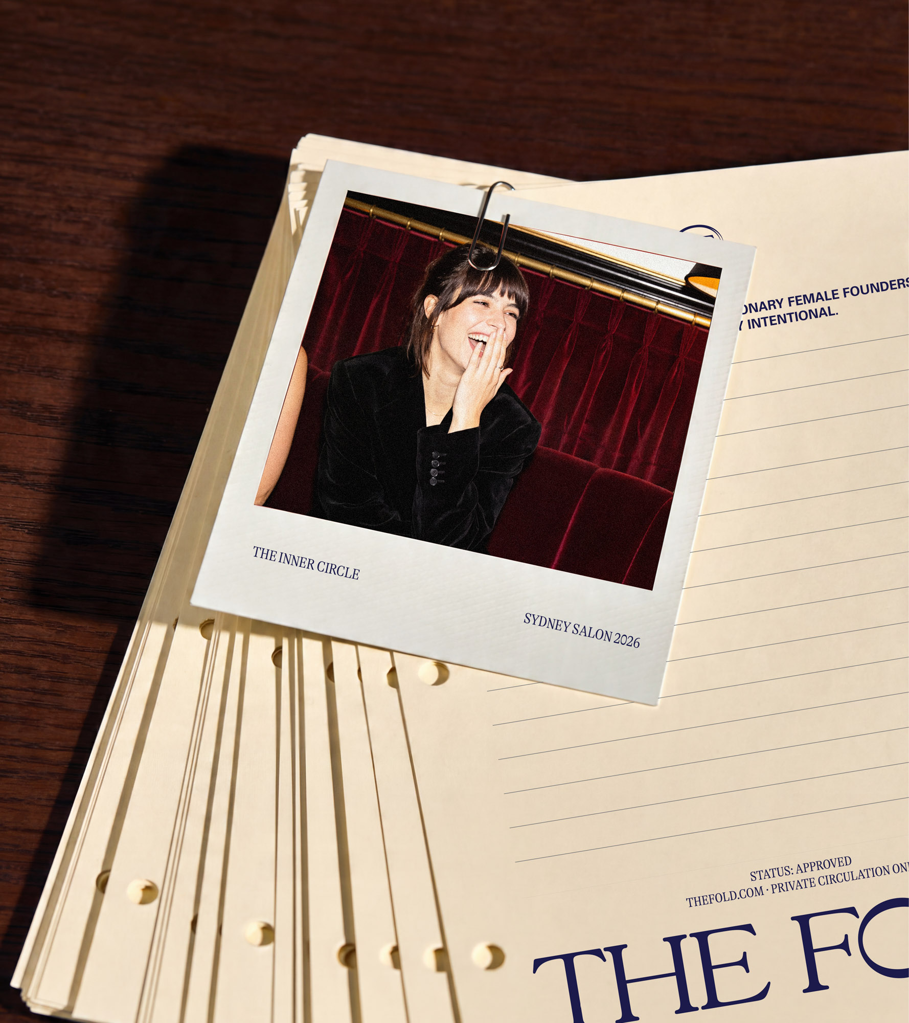
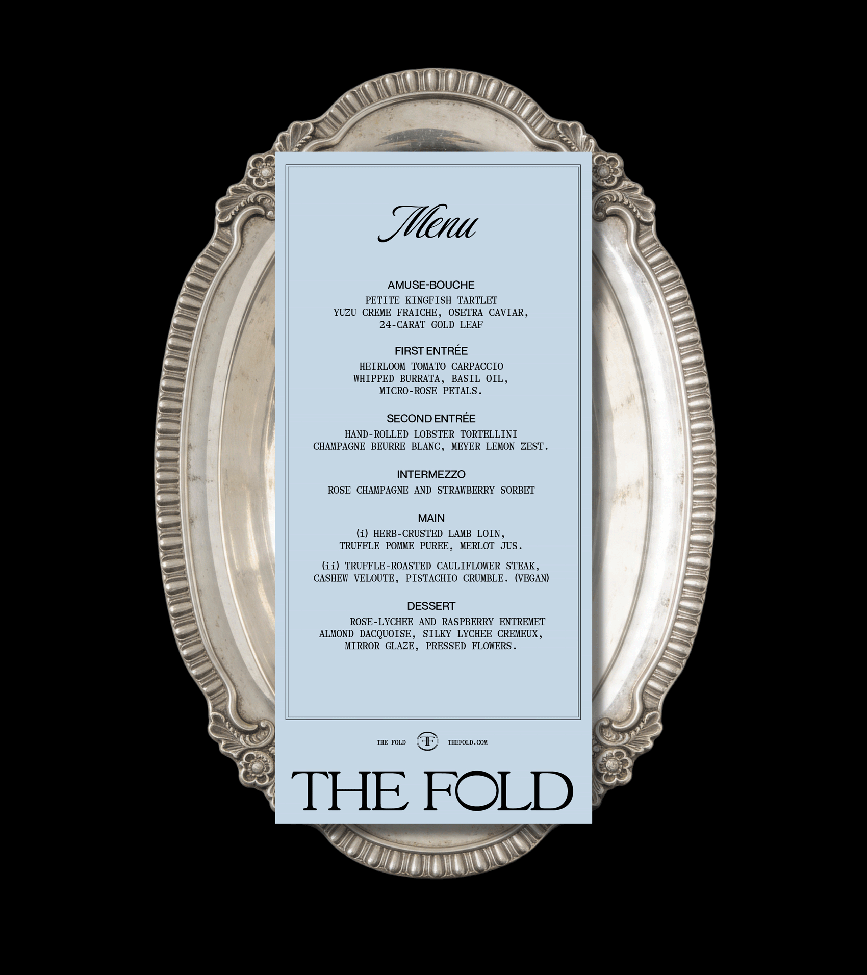
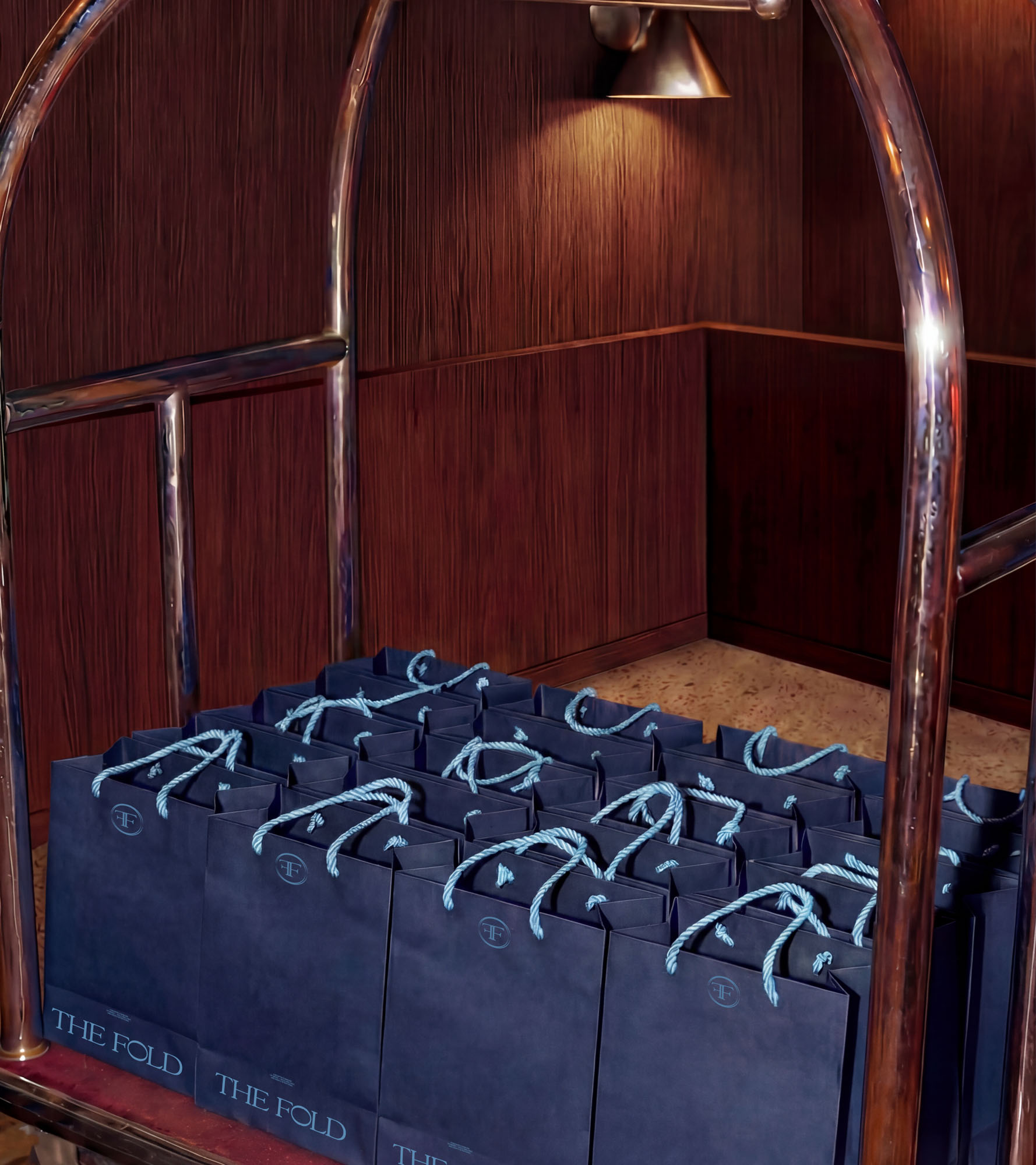
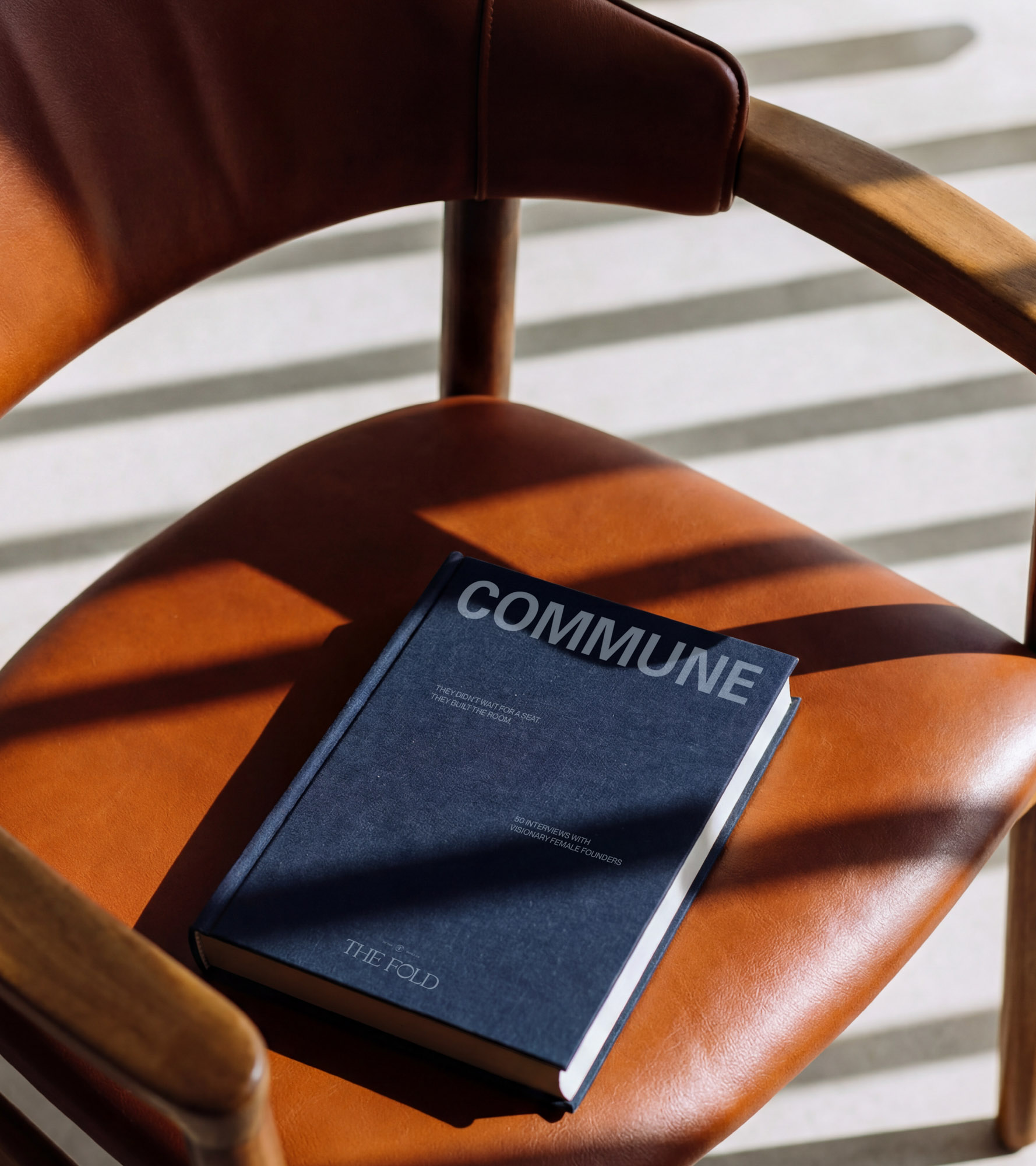
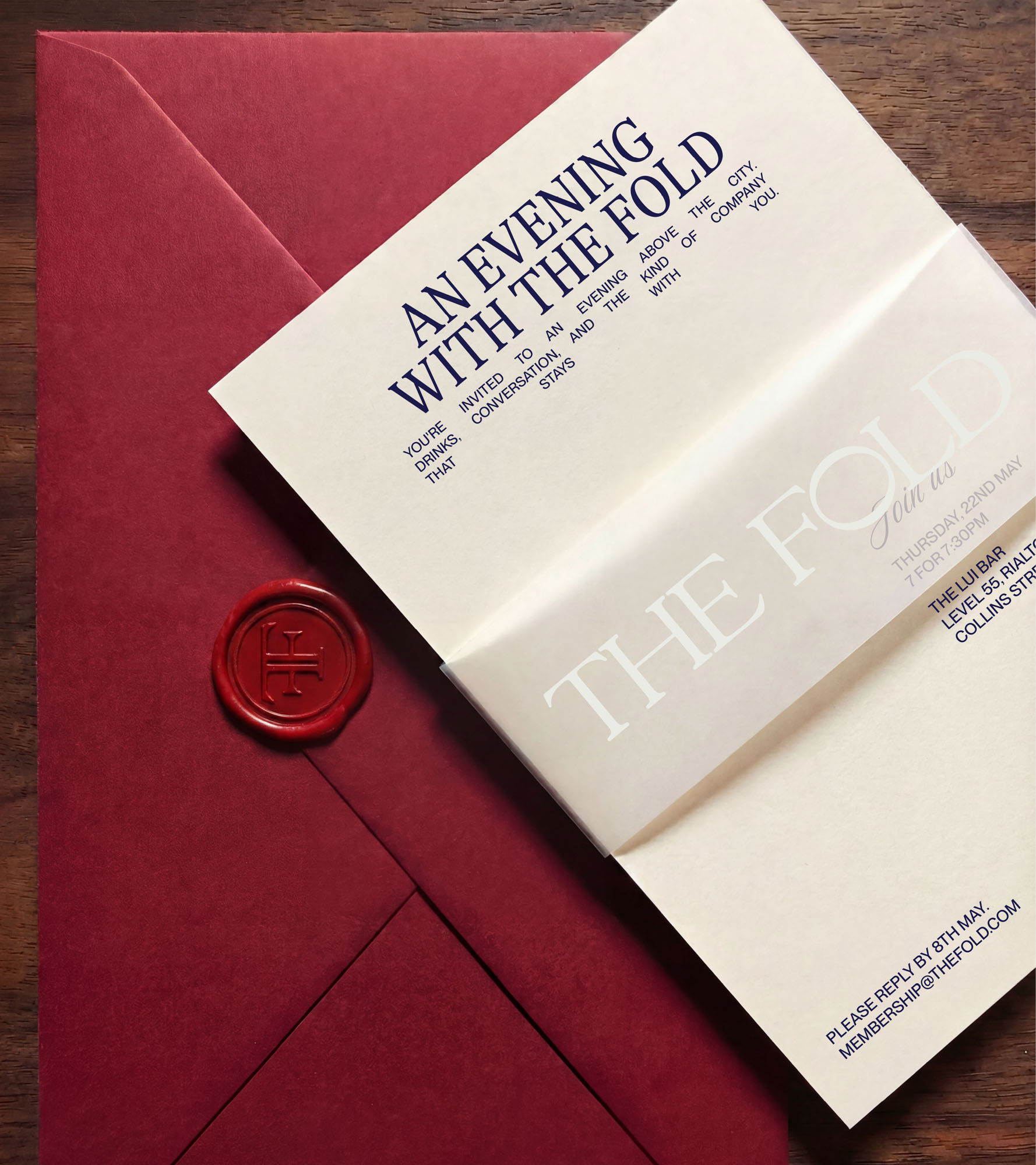
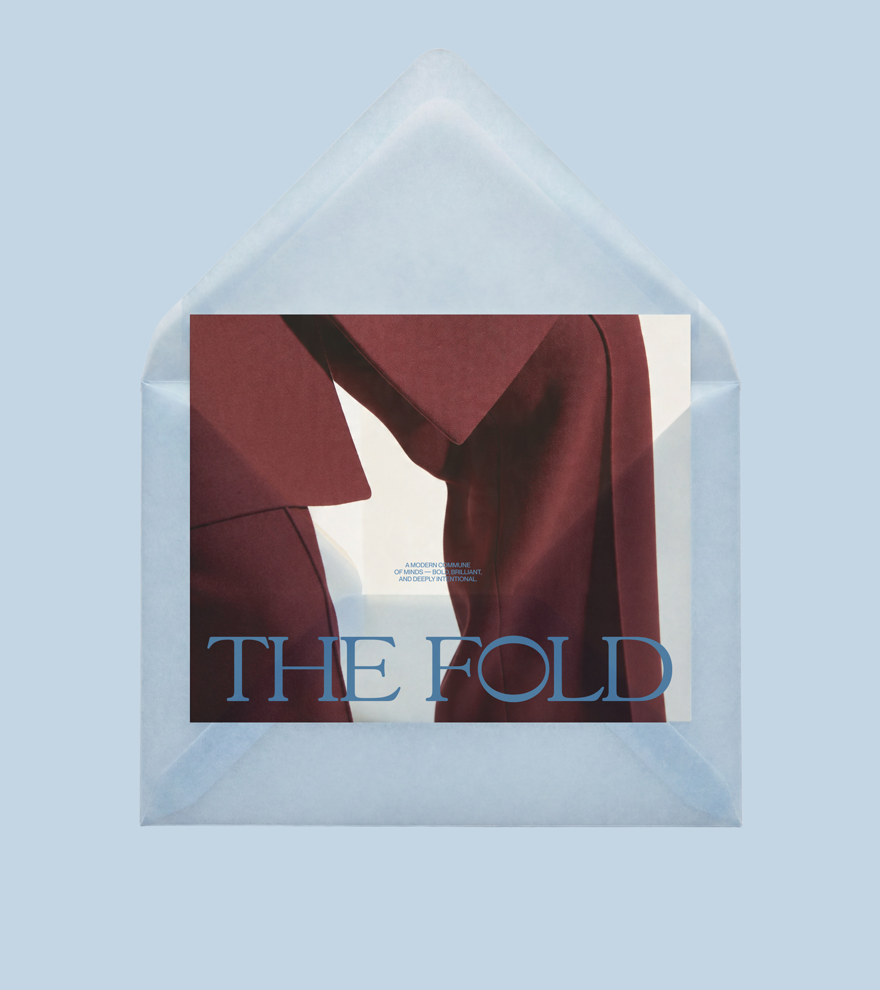
The broader visual language plays with layers, depth, and tactility, rich tones, sculptural compositions, and editorial framing that feel closer to a members’ club or a cultural institution than a typical startup. A palette of deep blues, black, and cream is warmed with emotive imagery, striking a balance between restraint and richness.
The result is a brand that feels both timeless and forward-thinking, a quiet signal to those who recognise it.
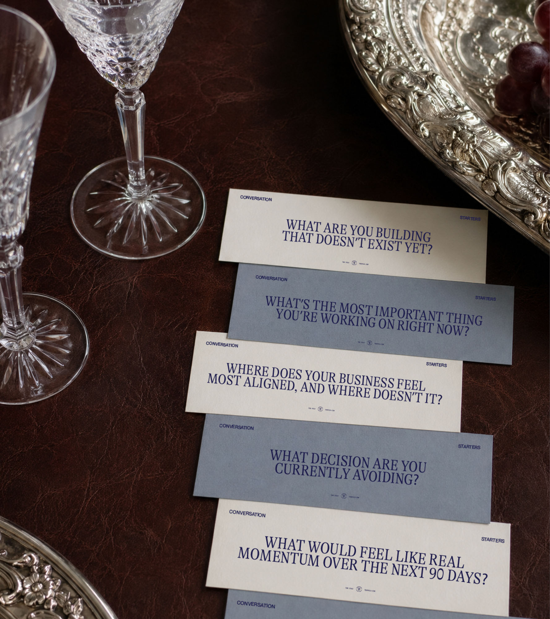
The Fold’s voice is poised, precise, and deeply human. It doesn’t try to impress, it understands. It speaks with clarity, not clutter. With conviction, not volume.
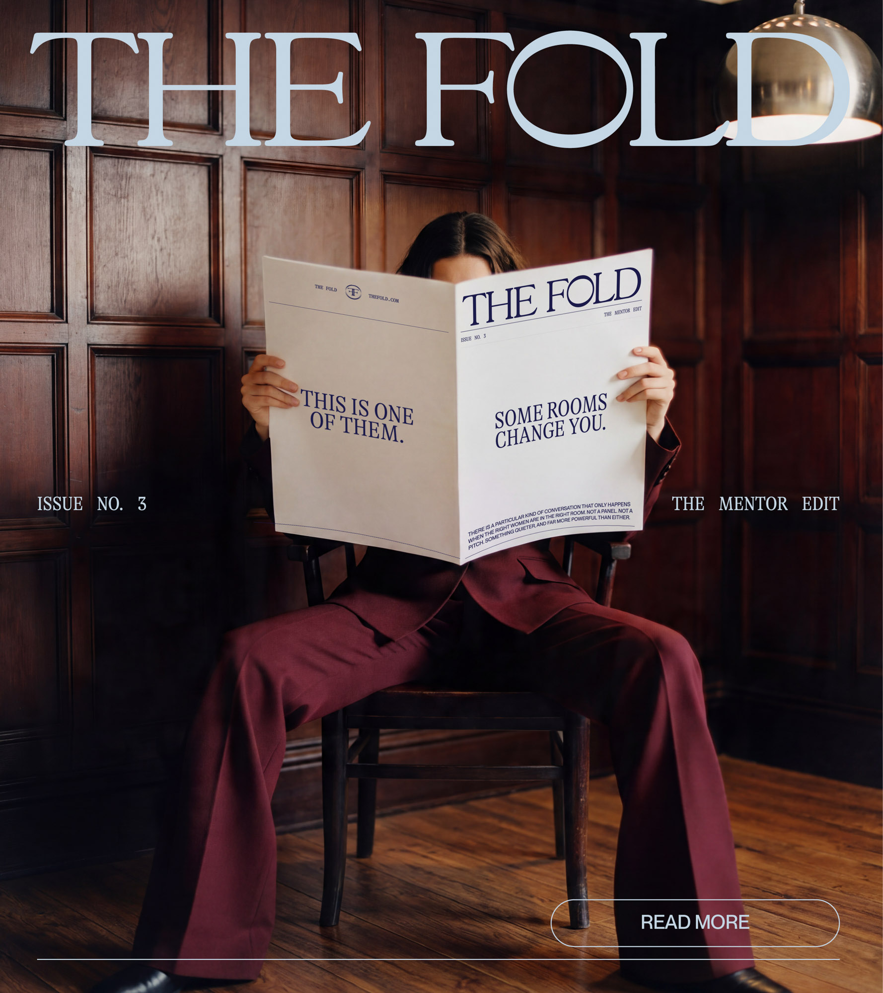
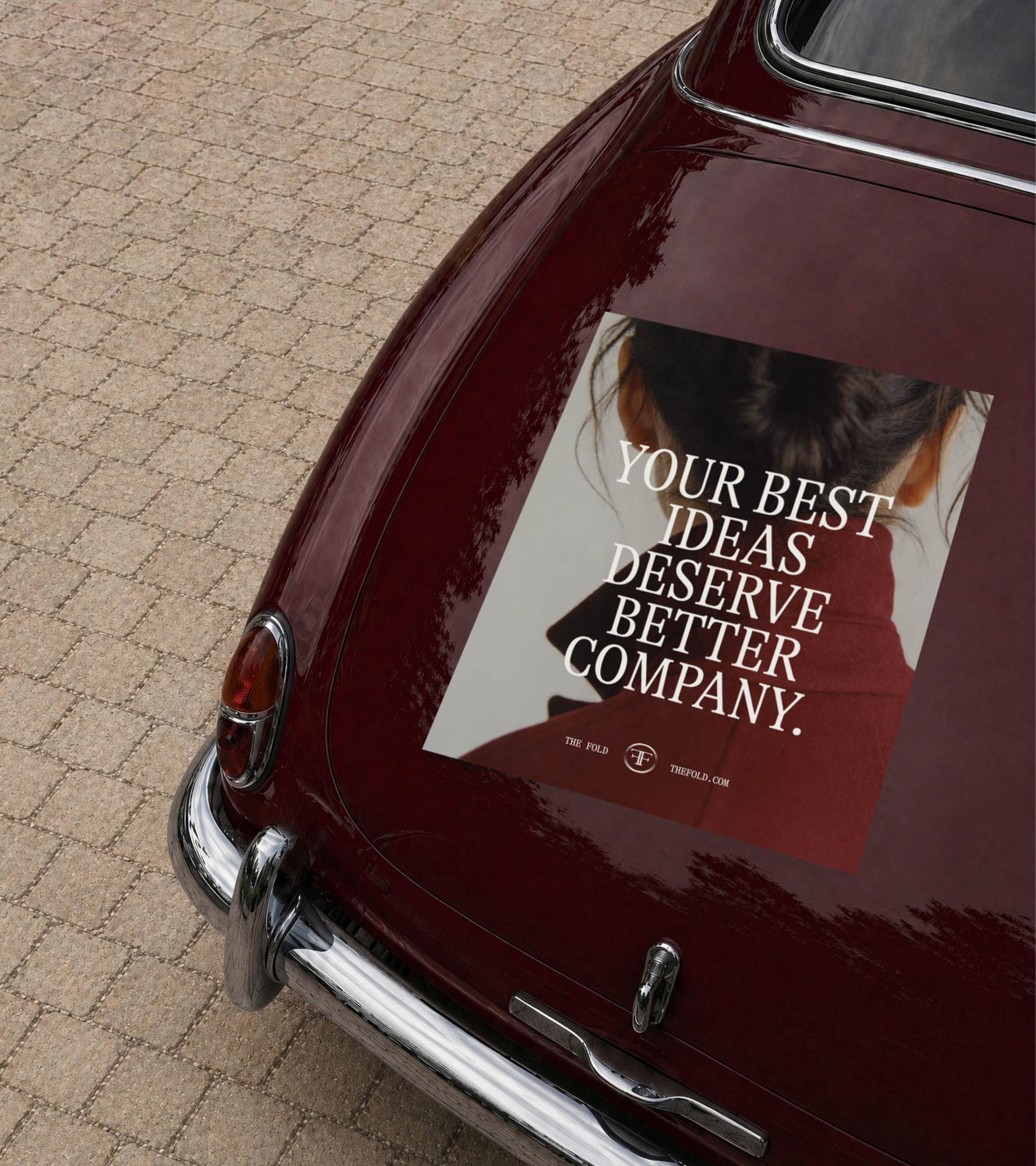
We built a language system that reflects the intelligence of its audience. Lines like “Your best ideas deserve better company” and “Proximity is strategy” don’t over-explain, they land, and linger.
The tone sits at the intersection of editorial and intimate. Equal parts invitation and filter. It welcomes the right people in, while making it clear this isn’t for everyone.
Because in a world of endless access, discernment is the new luxury, and The Fold speaks to that fluently.
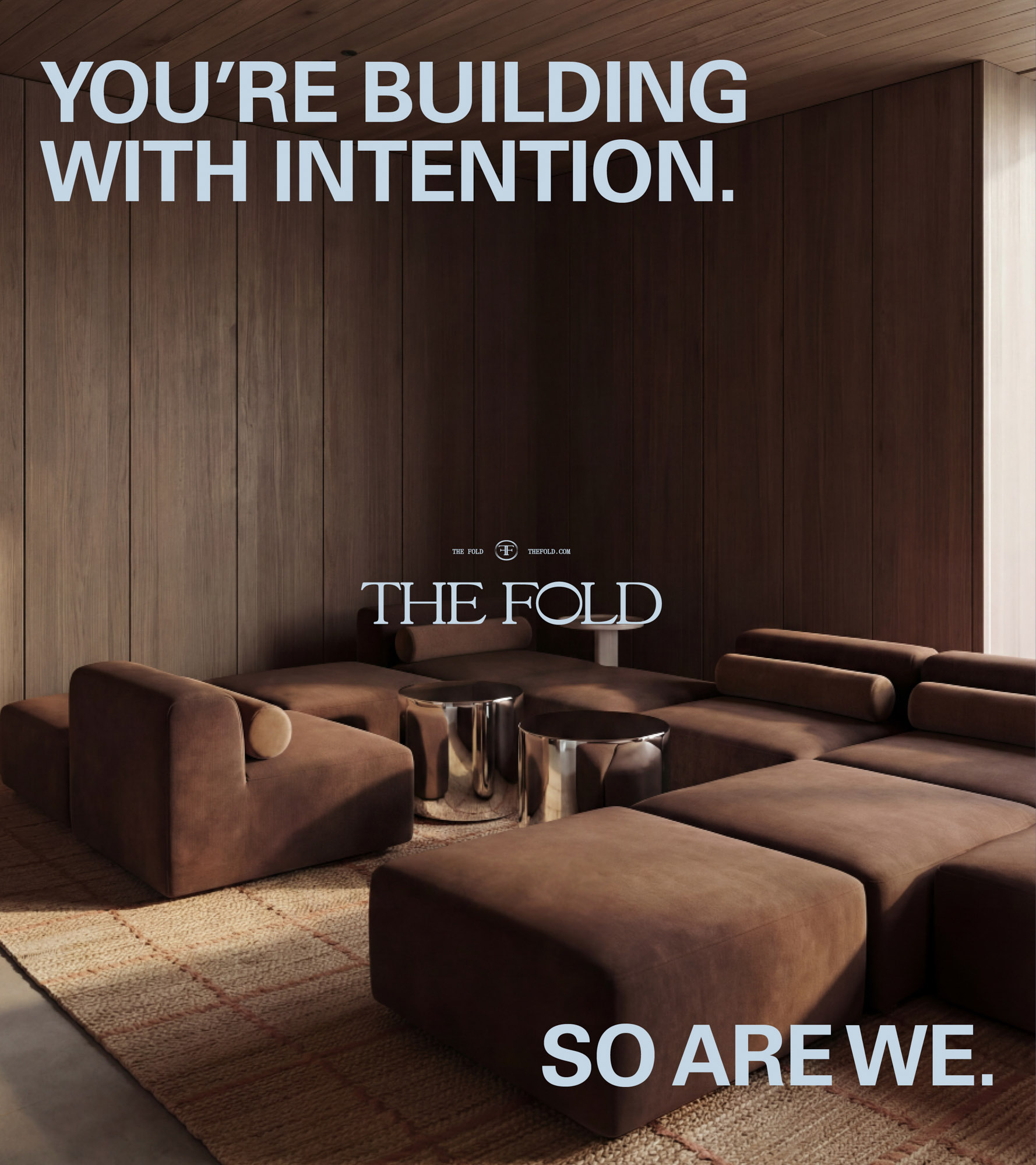
The result is a brand defined by quiet magnetism, drawing the right people in with precision and intent.
The Fold redefines what a founder network can be. Not a platform for visibility, but a space for velocity. It transforms connection into something more deliberate. More intelligent. More powerful. A place where ideas stretch, standards rise, and the future is built, quietly, collectively, and with intent.
© 2026 Smack Bang


We pay respect to the Traditional Custodians and First Peoples of NSW, and acknowledge their continued connection to their country and culture.