

We pay respect to the Traditional Custodians and First Peoples of NSW, and acknowledge their continued connection to their country and culture.
Phantm
- Share


As it stands, our recycling system is broken. A huge amount of what are meant to be recyclable products continue to end up in landfill. We’re in a waste crisis. Single-use plastics are amongst the most problematic and widespread of materials and in order to move away from them, we need two things; behavioural adjustment and healthier, alternative materials.
Enter Phantm, an Australian start-up working to help build a circular economy through the development of novel materials. Through the use of microbial-based biopolymer technology, they have found a groundbreaking way to replace single-use plastics and address some of the challenges presented by food waste, pollution and climate change.
Phantm’s technology converts organic waste into a natural material that is fully recyclable, can be composted in soil and biodegrades in ocean environments. The first enterprise of its kind in Australia, Phantm is merging commercial viability with sustainable vision and needed to back this with a strong, planet-positive brand.
2021 AGDA Brand + Identity Merit Award Winner.
2021 AGDA Design for Good Finalist.
2022 Indigo Awards Silver Winner.


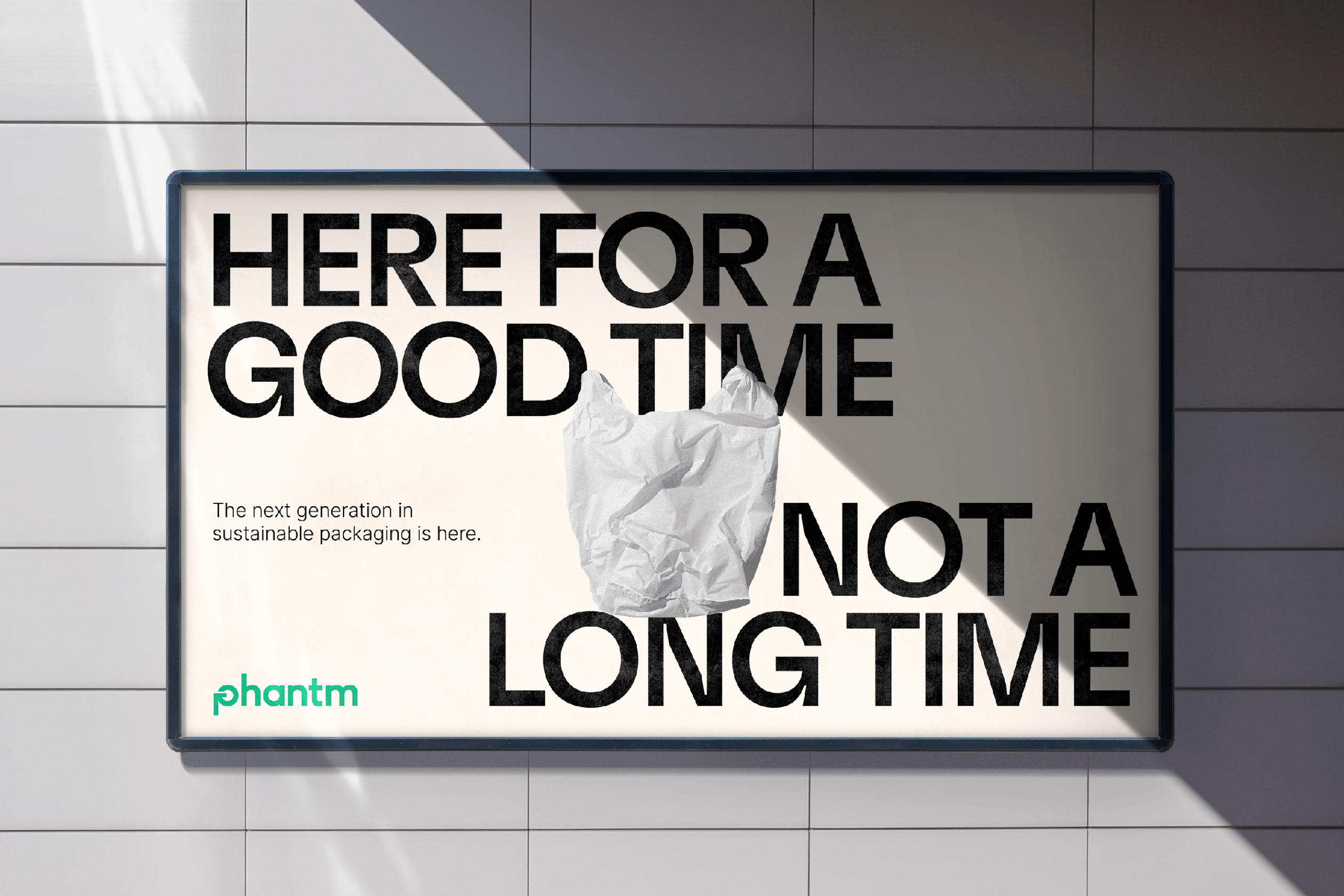
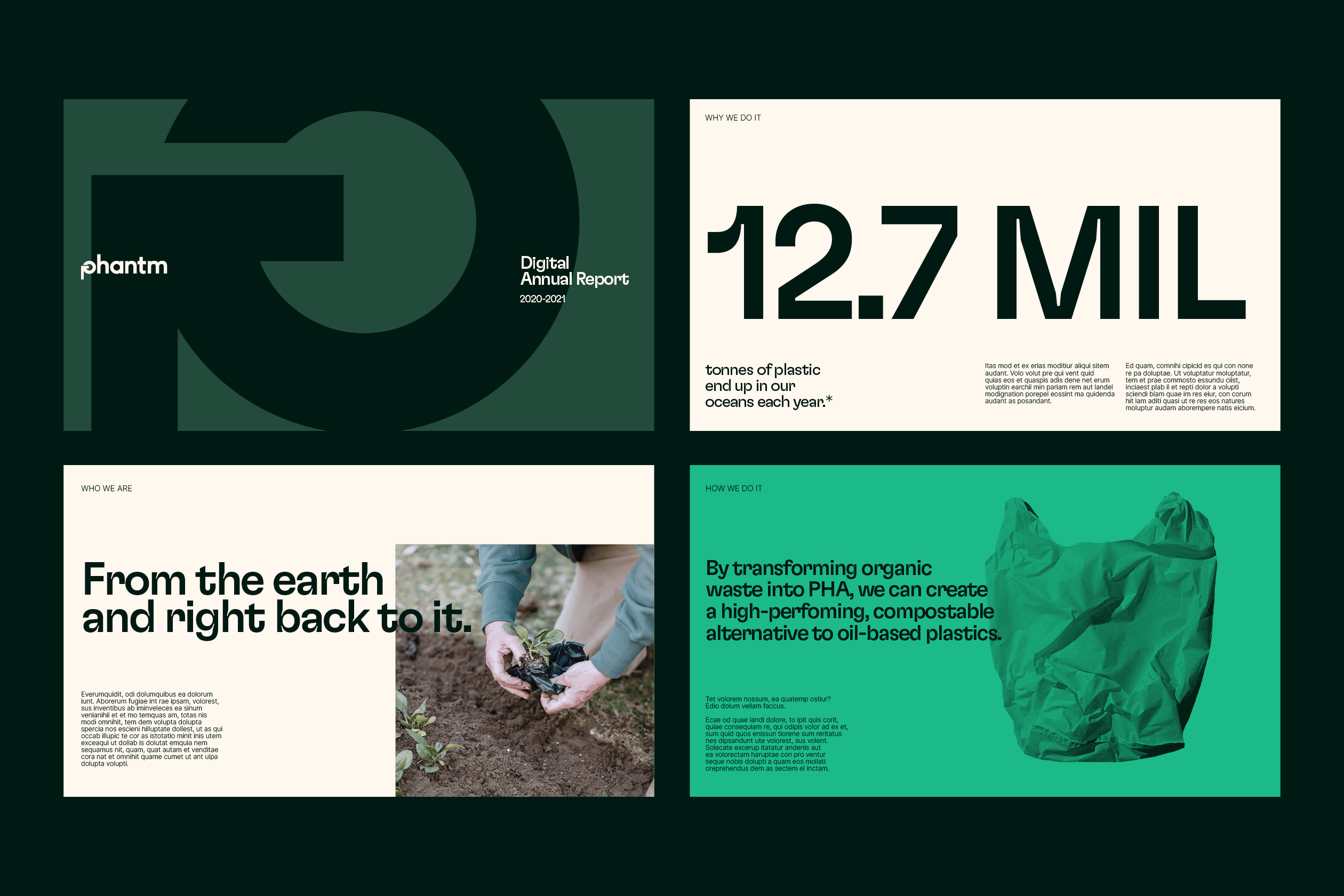
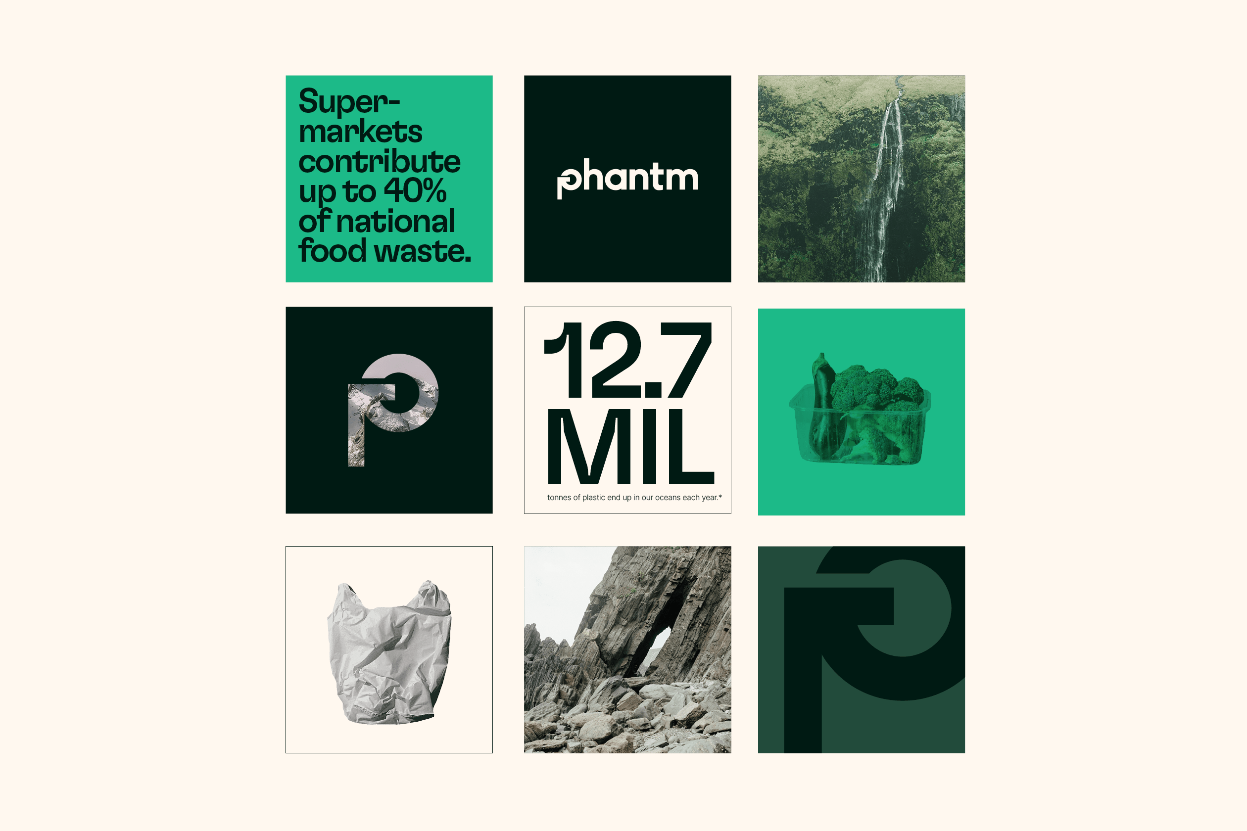
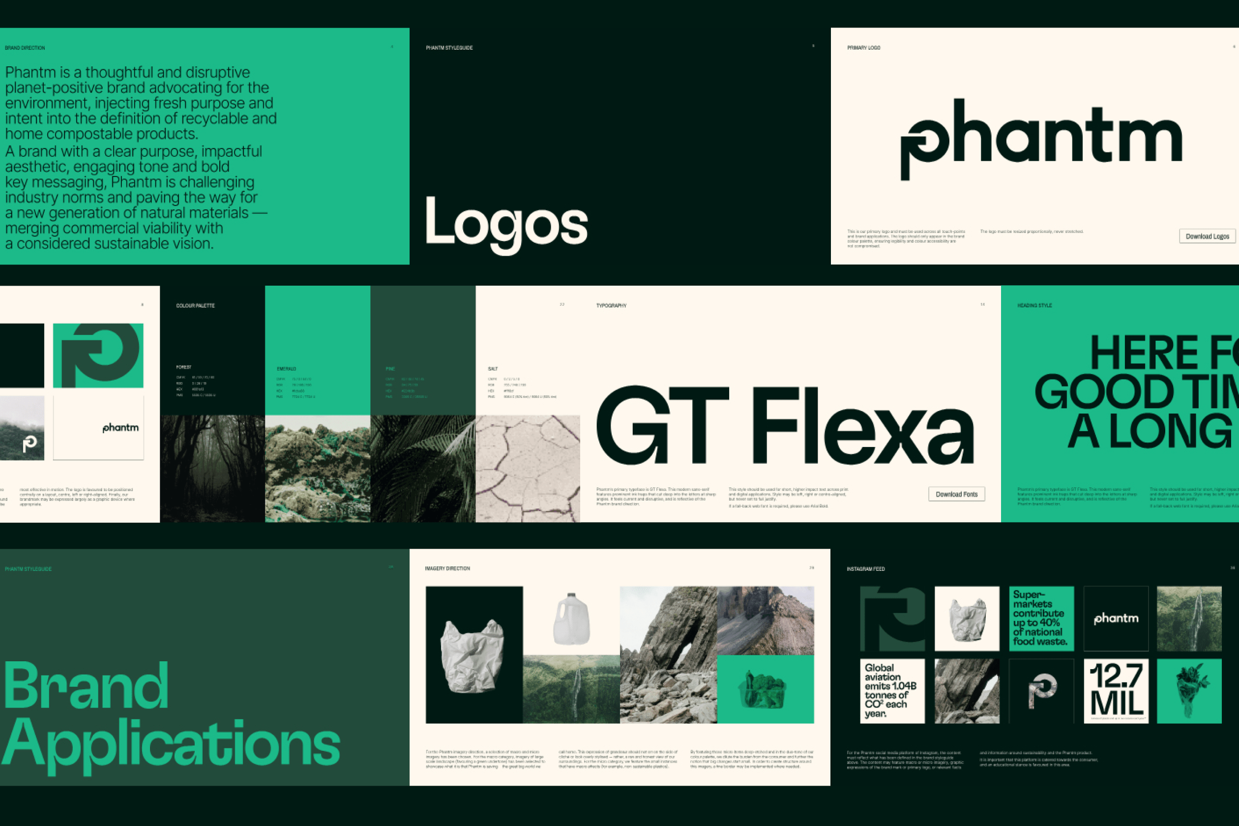
As their brand builders, we were tasked to build a brand identity that embodied their innovative approach and audacious vision. As such, it was imperative for our team to design something powerful and distinct. A modern colour palette of deep greens and salt was chosen to indicate their work with natural materials, whilst prominent accents position them as pioneers of the climate-change revolution.
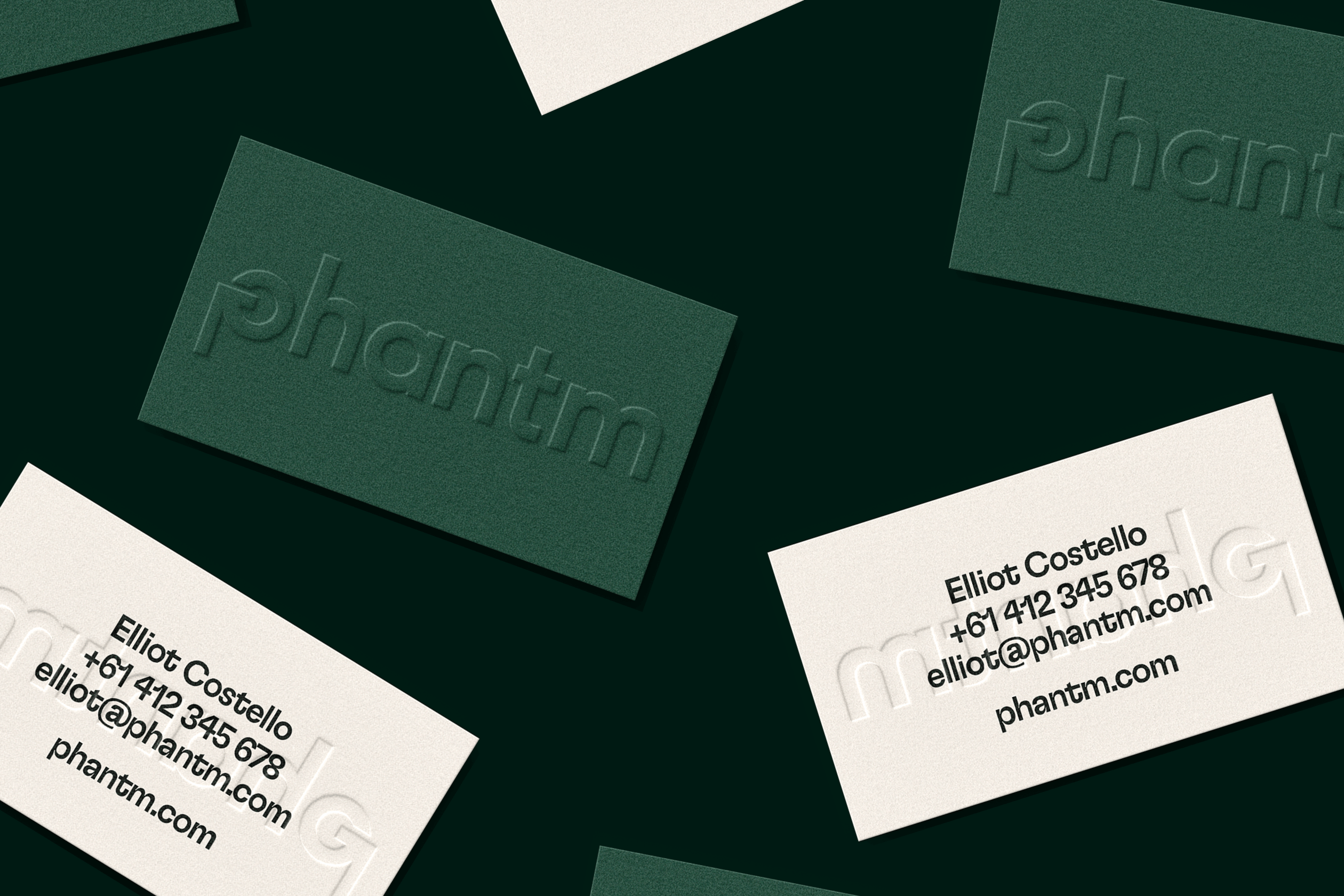
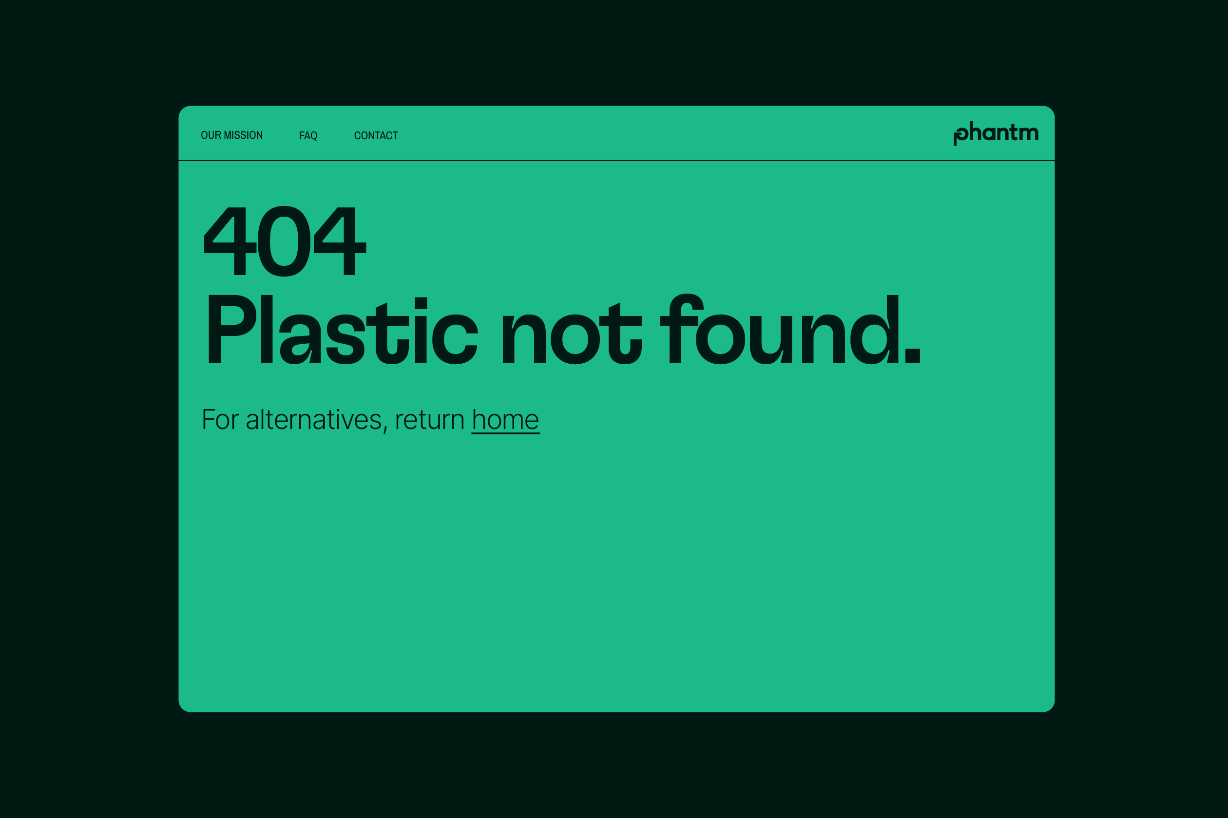
Bold and iconic, Phantm’s wordmark is a visual interpretation of the circular economy. The mark is representative of a ‘P’ and recreates the traditional recycling icon with added momentum and contemporary relevance.
Phantm’s finished identity is intelligent and forward-thinking. A reflection of their considered vision, it feels just like the kind of brand we want to see leading the way towards a better, healthier future.
“Our company was blown away by the intimate, precious, and compelling work completed by Smack Bang.
Internally, it has been very well received and loved. Smack Bang’s contributed value to our business has been game-changing!”
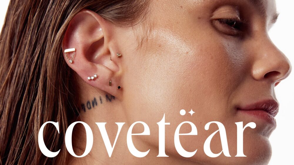
An unapologetic new take on adornment.
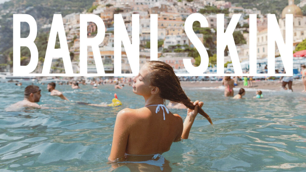
A story of sun-kissed skincare.
© 2026 Smack Bang


We pay respect to the Traditional Custodians and First Peoples of NSW, and acknowledge their continued connection to their country and culture.