

We pay respect to the Traditional Custodians and First Peoples of NSW, and acknowledge their continued connection to their country and culture.
Mister Zimi
- Share


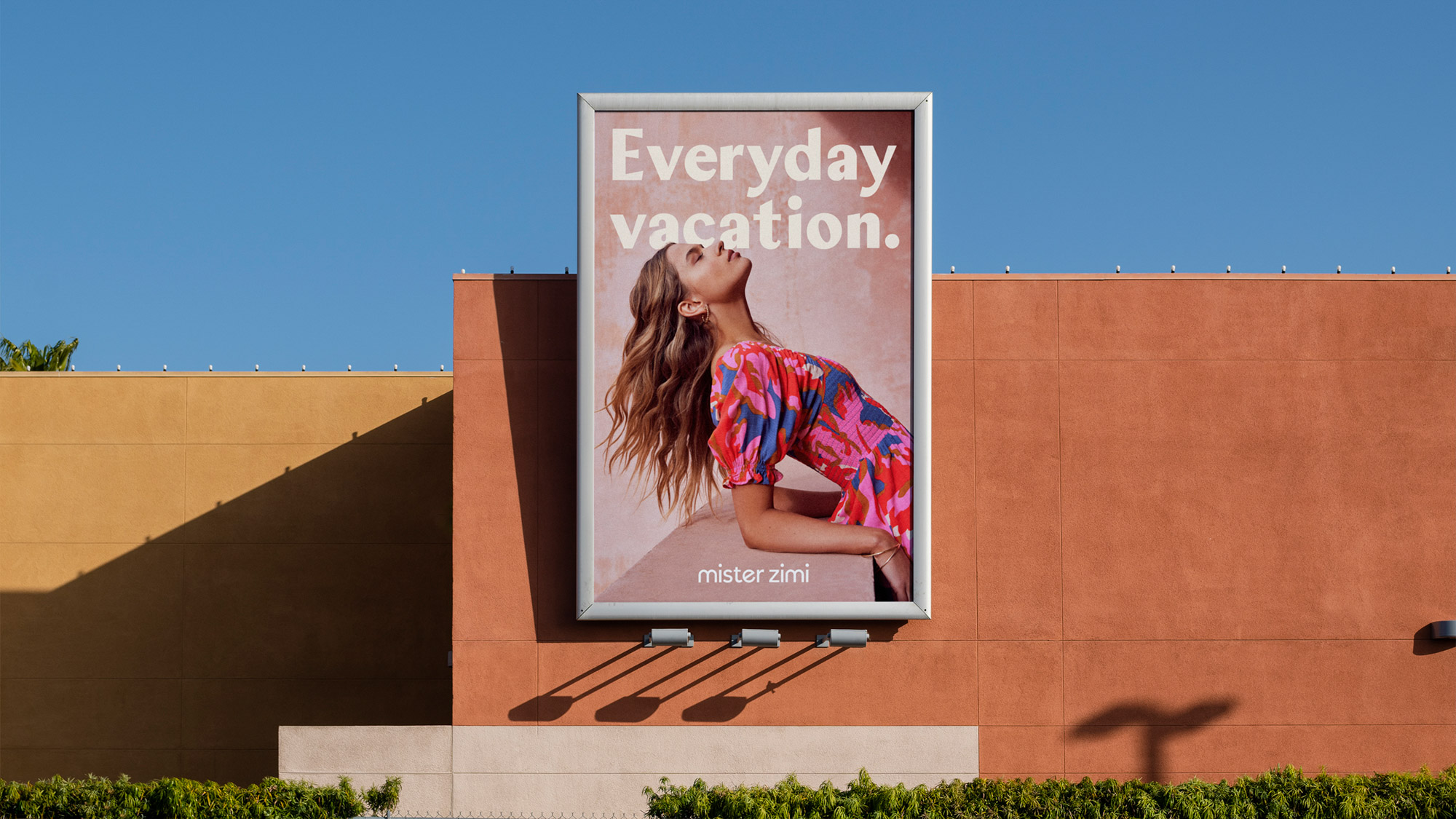
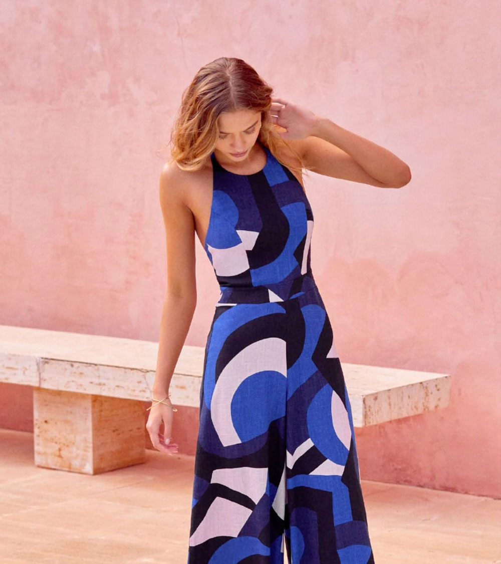
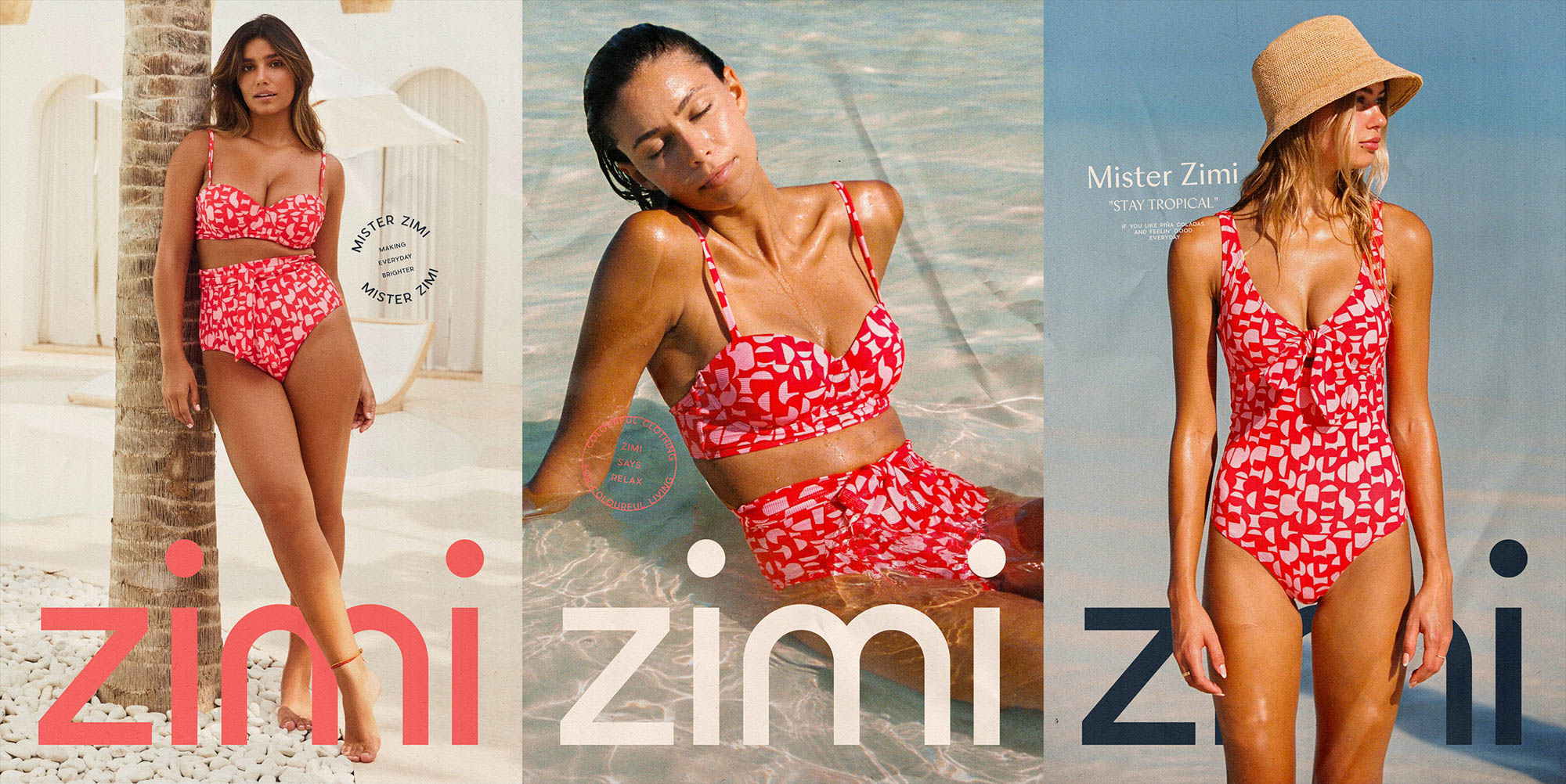
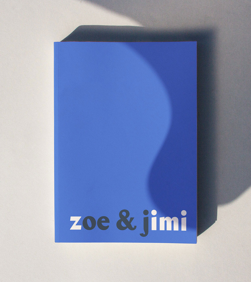
Meet Mister Zimi, an Australian fashion and lifestyle brand with an inherently distinct flair for colour, pattern and design. Born in the tropics and currently residing in Byron Bay, Mister Zimi is run by husband and wife duo Jimi and Zoe Paul as they arm their customers with resortwear that inspires confidence, individuality and year-round summer vibes. Reminiscent of that carefree Australian attitude and a time where things were a little more simple, Mister Zimi designs collections that transcend trends or seasons and radiate that sunny summer attitude all year round.
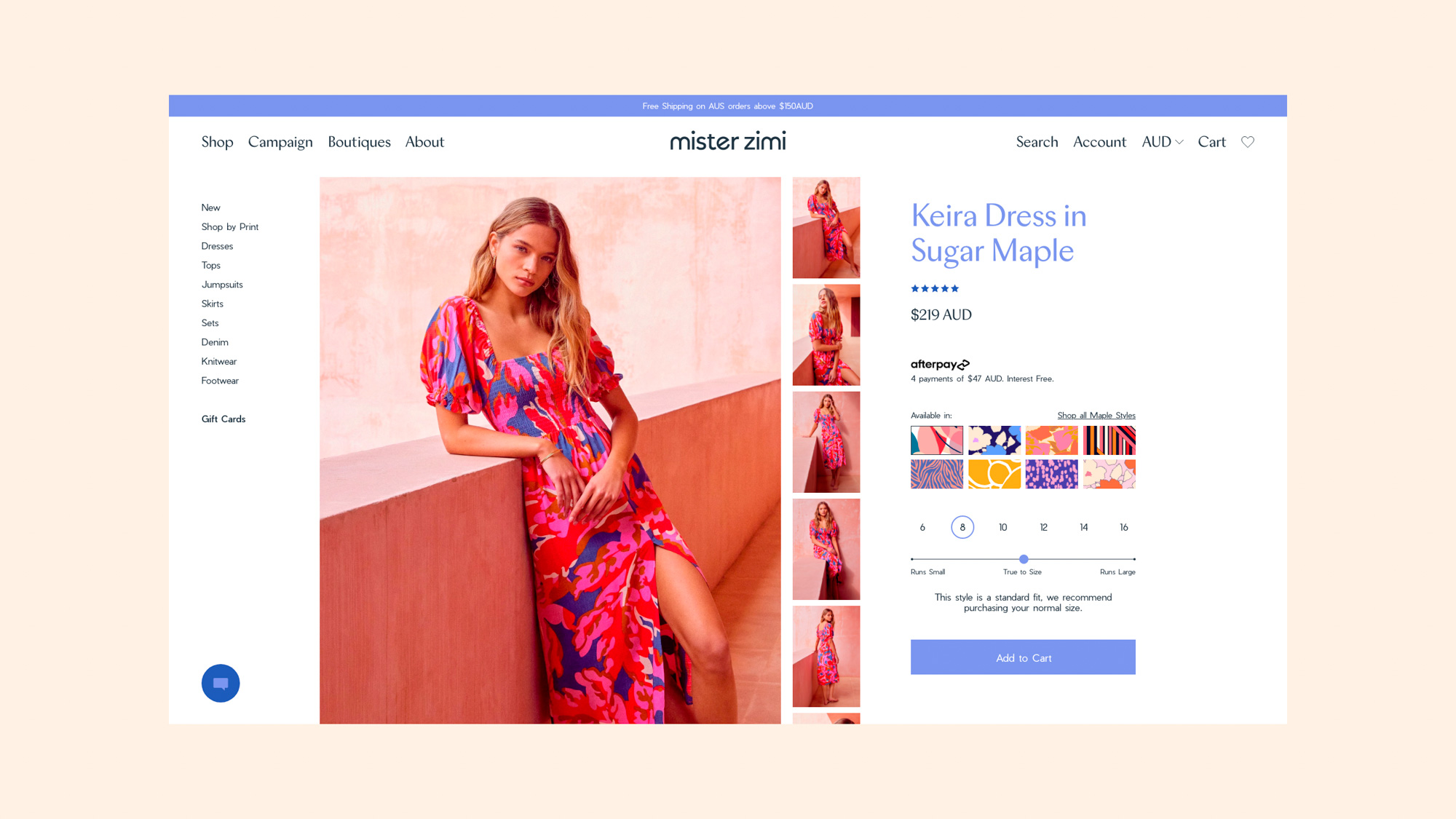
Smack Bang was tasked with developing the brand identity, brand strategy, web design and copywriting for this colourfully cool brand. The result is a nostalgic lifestyle brand filled with design-driven pieces that cleverly marry cut, colour and print delivering a positive, uplifting summer experience, every time.
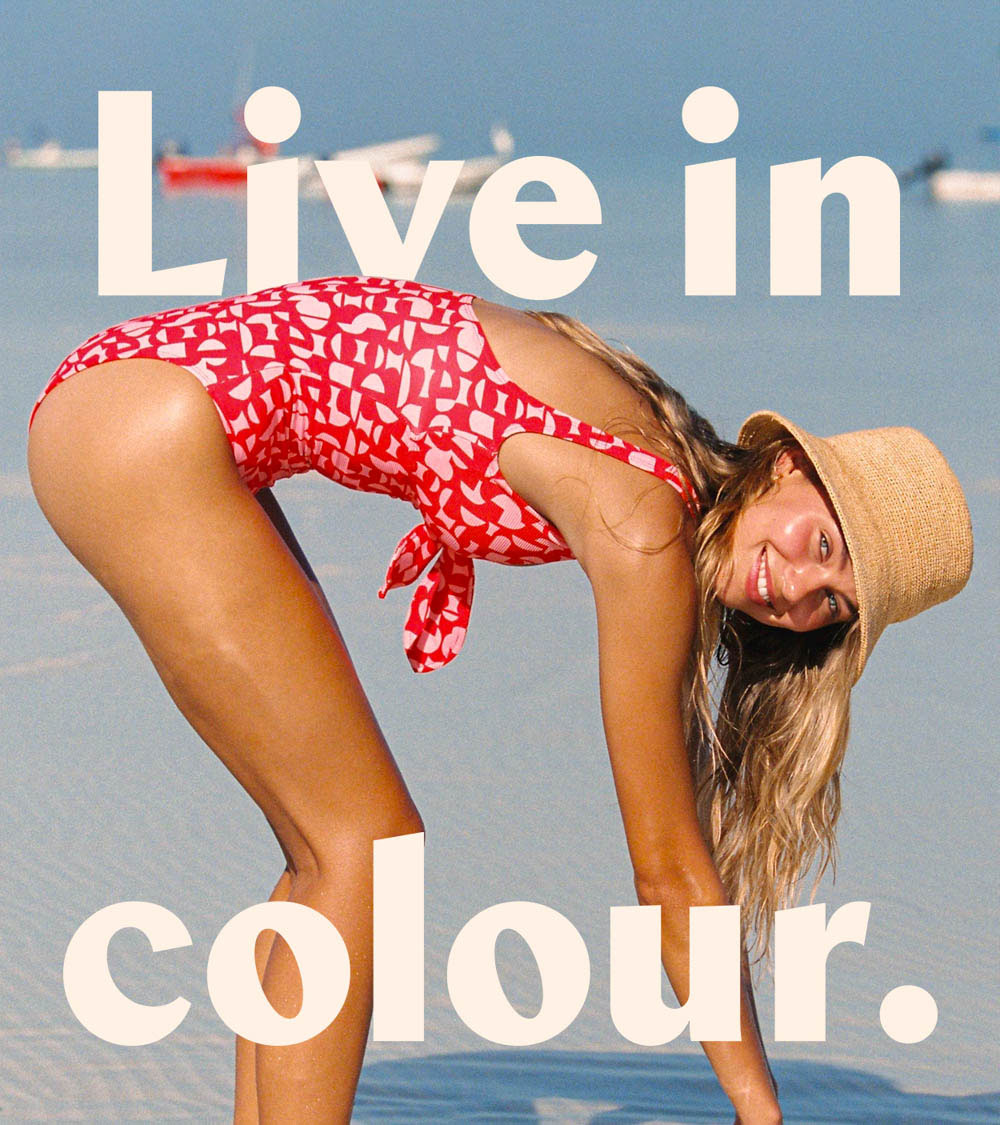
As one of the originals, Mister Zimi had garnered a cult-like community, but was lagging on brand clarity and sharpness. We worked with them to re-energise their identity to build a brand experience that spoke to their exuberant collections and enraptured audience. This is a brand refresh that realigns the company with its purpose.
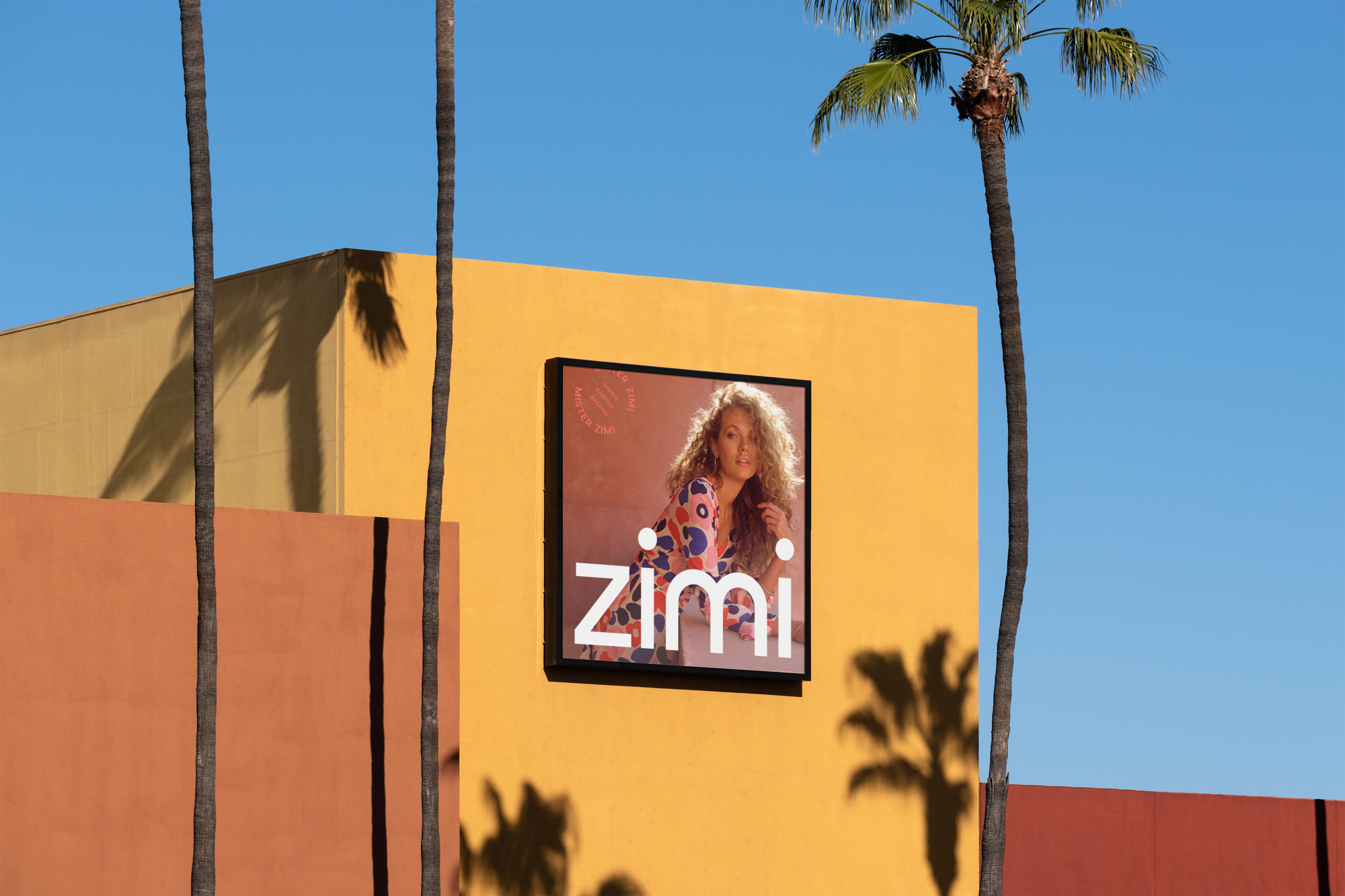
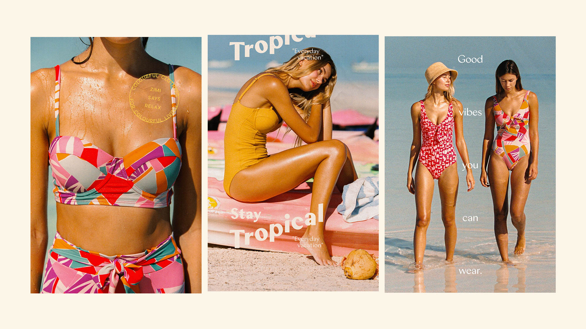
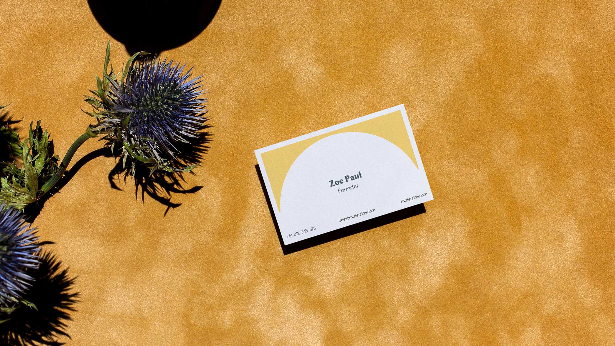
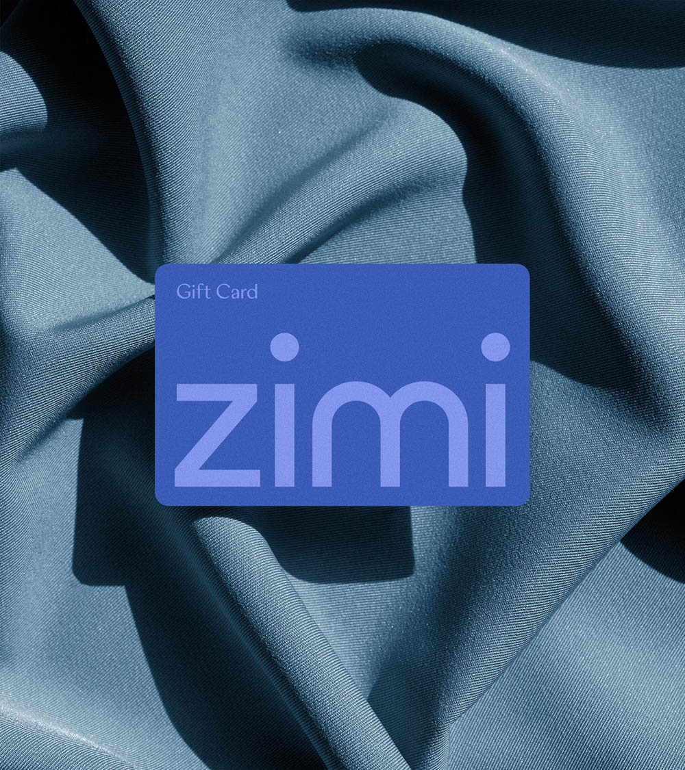
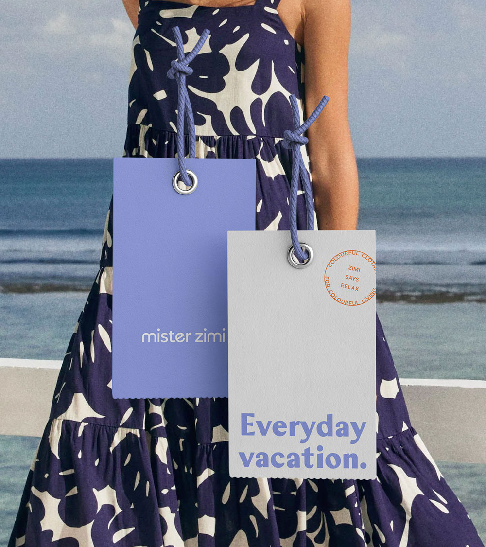
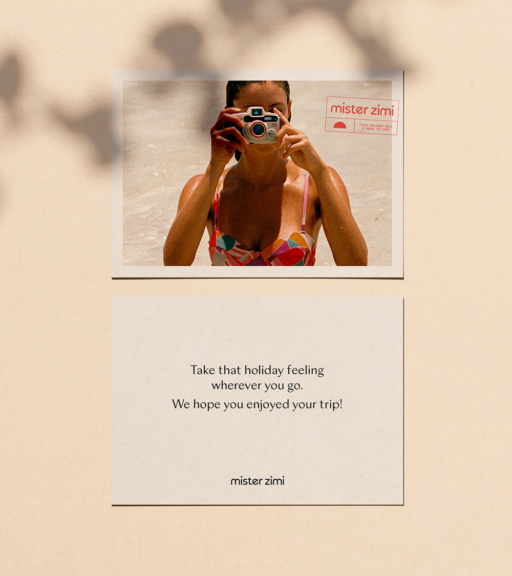
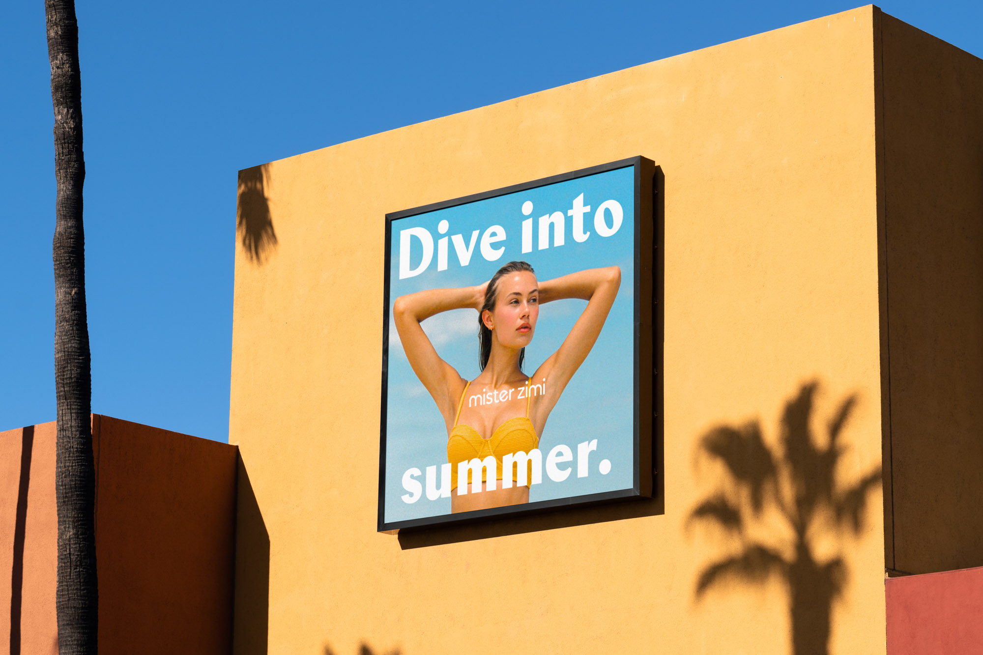
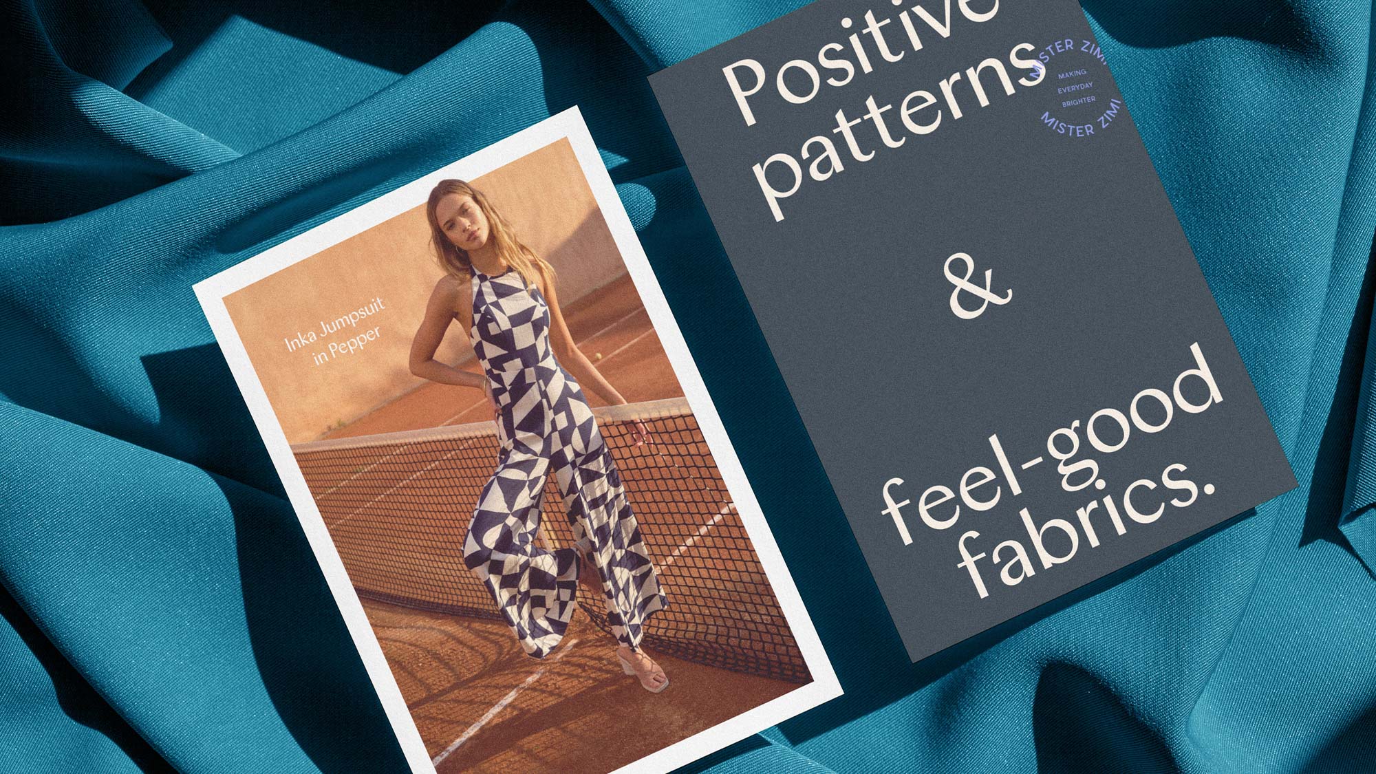
Smack Bang worked with the team at Mister Zimi to create a brand identity that speaks to a feeling of endless holidays and good vibes with its playful and retro feel. Focused on bold, creative and artistic prints with tried and tested shapes, the Zimi formula is what keeps customers coming back for more – and demands a highly recognisable, distinguishable and distinctive identity. The clean, lowercase sans serif of the logo creates a timeless and unmistakably modern aesthetic – providing a strong foundation on which to grow the brand. Inspired by retro travel stamps from days gone by, we introduced a versatile suite of stamp assets. An additional typeface has been introduced, which feels bold, joyful and nods to classic holiday posters from the 60s – giving consumers a sense of escapism and feel-good fun. The colour palette captures the picture perfect postcard beach view of your favourite holiday from years gone by.


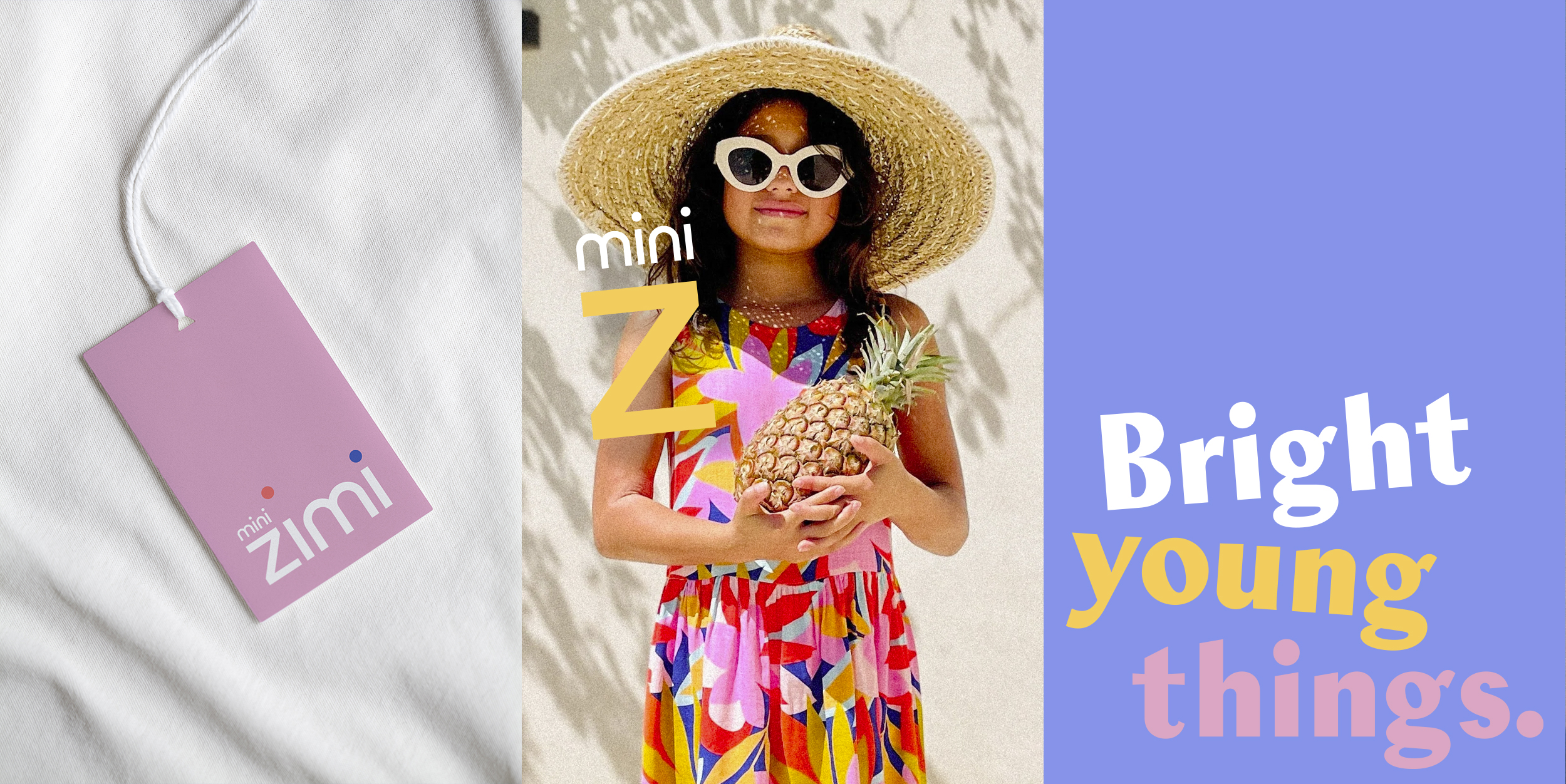
Pioneering an entirely new category.
The kingdom of kid-dom, where where “oui” meets “no worries”.
© 2026 Smack Bang


We pay respect to the Traditional Custodians and First Peoples of NSW, and acknowledge their continued connection to their country and culture.