


We pay respect to the Traditional Custodians and First Peoples of NSW, and acknowledge their continued connection to their country and culture.
Growth Bomb
- Share


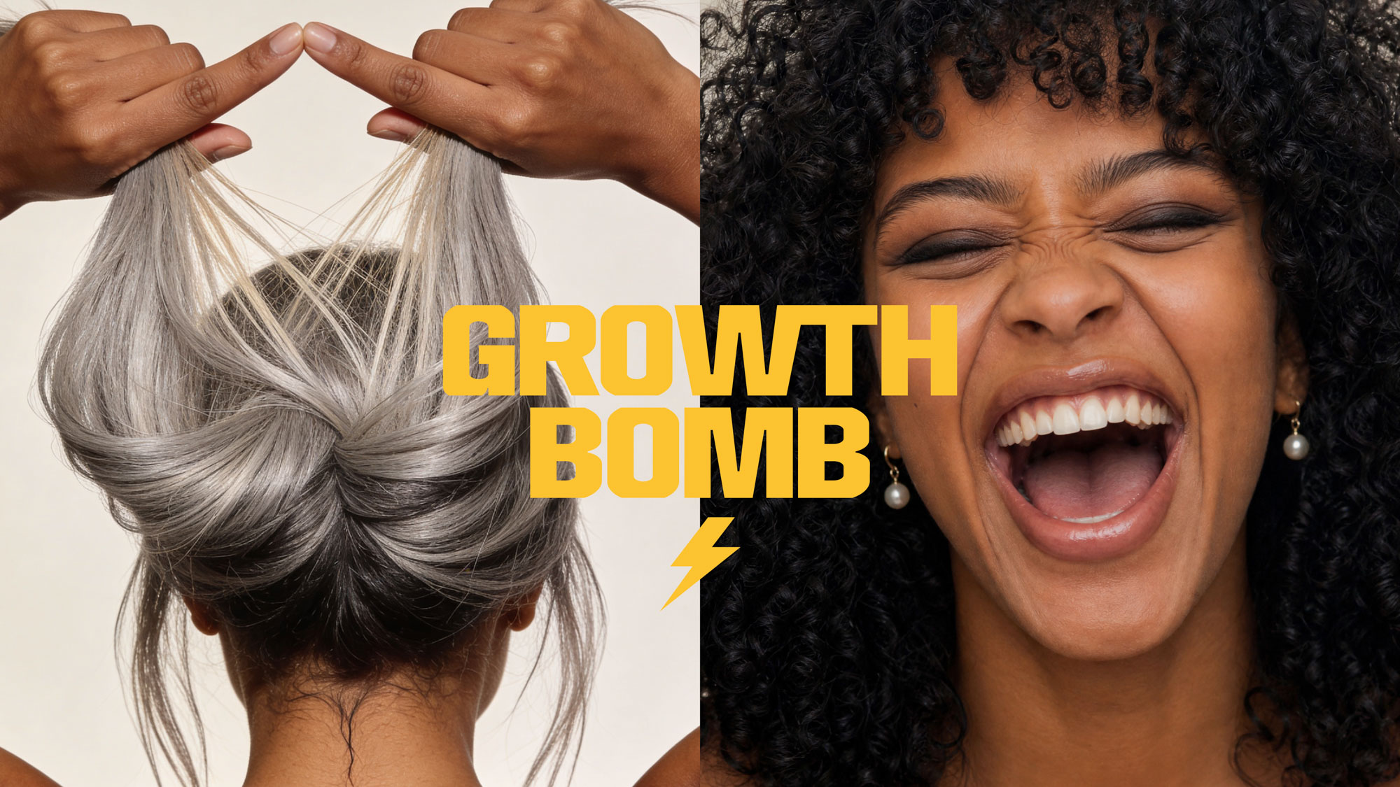
Growth Bomb had already earned cult status in the hair growth space. Our job was to turn up the voltage. Powered by fermented Yerba Maté caffeine and clinically proven actives, Growth Bomb treats scalp care less like a pampering ritual and more like a performance hack. Fast, focused and electric.
We partnered with Growth Bomb to rewire the brand from the root up: strategy, verbal identity, visual world, and positioning included. The ambition was clear: create a scalp-first haircare brand that felt clinically credible without slipping into sterile beauty territory. A brand with enough scientific authority to earn trust, and yet enough cultural energy to wake the entire aisle up.
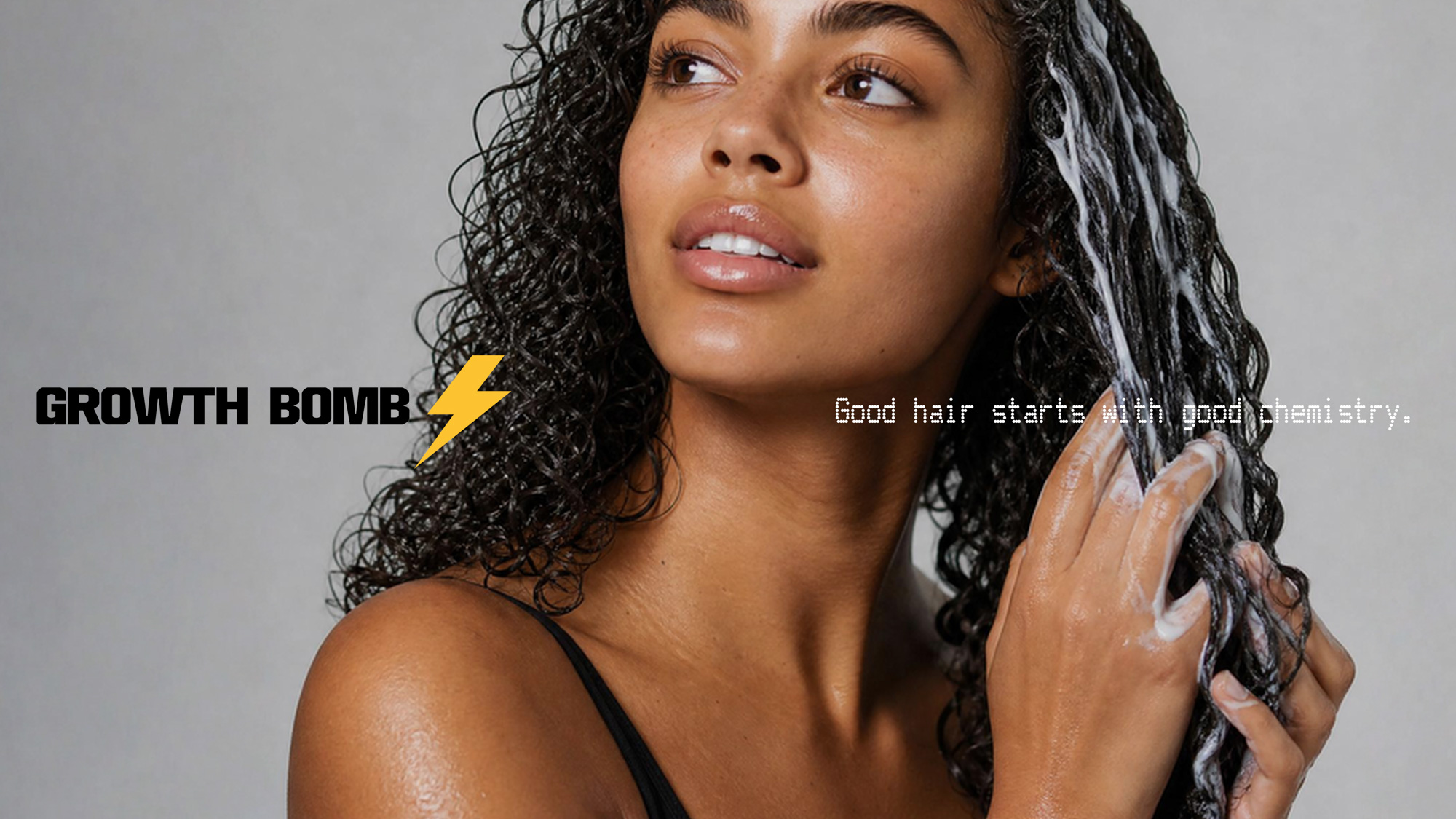
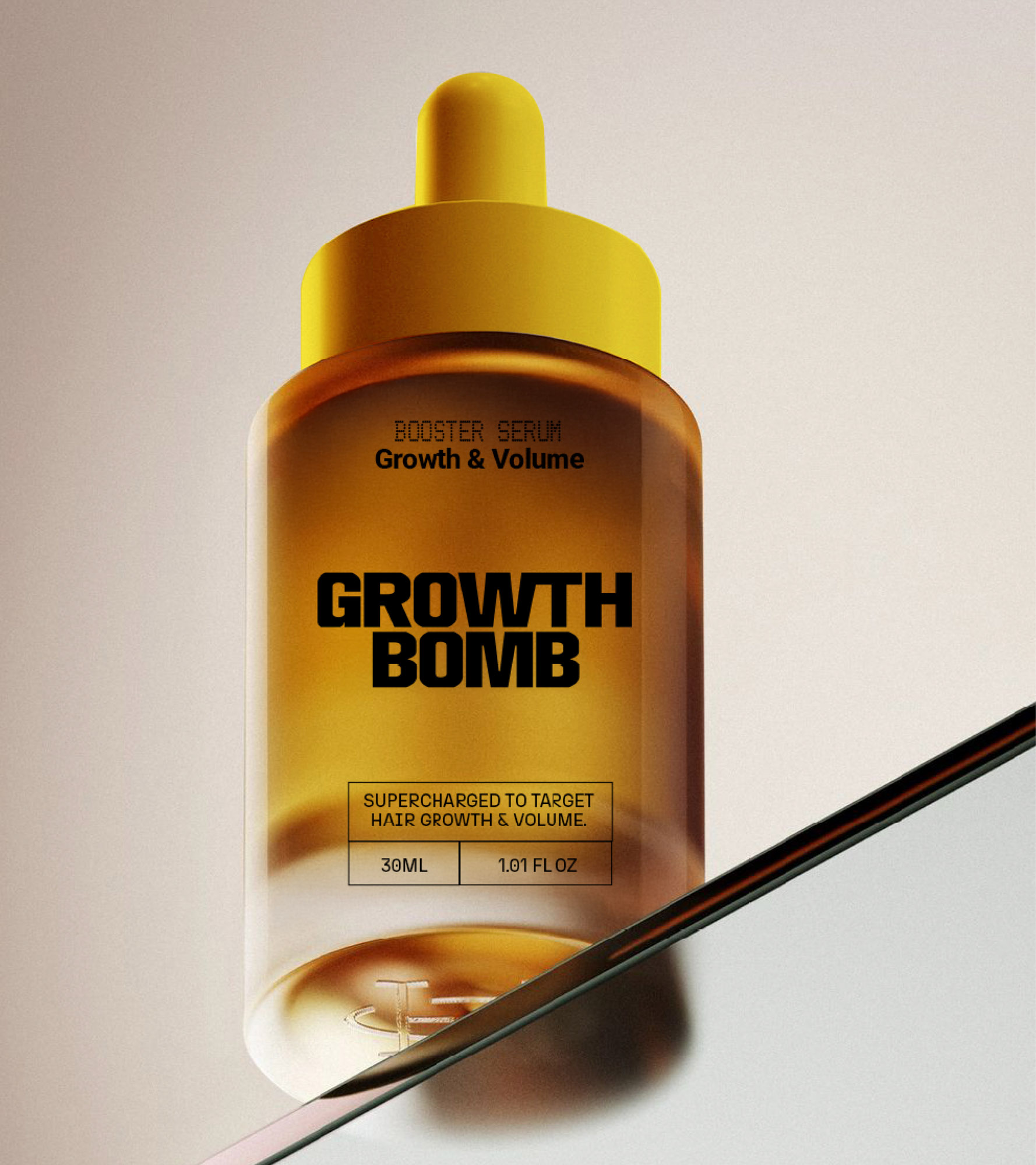
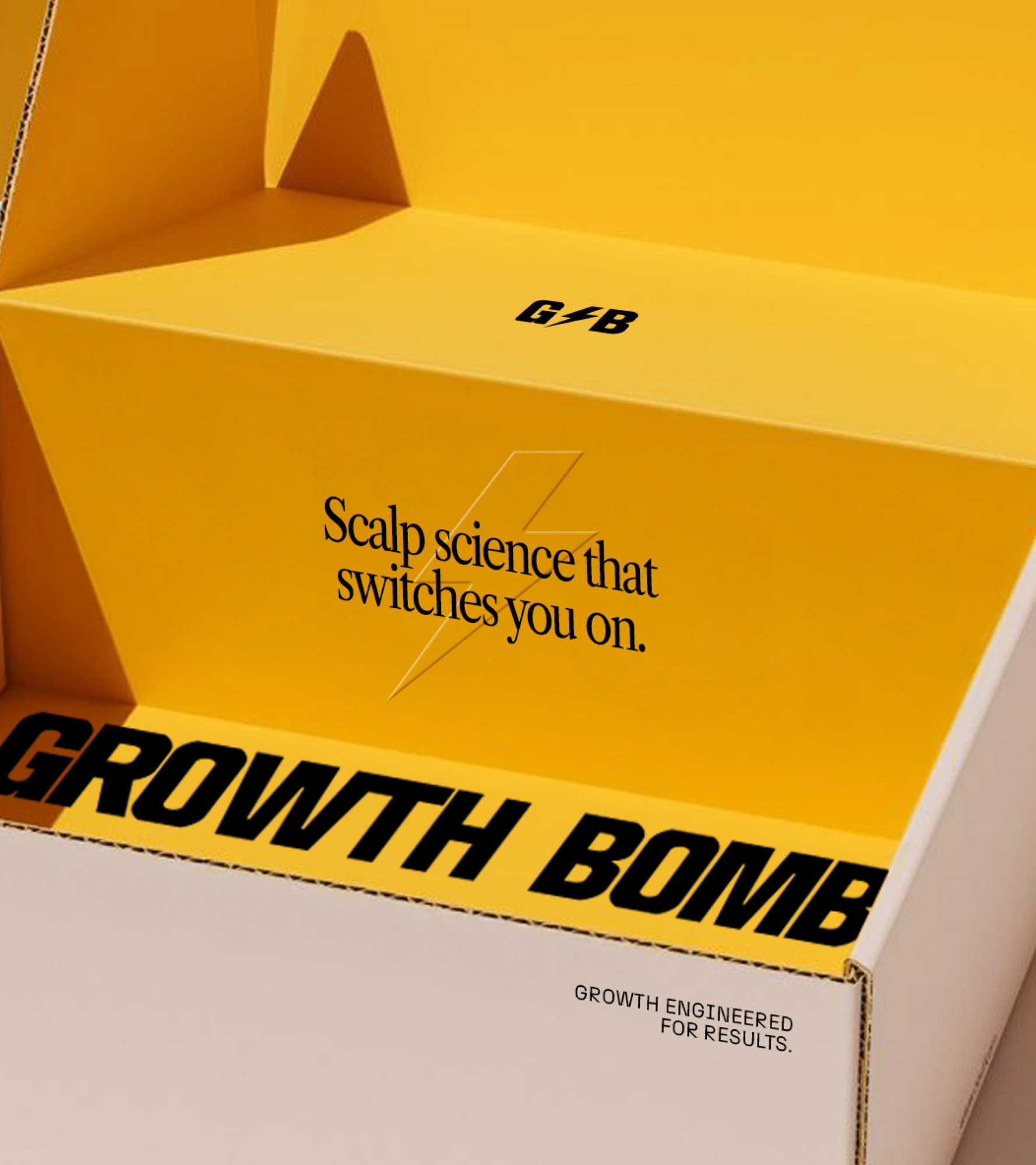
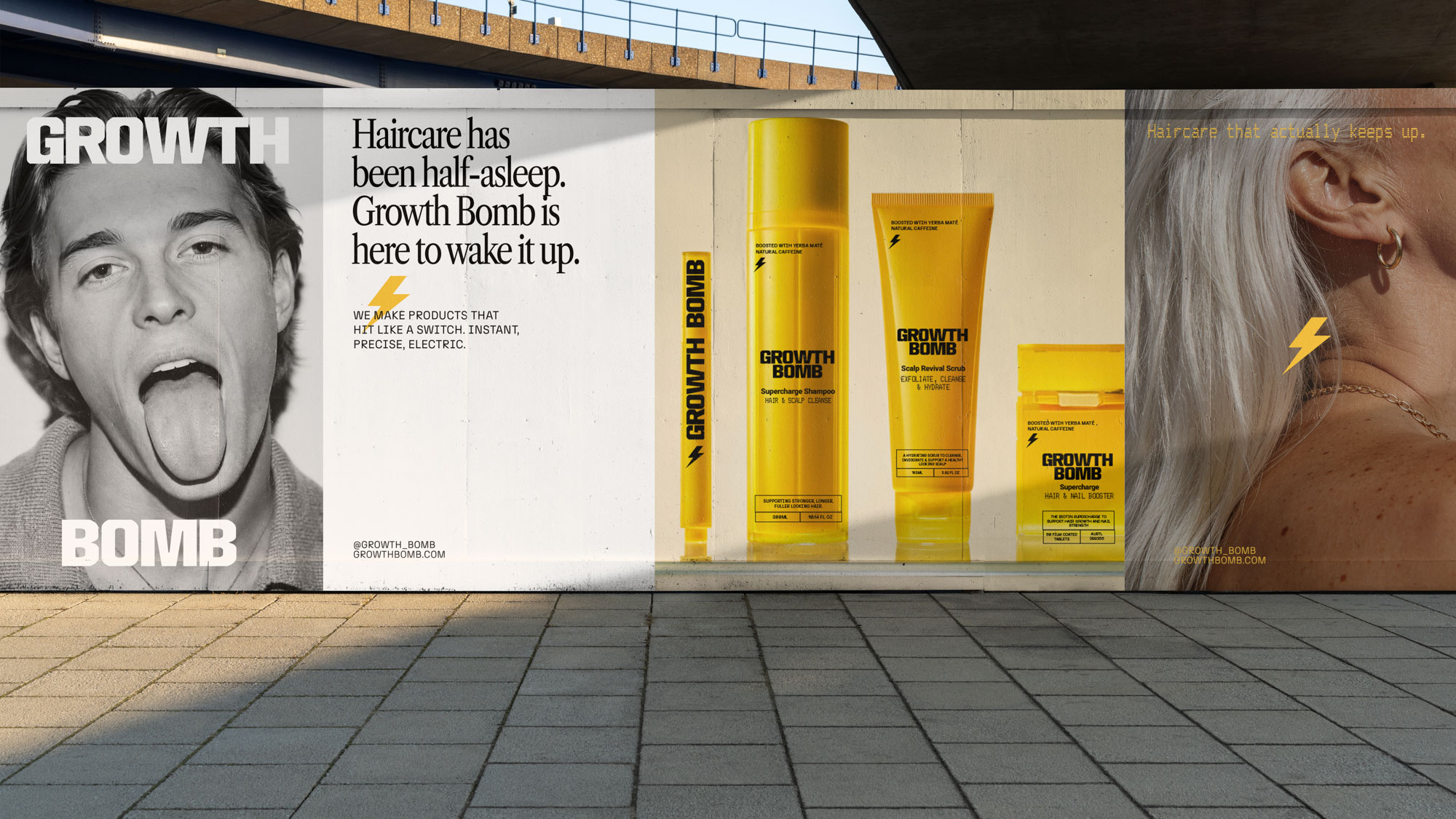
Growth Bomb is scalp care with voltage. A stimulant-powered haircare system engineered to energise follicles, accelerate growth, and transform the daily wash routine into something people actually feel excited about.
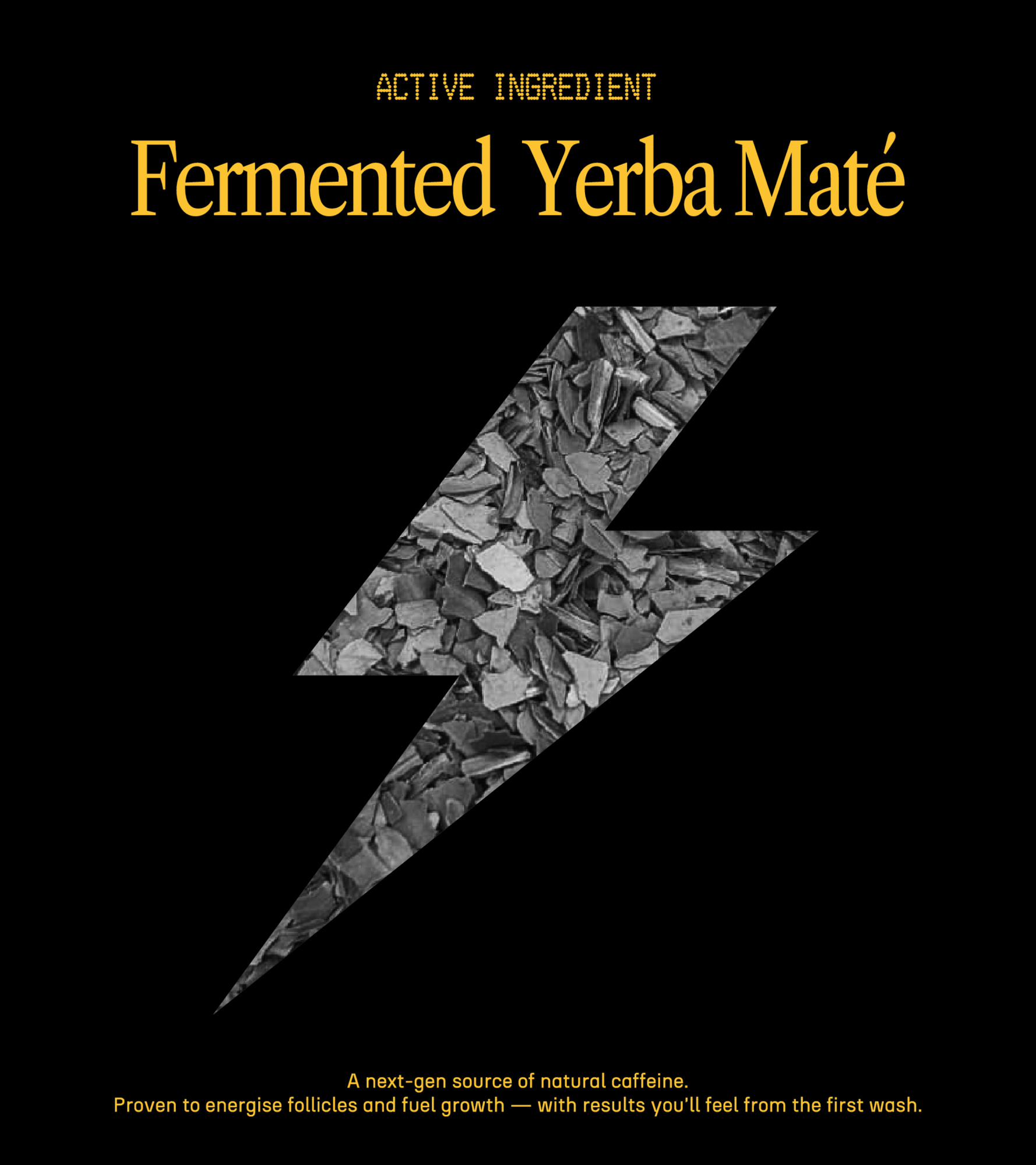
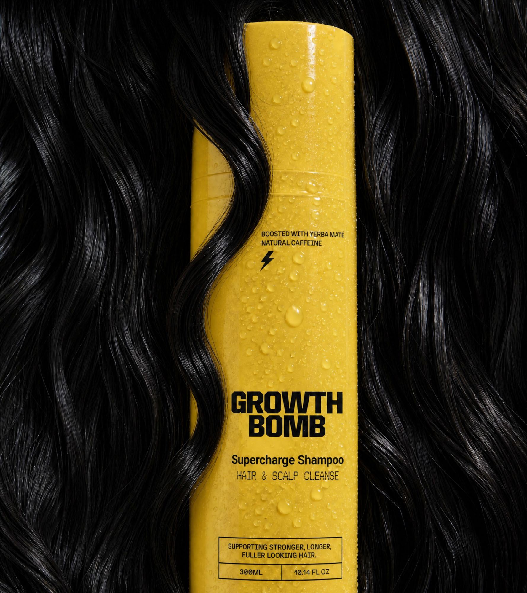
Built around fermented Yerba Maté caffeine and clinically proven actives like Capixyl™ and Redensyl™, every formula is designed to activate the scalp’s performance circuit, fuelling circulation, clearing buildup, and creating the ideal environment for stronger, healthier hair growth.
But Growth Bomb doesn’t behave like traditional “clinical” haircare. This is science with swagger. A brand built for overstimulated lives, hormonal shifts, post-partum regrowth journeys, late nights, gym sessions, perimenopause, and every chaotic chapter in between. Equal parts proof-driven and personality-packed, Growth Bomb brings energy back to a category that had grown painfully beige.
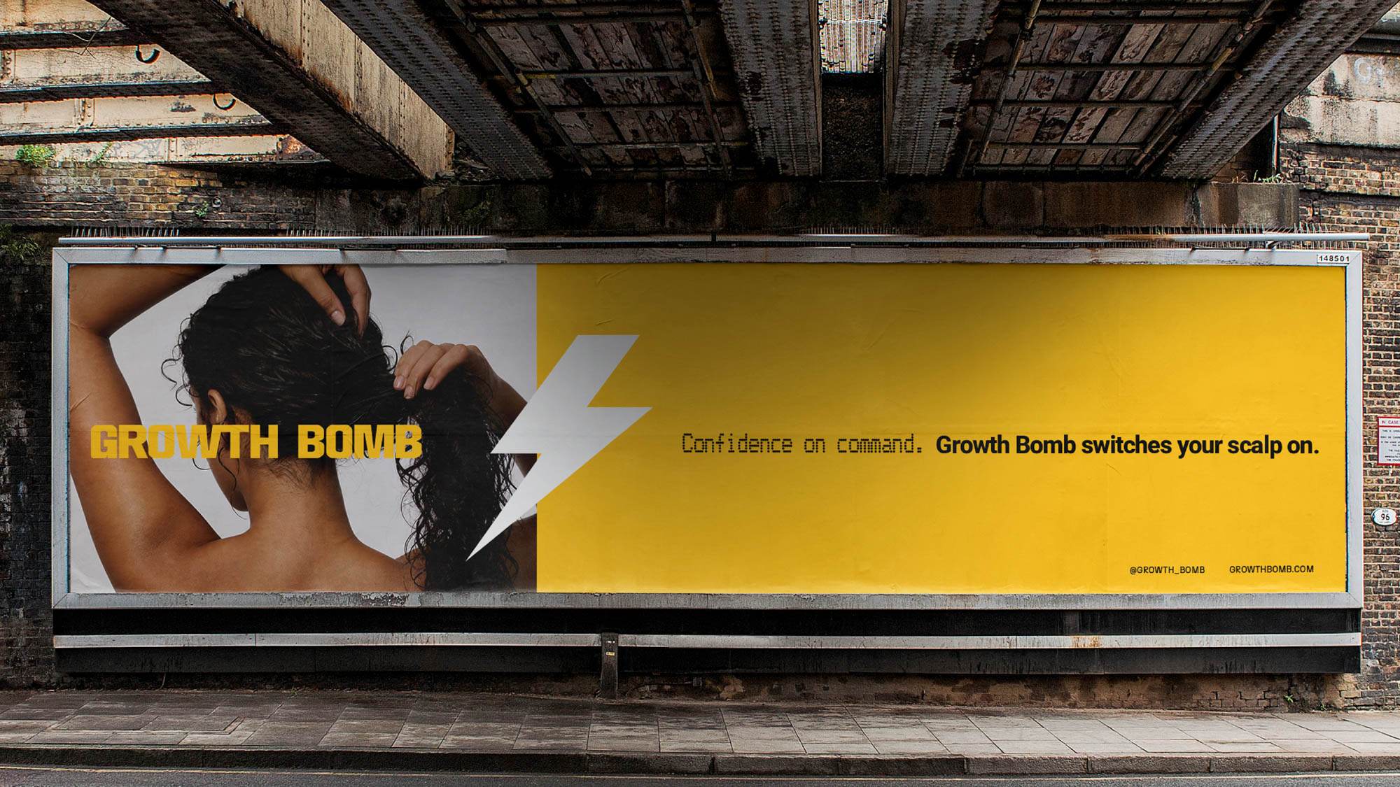
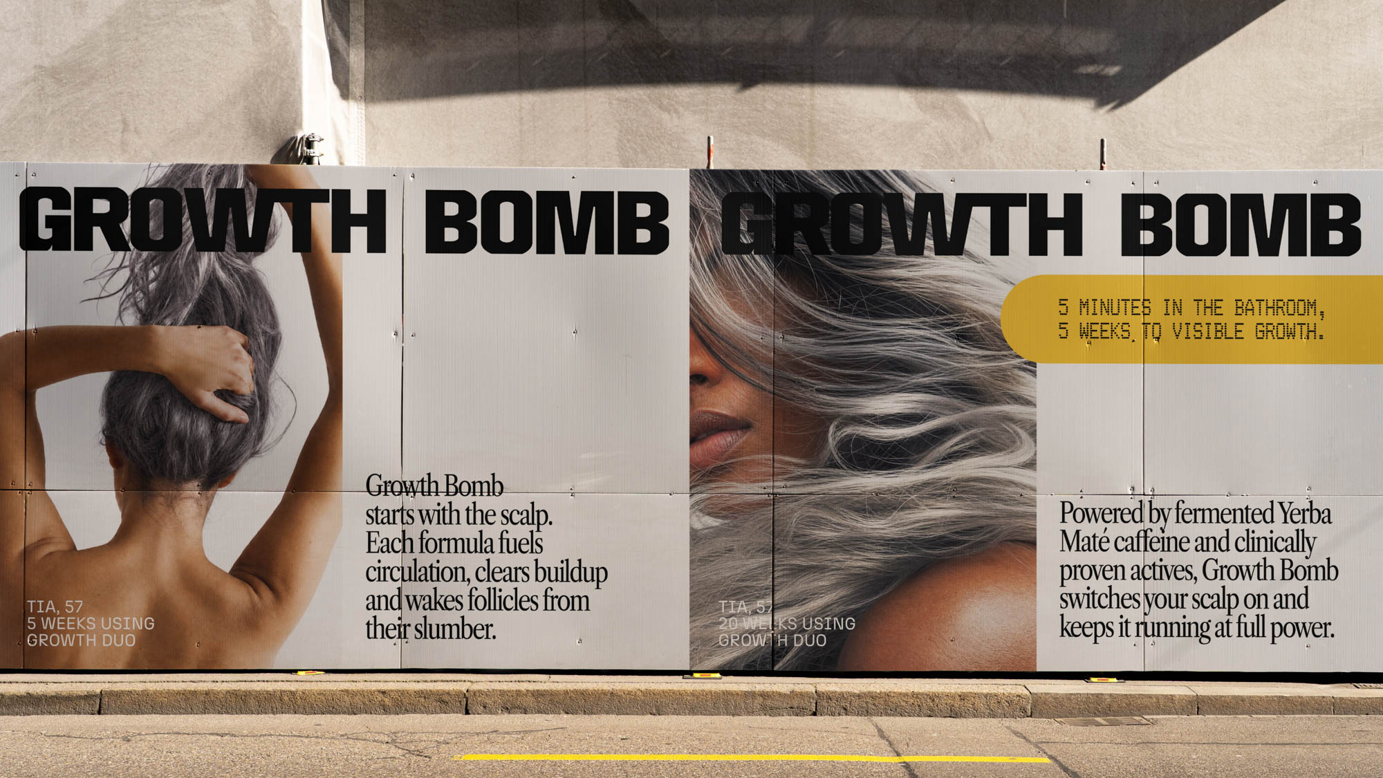
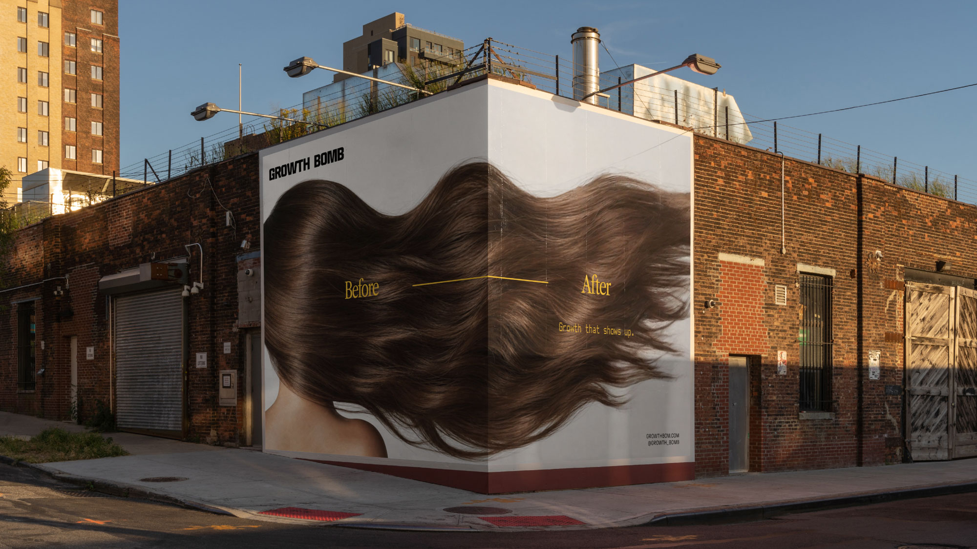
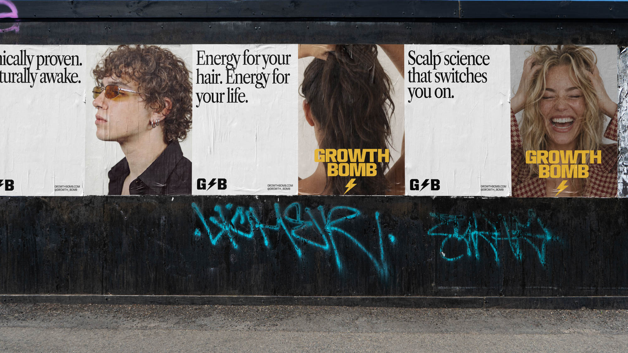
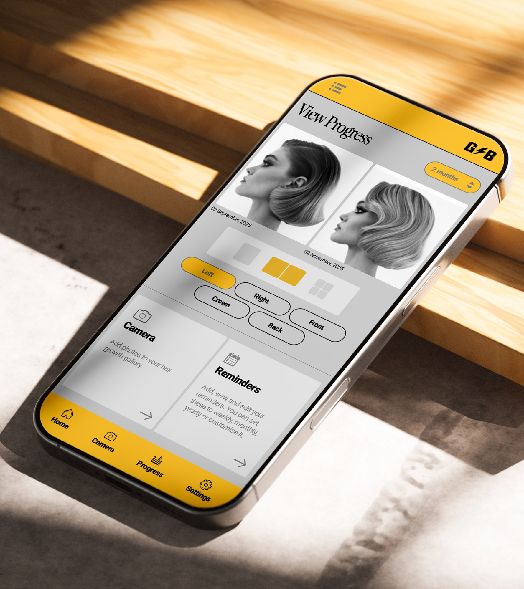
The challenge was to create a brand identity that captured stimulation itself: something energetic, disruptive, and impossible to scroll past, while still grounded in scientific credibility.
We anchored the creative direction in the idea of activation. Inspired by electrical signals, performance systems, and the instant jolt of caffeine, the identity pulses with movement, momentum, and tension. The custom logotype features sharp, angular letterforms inspired by digital clock typography, paired with a starburst icon that acts as a visual wake-up call across the system.
Angles ripple throughout the entire identity suite, appearing in layouts, graphic devices, packaging structures, and campaign typography to create a sense of acceleration and movement. The warm golden yellow — an evolution of the original Growth Bomb yellow — injects energy and recognisability into the category, while the monochromatic supporting palette grounds the brand in modernity and confidence.
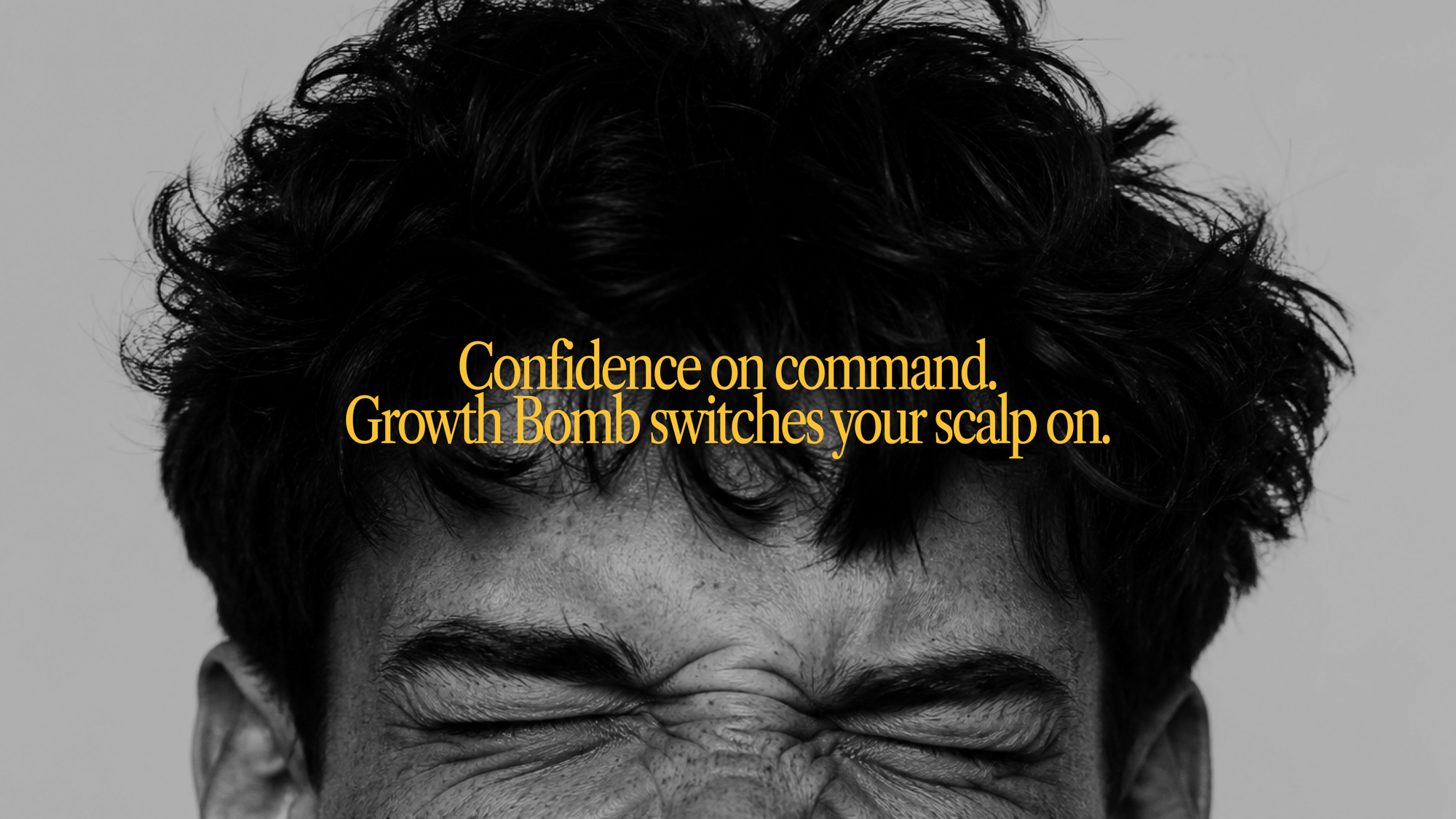
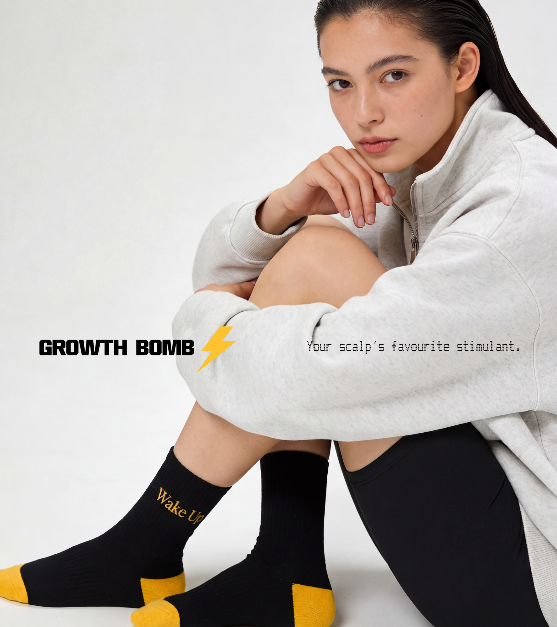
Throughout the brand world, we intentionally blurred the line between beauty, performance, and culture. Editorial imagery, oversized typography, clinical claims, and punchy campaign lines collide to create a system that feels more like an underground energy brand than traditional haircare.
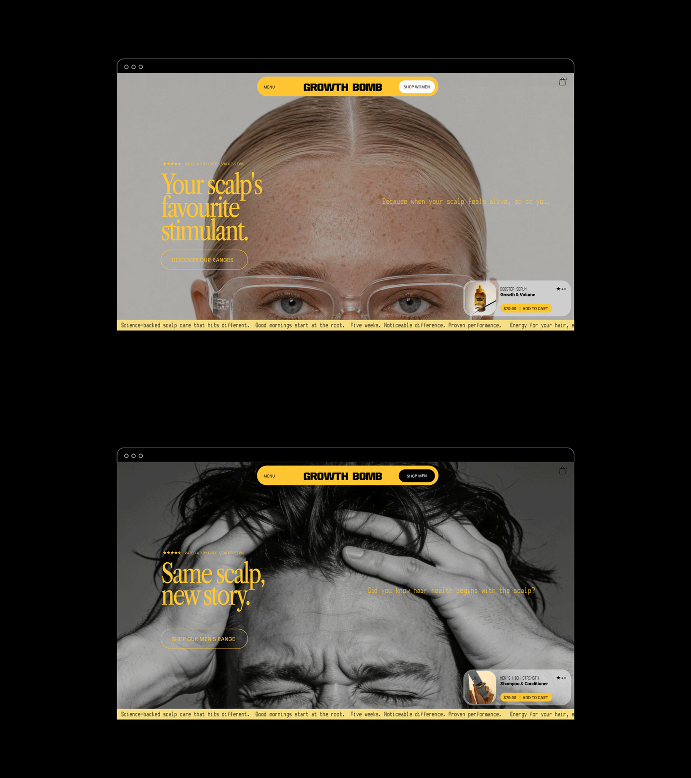
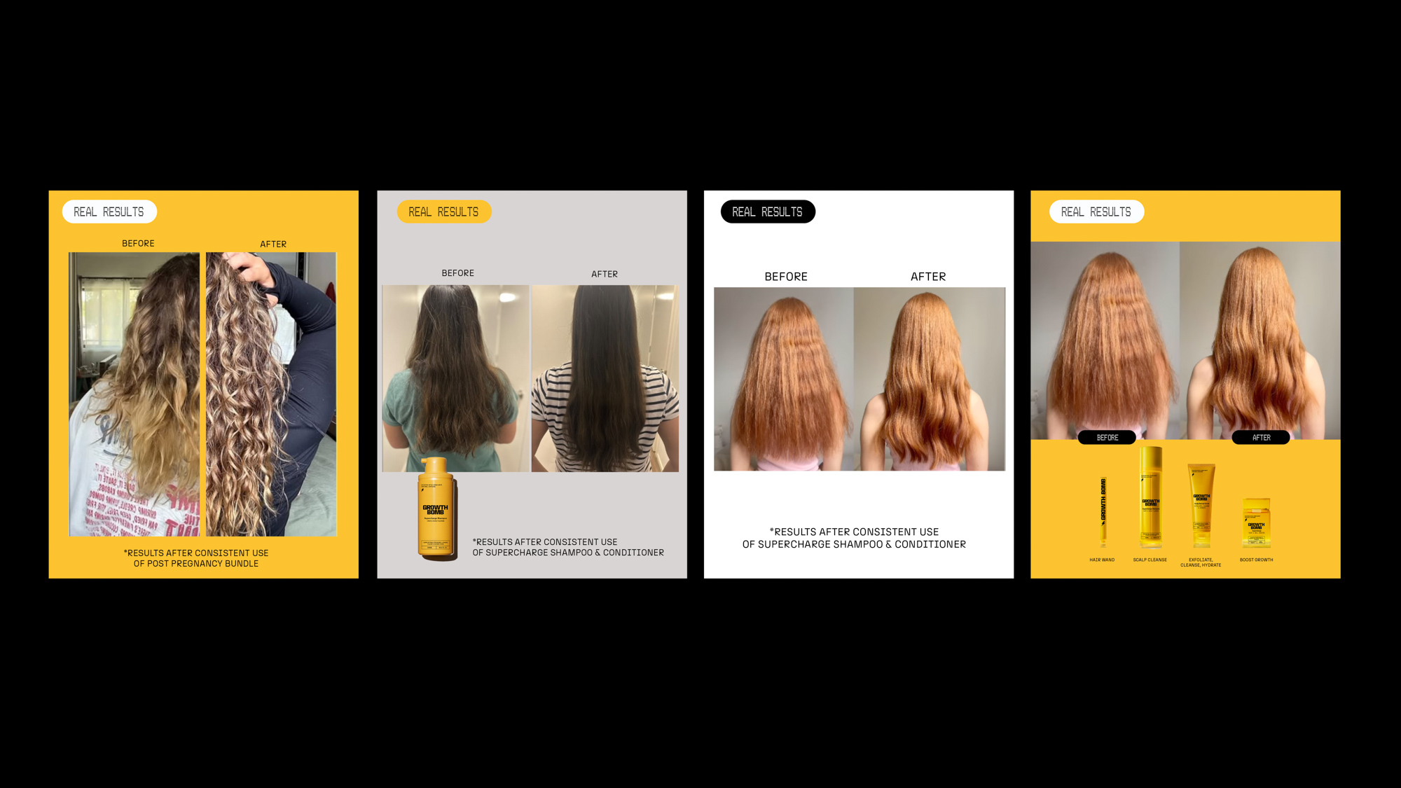
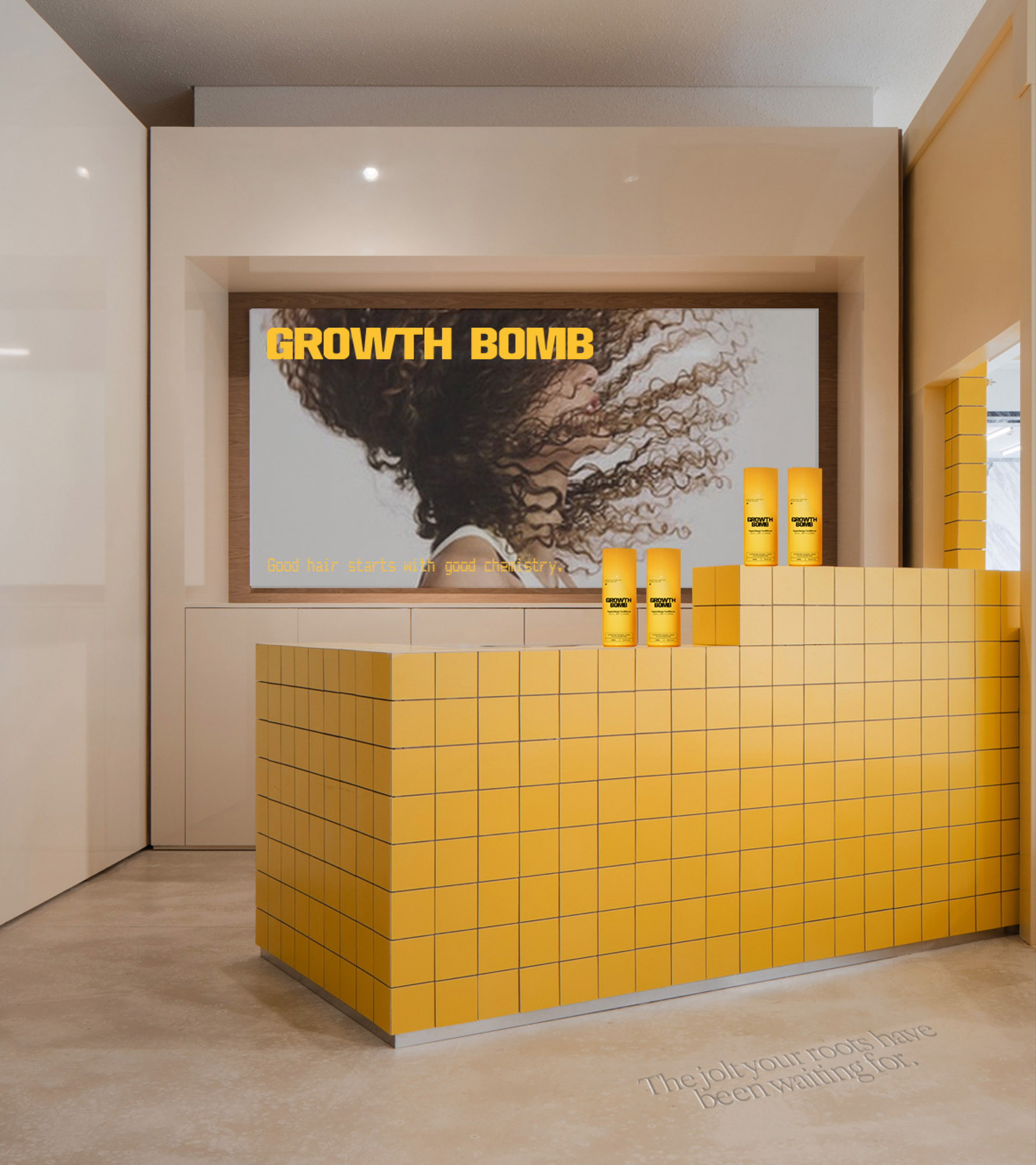
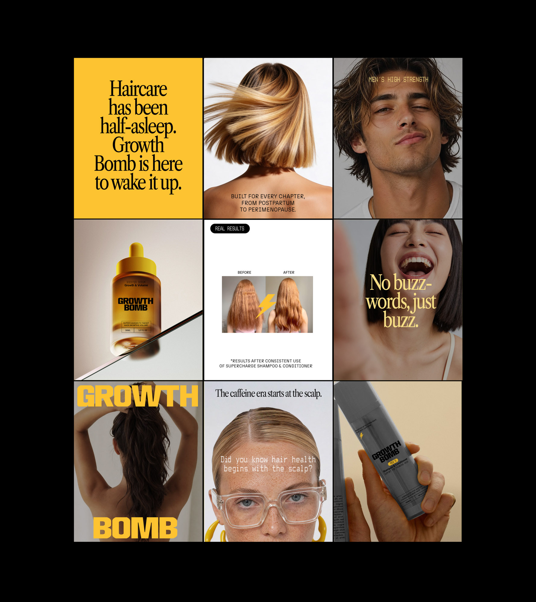
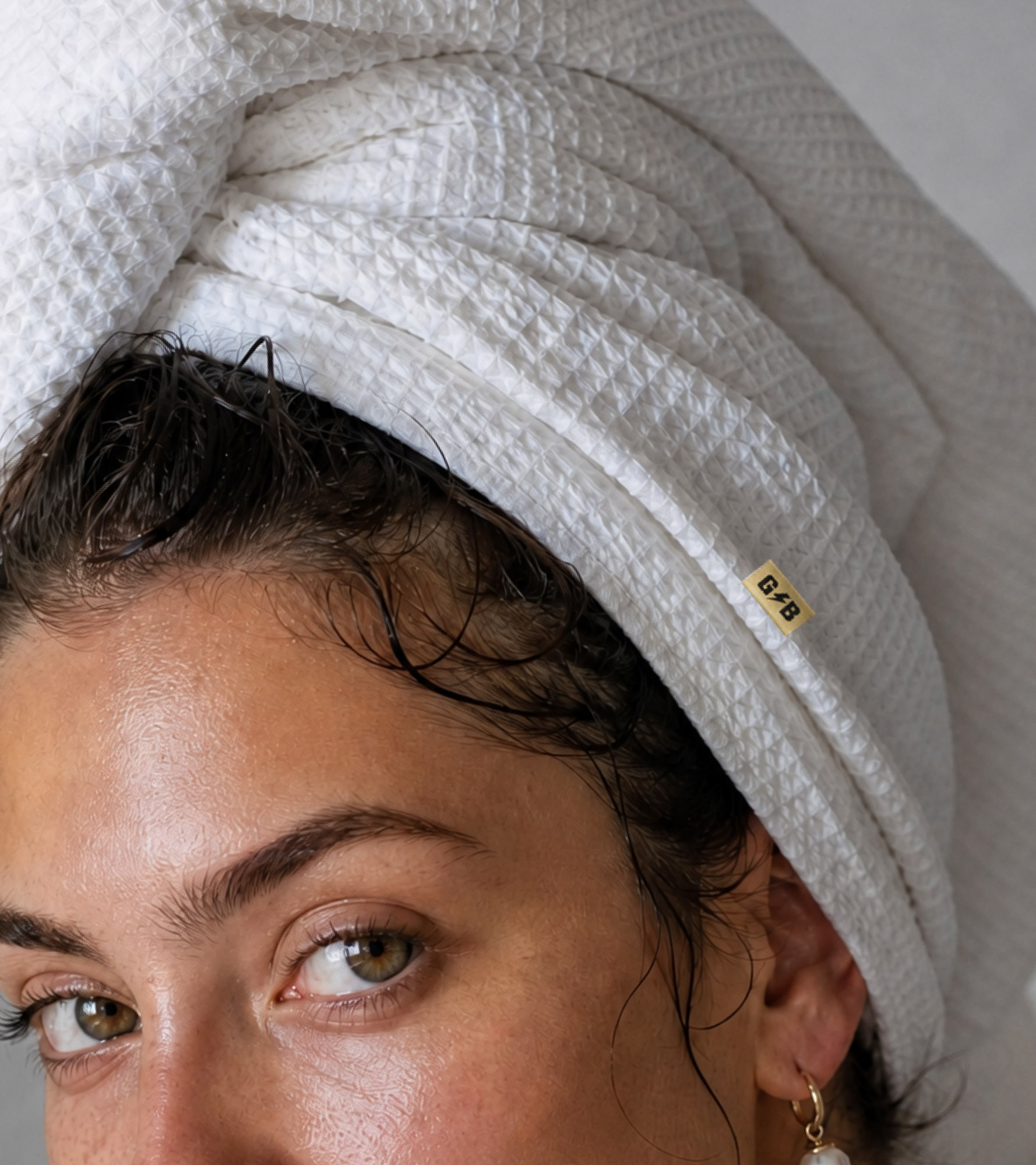
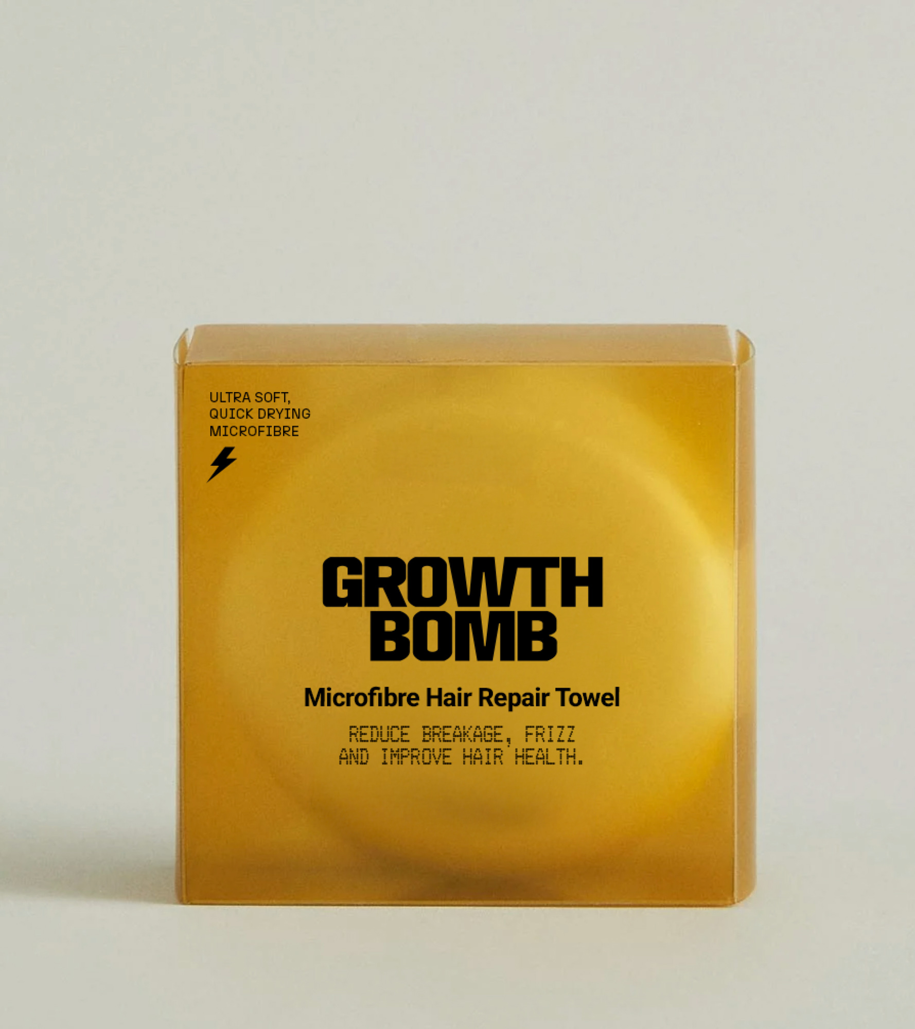
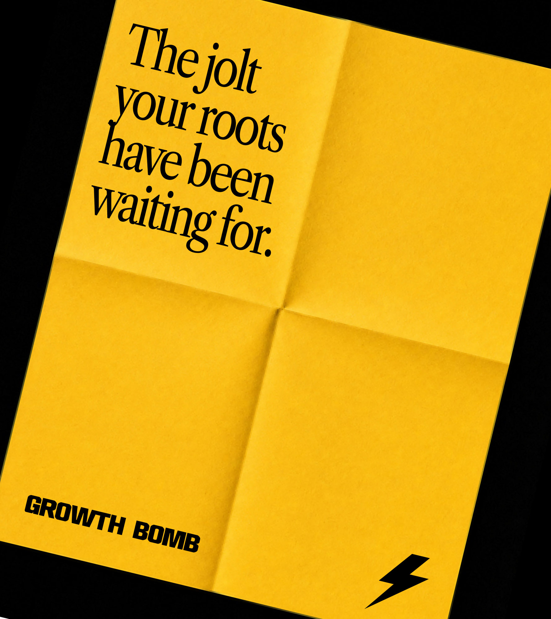

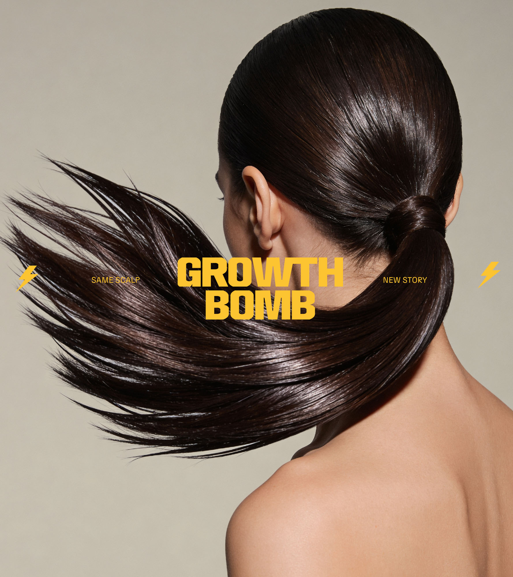
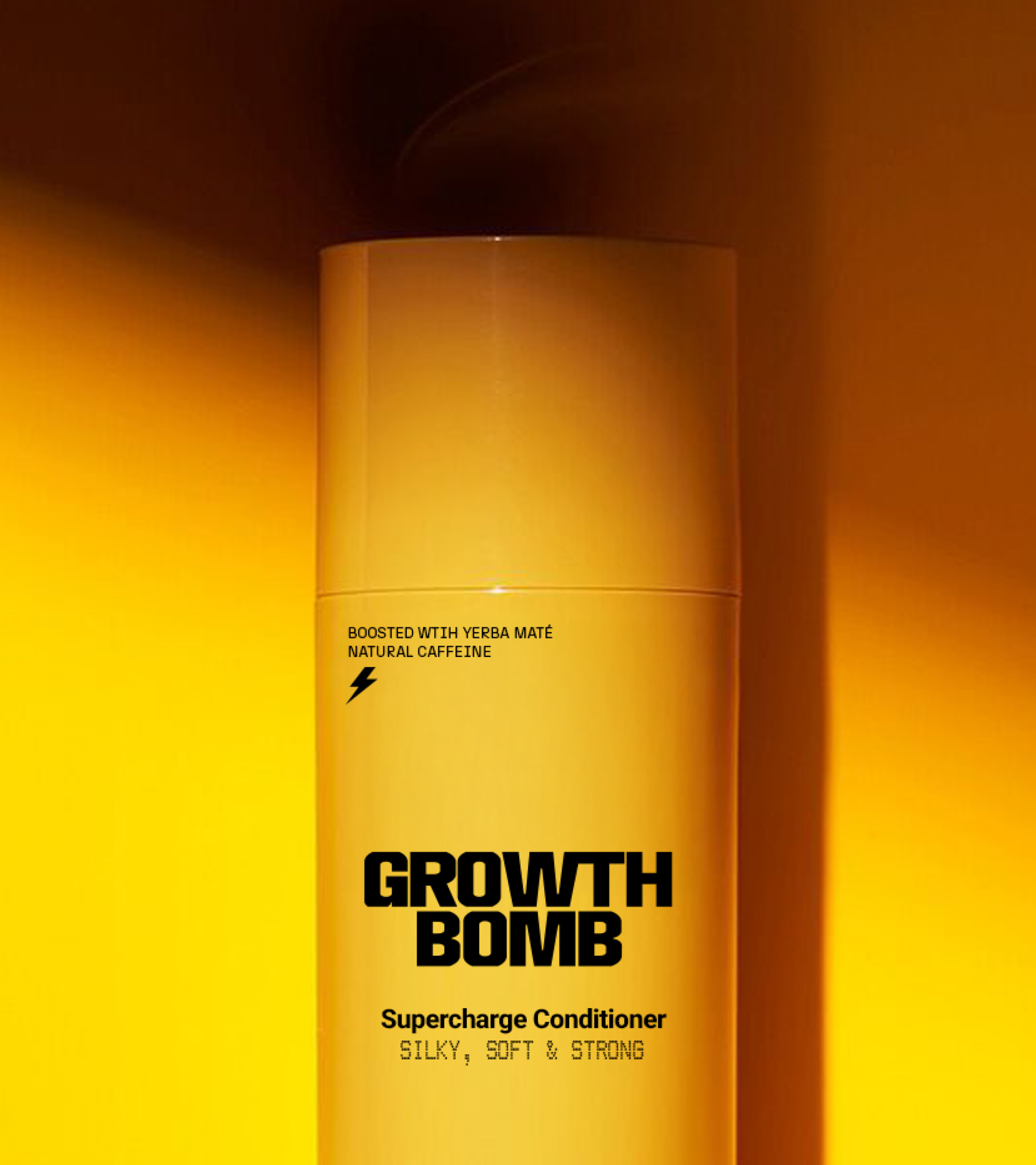
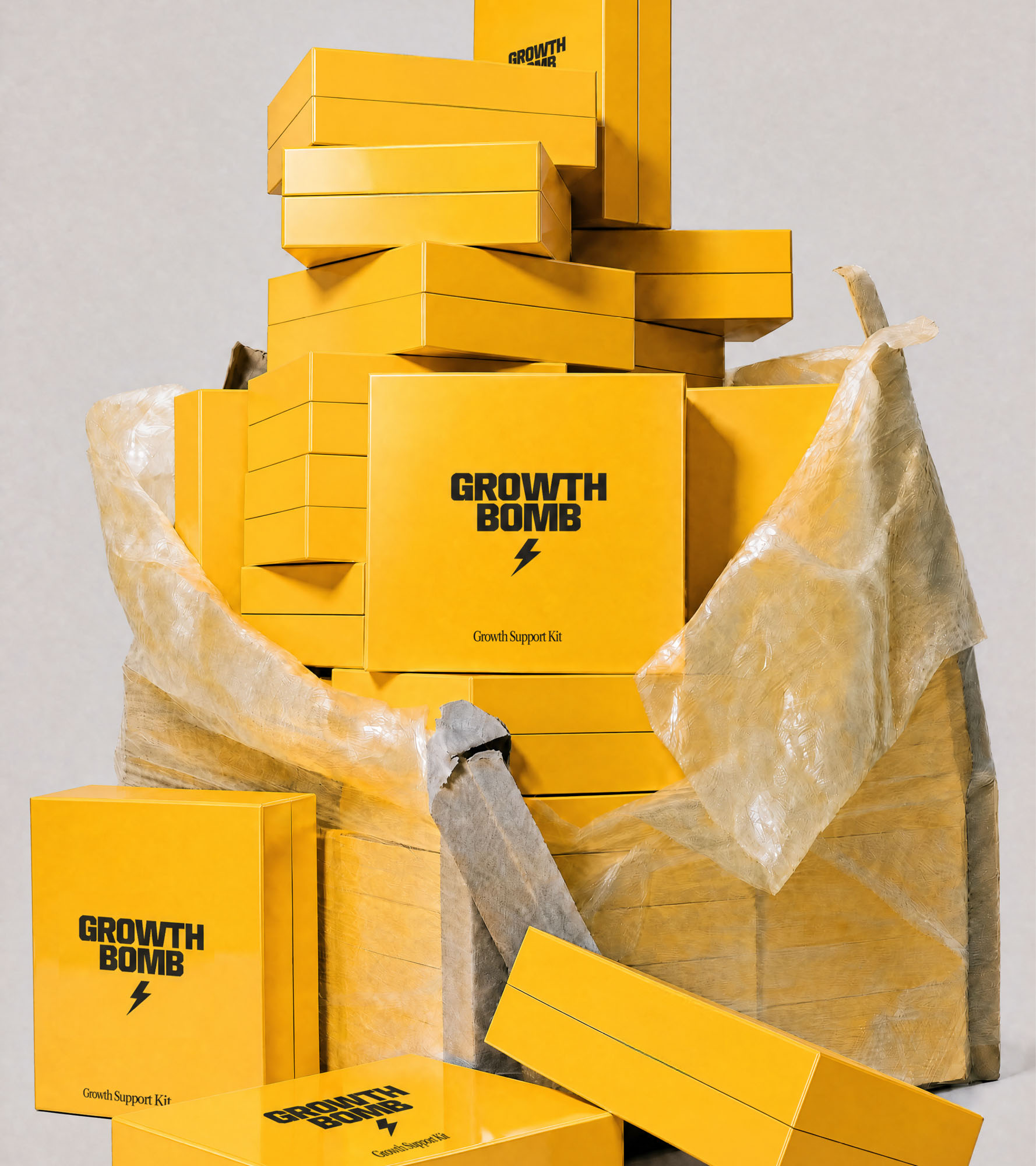
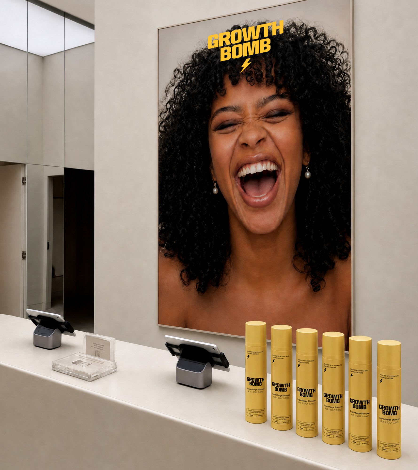
Growth Bomb’s voice is caffeinated, charged, and culturally awake. We built a language system designed to make scalp science feel magnetic, translating clinical efficacy into messaging that people actually want to engage with.
The tone balances scientific credibility with high-energy attitude, with copy emulating stimulation itself, punchy, kinetic, reactive, and full of momentum.
Importantly, the language never disappears into sterile lab jargon or fluffy wellness clichés. Every claim is anchored in evidence, every benefit feels measurable, and every phrase reinforces the same core belief: healthy hair starts with a switched-on scalp.
From campaign headlines to packaging copy, Growth Bomb turns proof into personality, building a brand voice that feels equally at home in beauty aisles, gym bags, salon shelves, and culture-led campaigns.
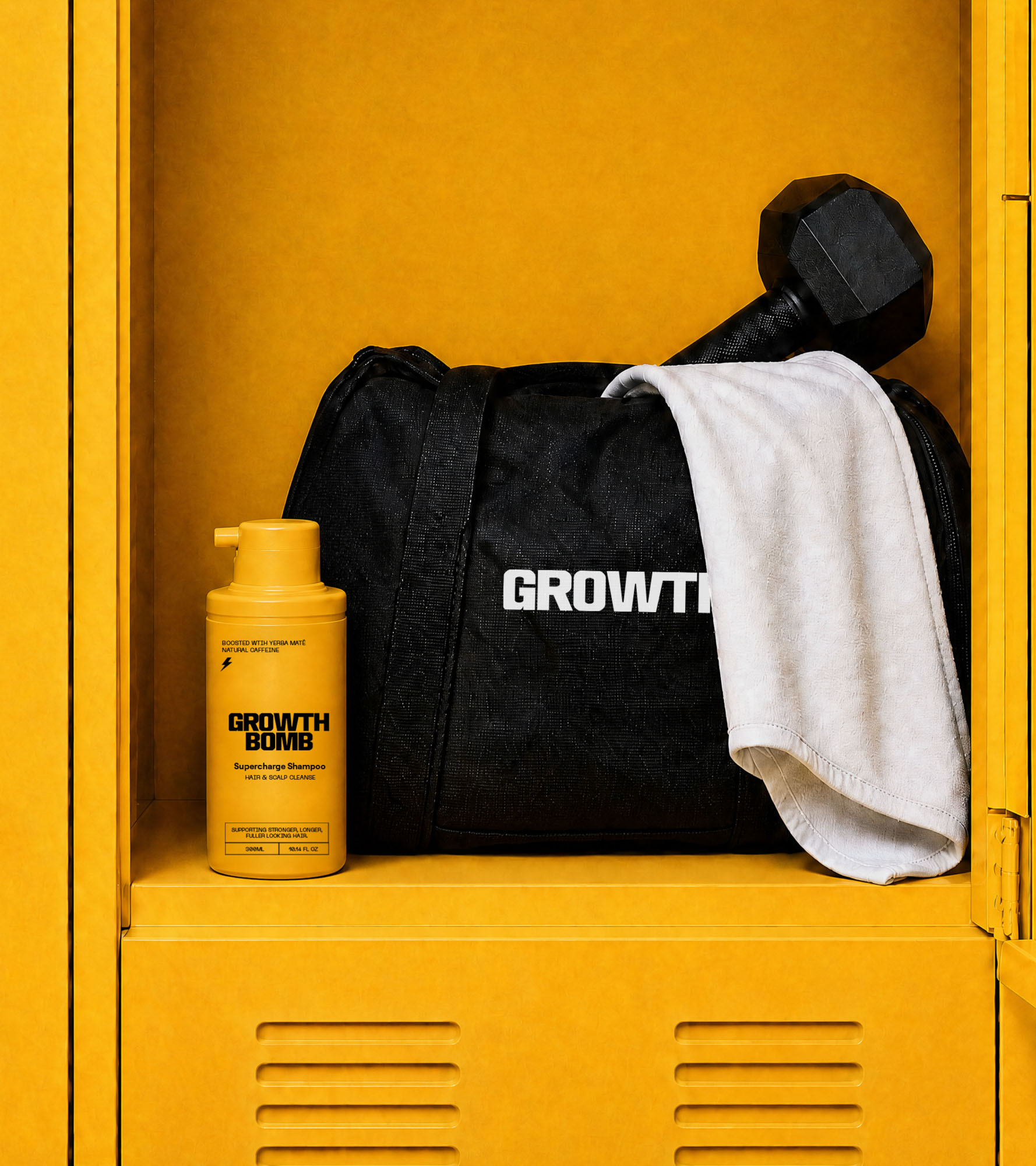
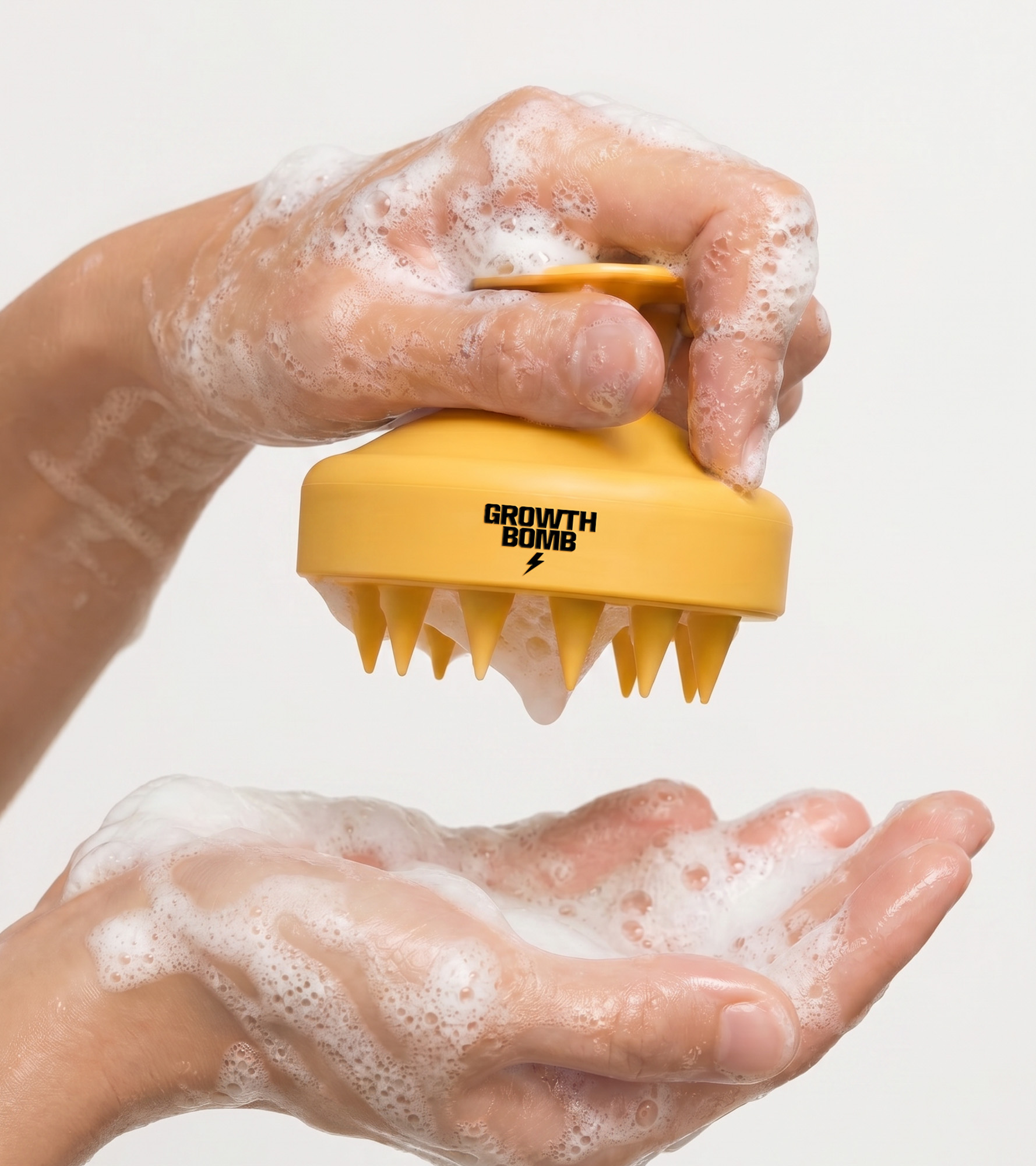
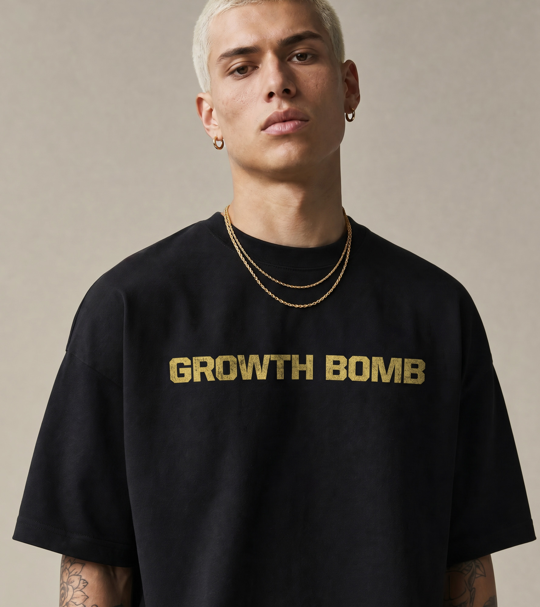
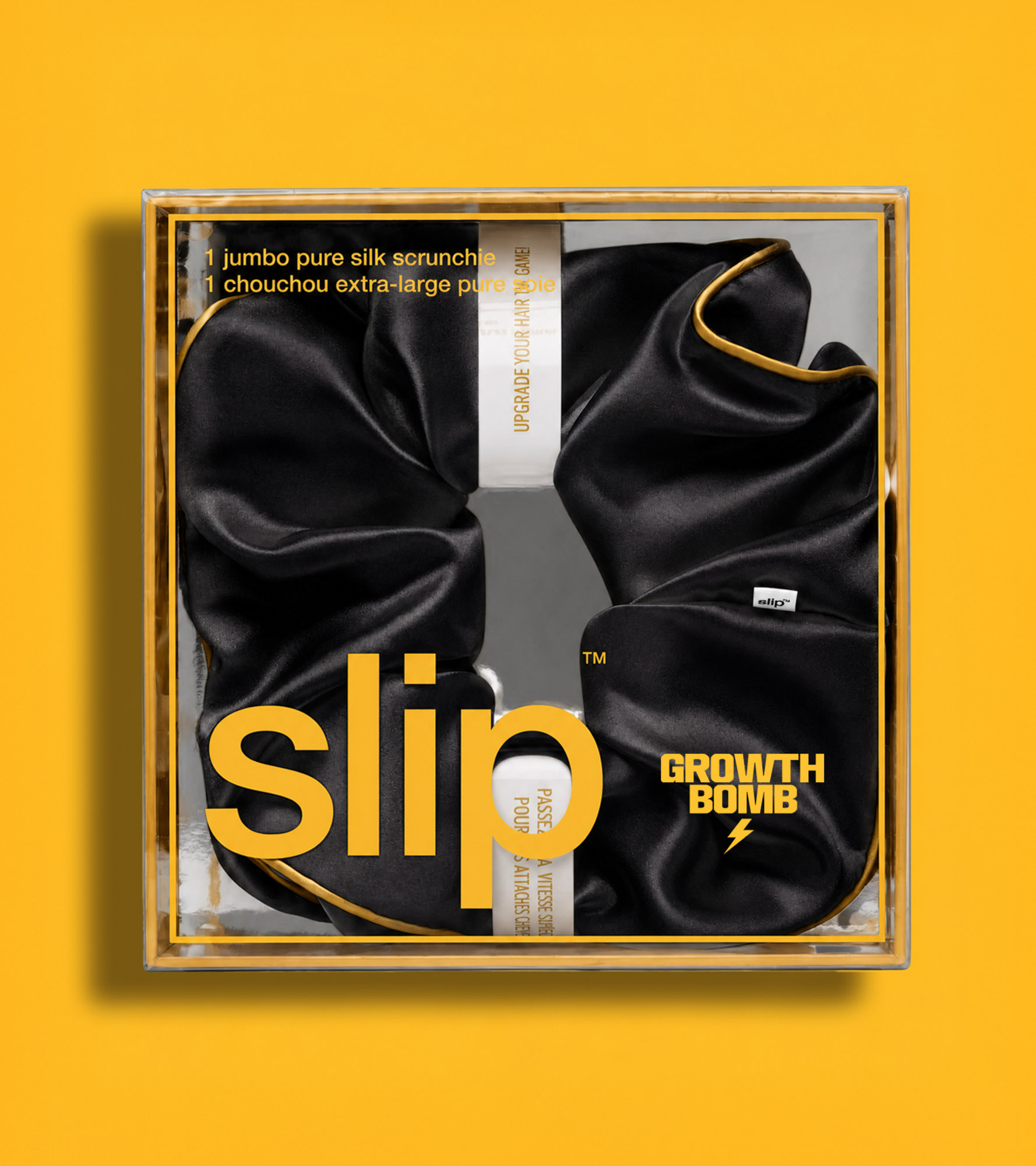
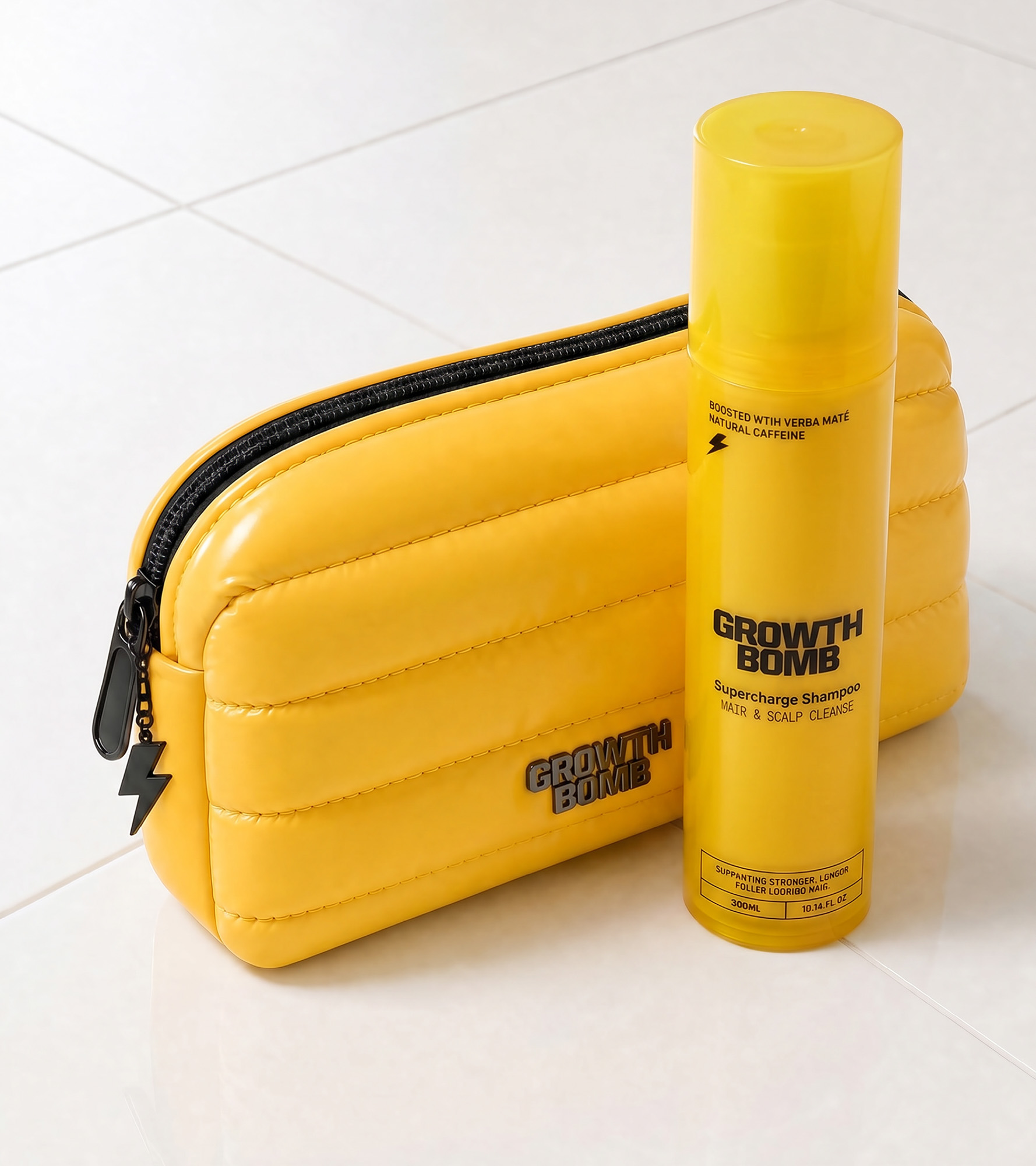
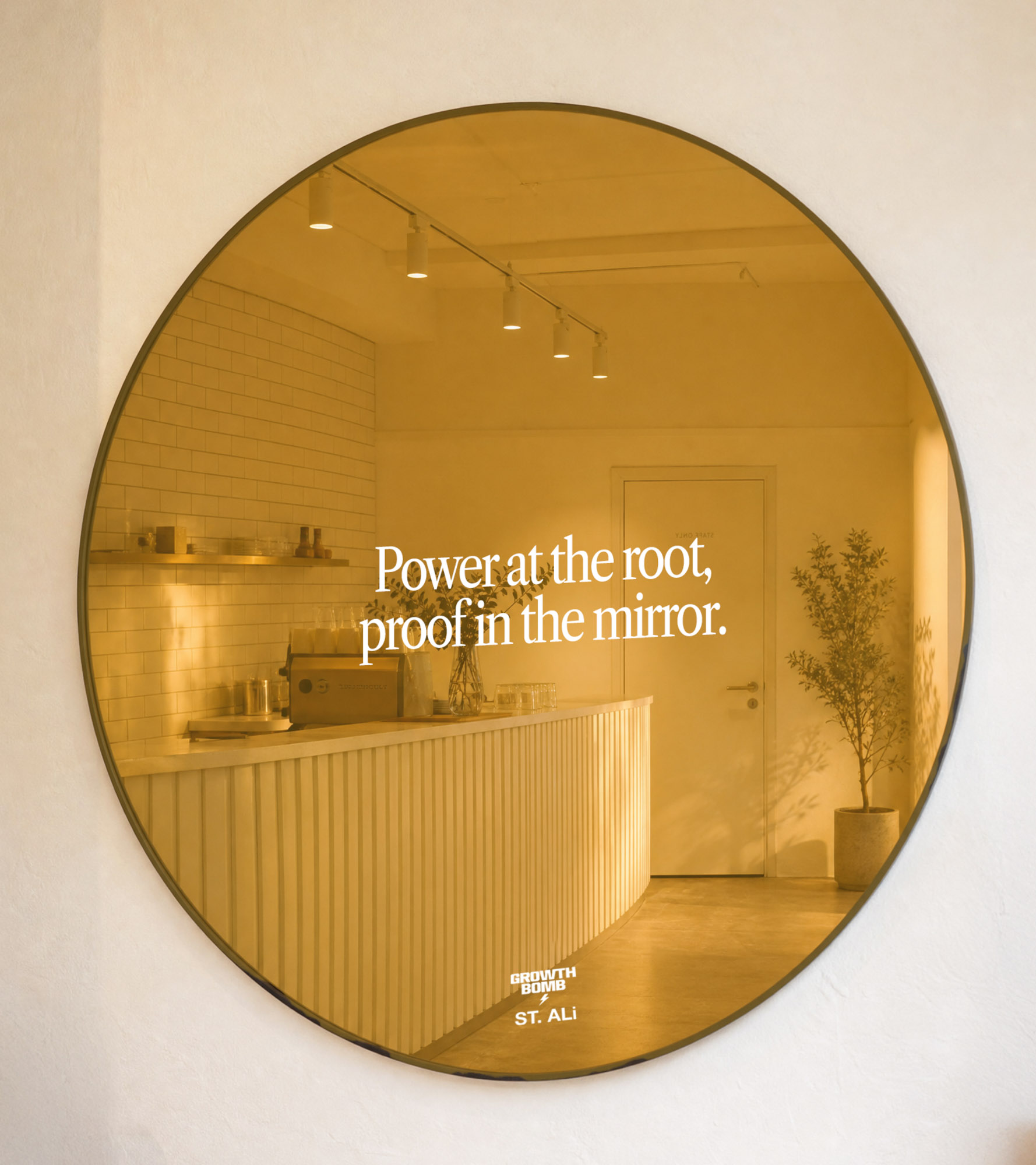
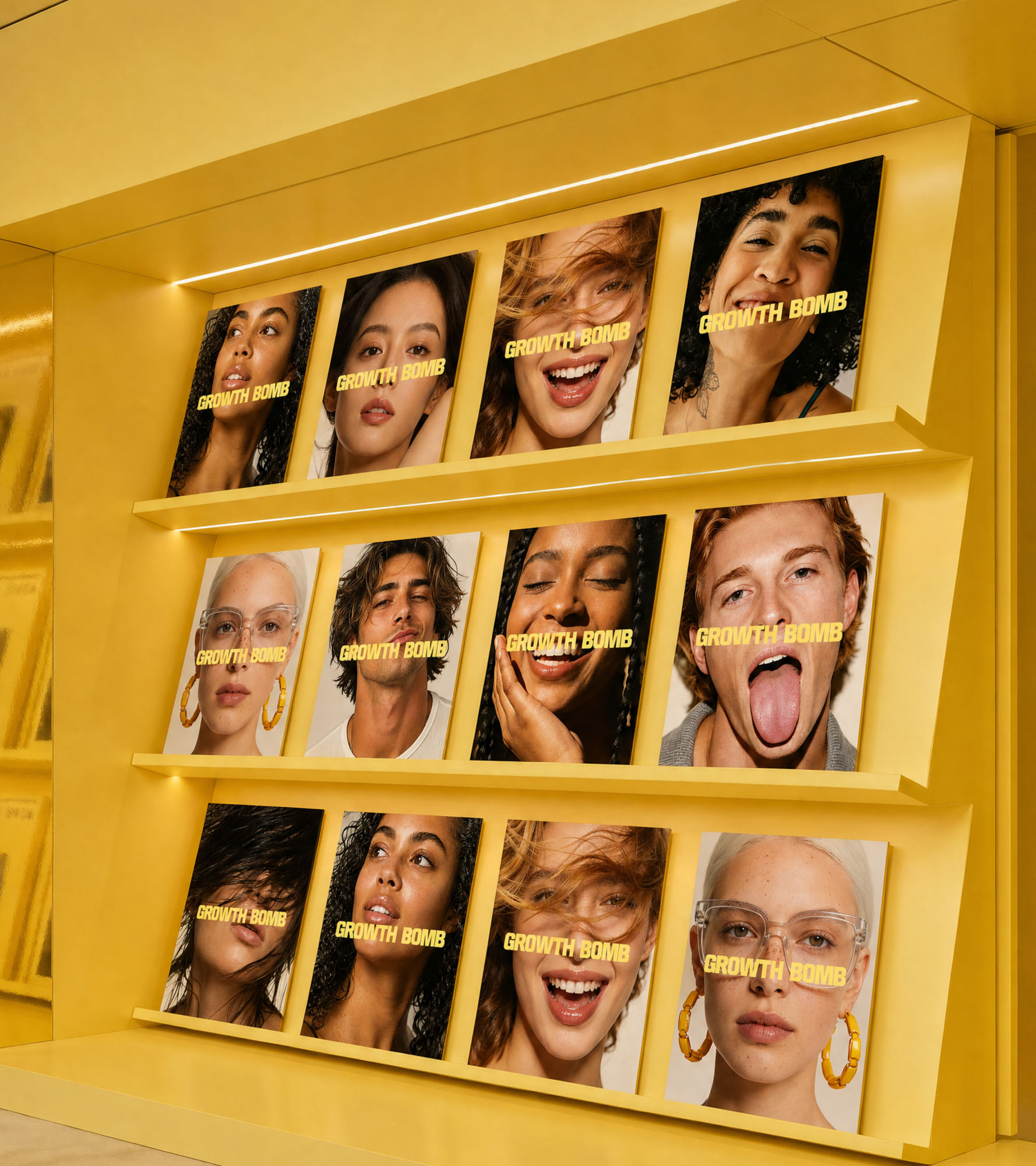

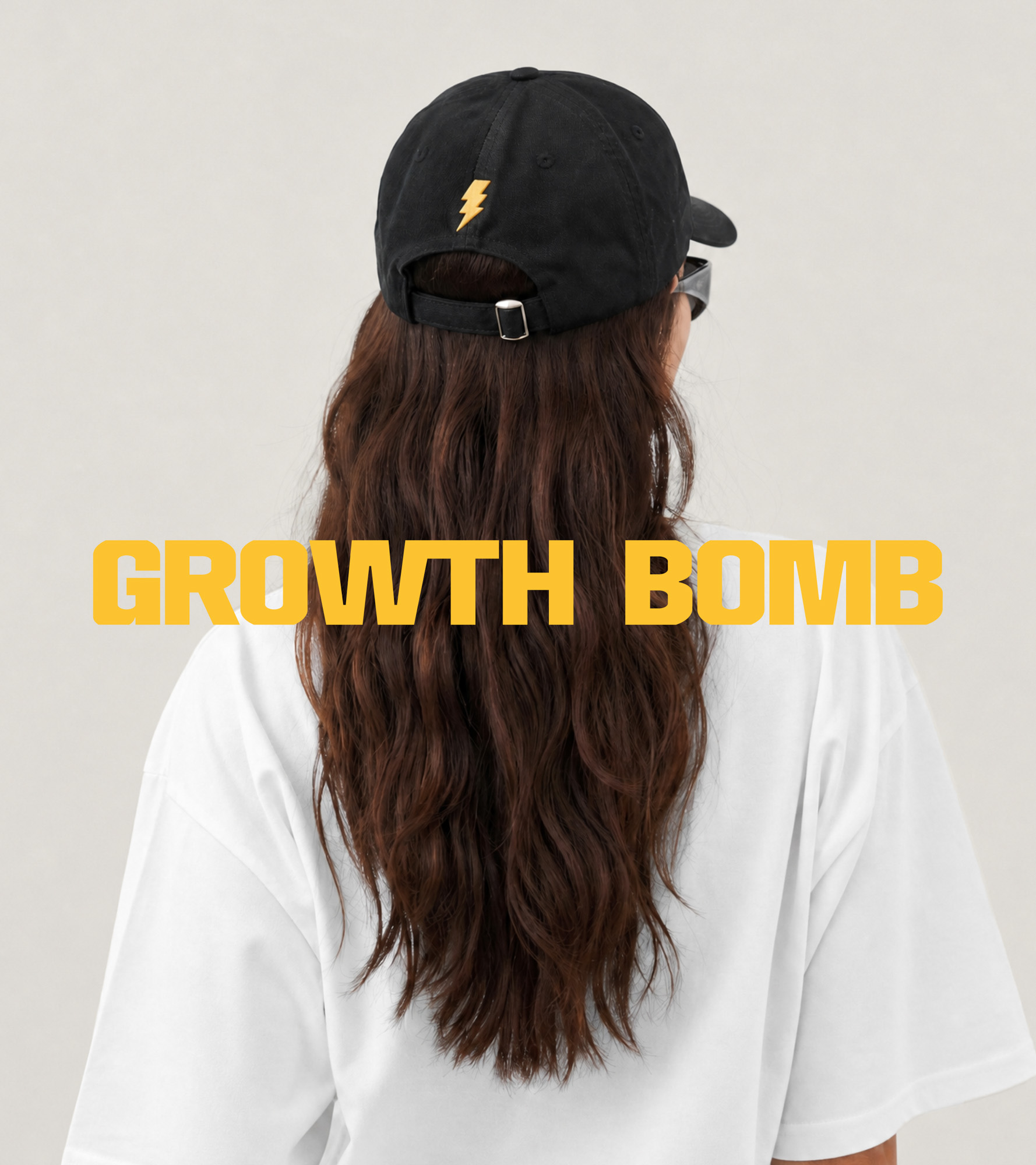
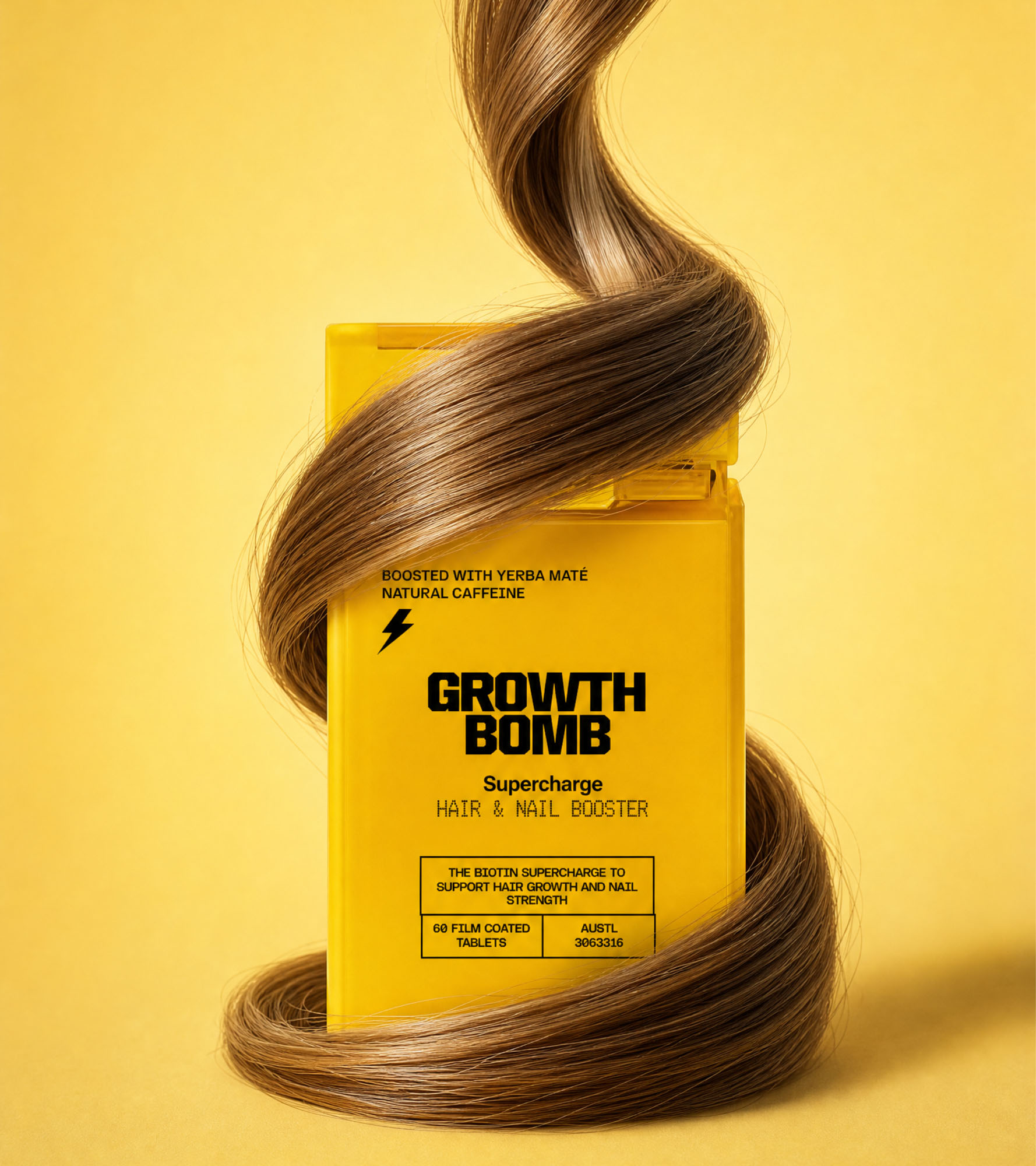
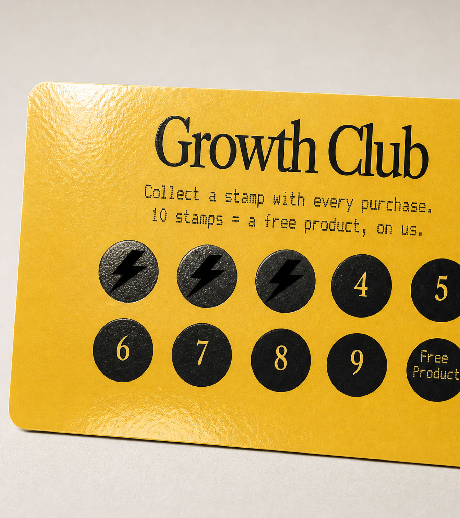
The result is a haircare brand with genuine pulse. Growth Bomb transforms scalp care from sleepy routine into full-system stimulation, giving people results they can see, rituals they can feel, and a brand world they actually want to belong to.
From the high-voltage visual identity to the stimulant-charged messaging system, every touchpoint was designed to create momentum: on shelf, online, and in culture. Growth Bomb doesn’t whisper about efficacy. It announces itself with confidence, clarity, and enough energy to cut through one of beauty’s most overcrowded categories.
In a market flooded with “clean”, calming, and clinically beige brands, Growth Bomb arrives like a live wire. Haircare, switched on.
© 2026 Smack Bang


We pay respect to the Traditional Custodians and First Peoples of NSW, and acknowledge their continued connection to their country and culture.