We pay respect to the Traditional Custodians and First Peoples of NSW, and acknowledge their continued connection to their country and culture.
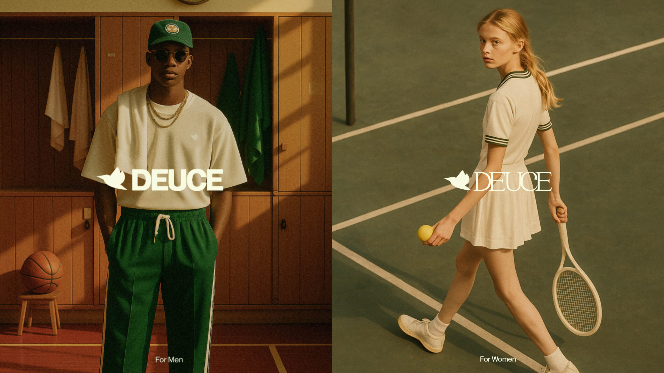
Where pressure builds, sweat drips, and character is revealed: Deuce is performance apparel built for the inner game. Less about who wins, more about how you play. Made for the ones who show up with purpose, practice with presence, and leave nothing behind but grit and grace.
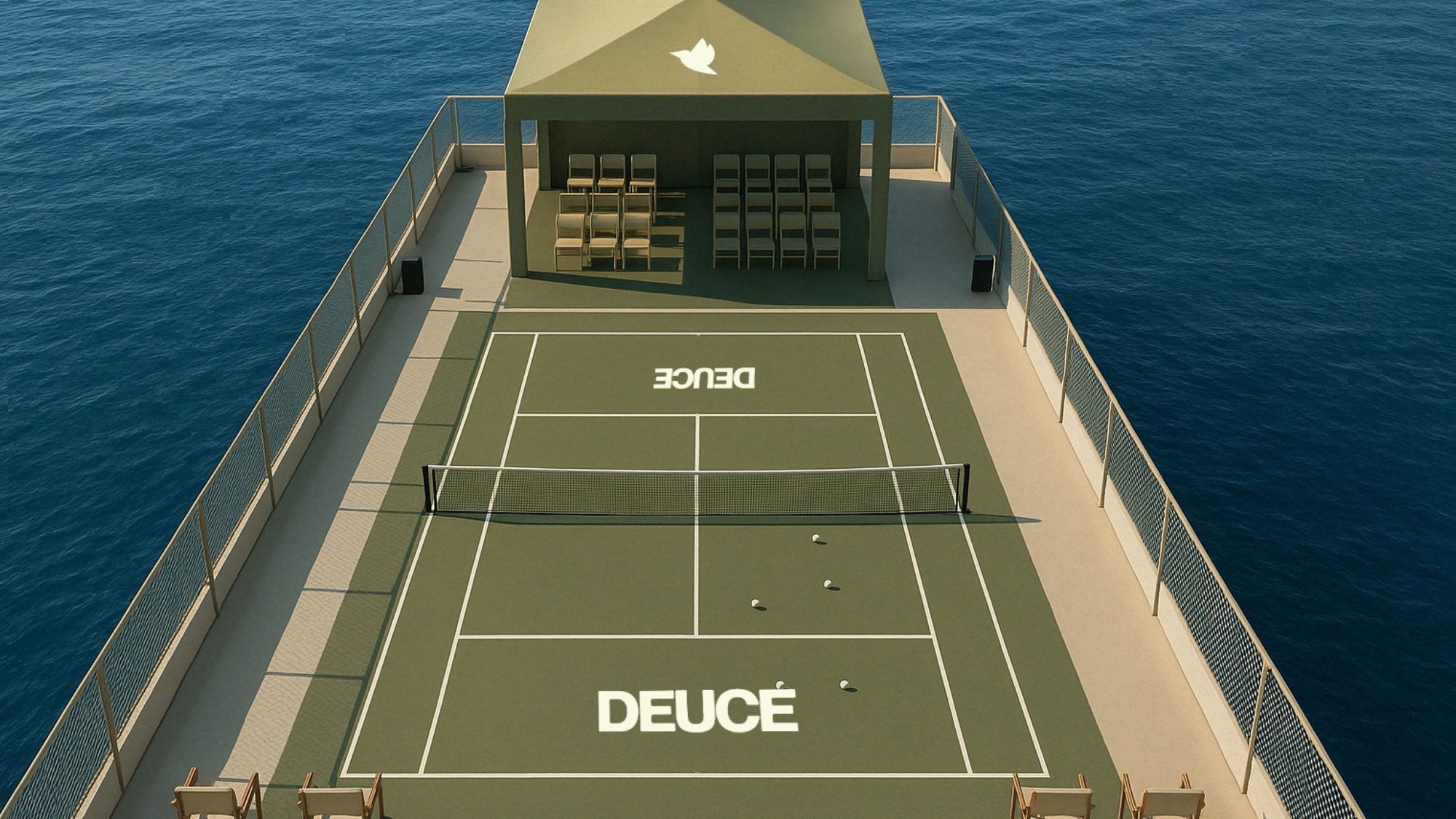
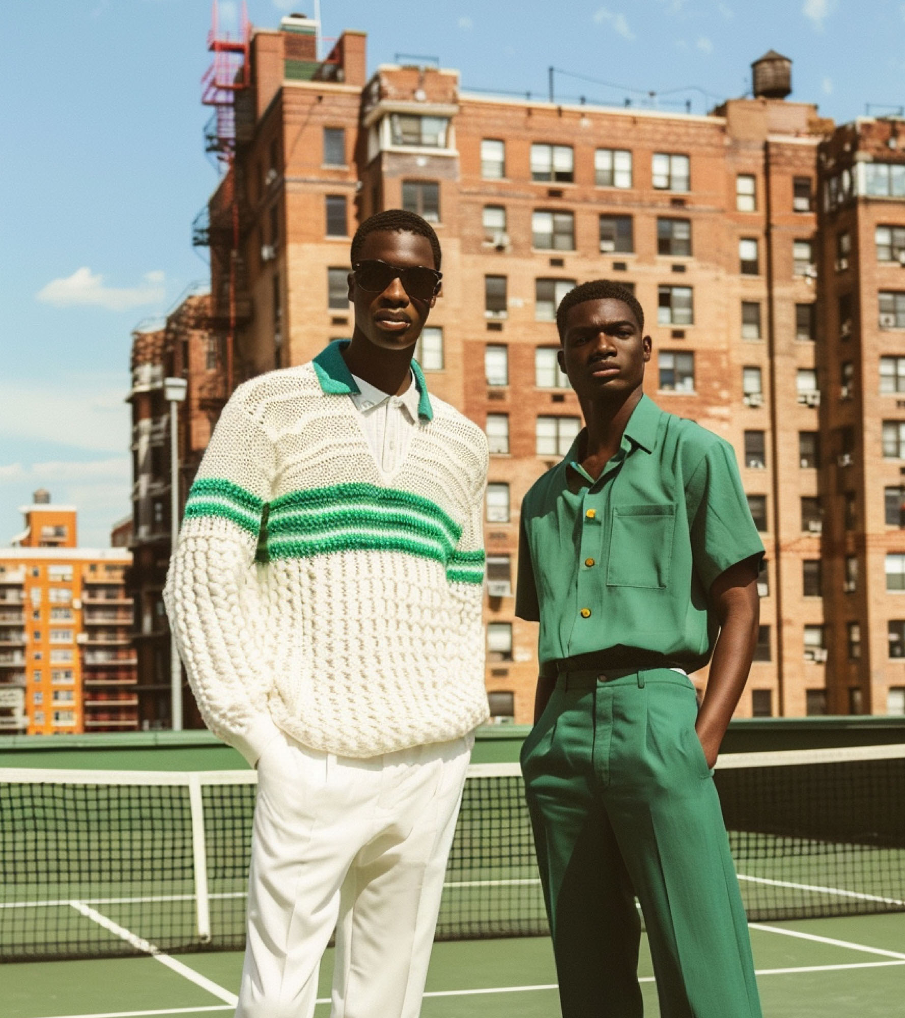
Deuce nods to tennis tradition, then flips the script. Heritage holds weight, but culture moves fast. Born at the intersection of sport, style, and social ritual, Deuce reimagines tennis for a new era, trading country club codes for cultural cues. Here, mindset is the metric. Movement is meditation. And feeling pride despite what the scoreboard says is the ultimate flex.
When we set out to build the brand, we knew it had to move differently. Not just on the court, but in culture. Deuce is performance apparel with a mindset-first philosophy, made for the athletes who show up with purpose, practice with presence, and leave nothing behind but grit and grace.
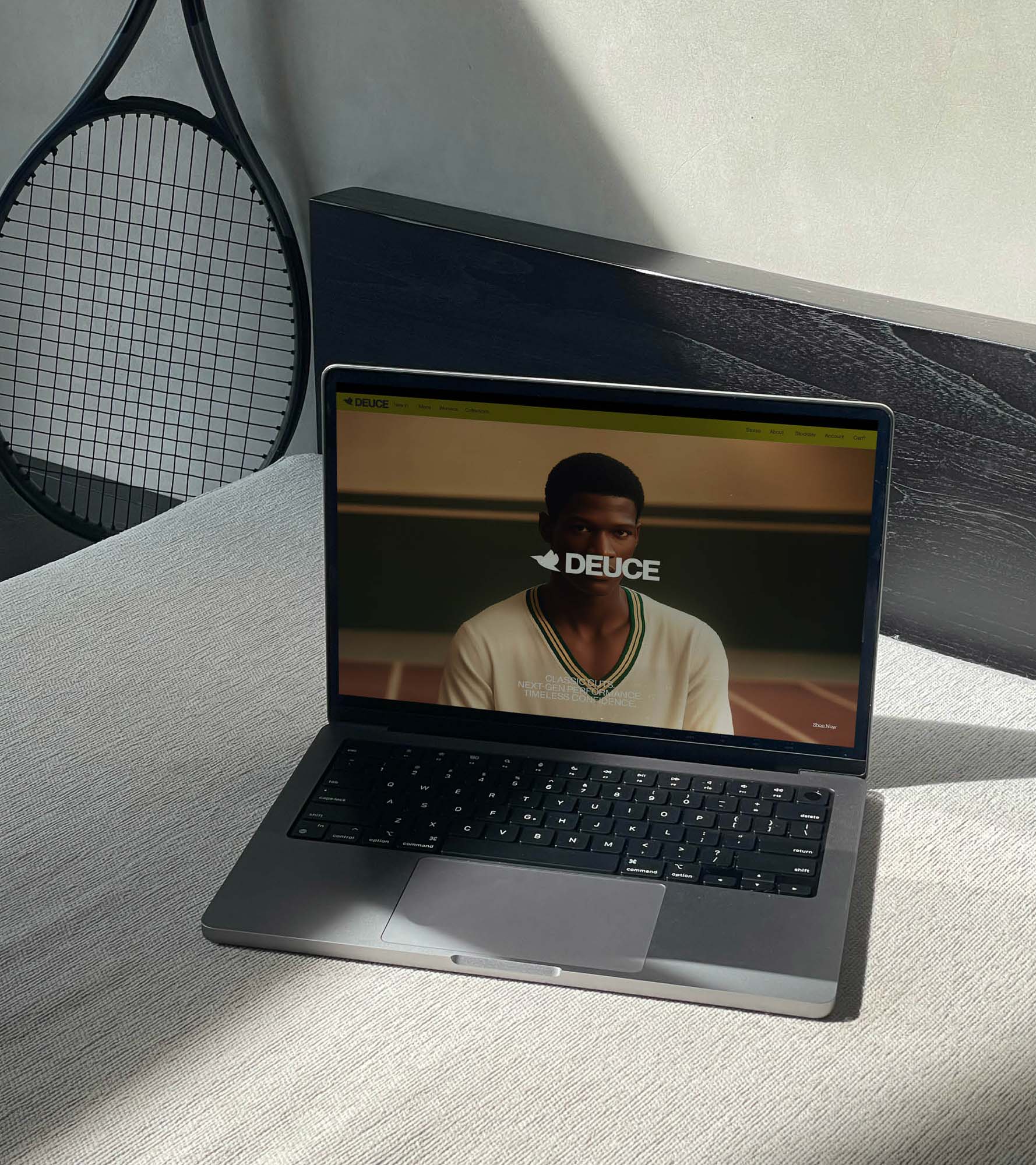
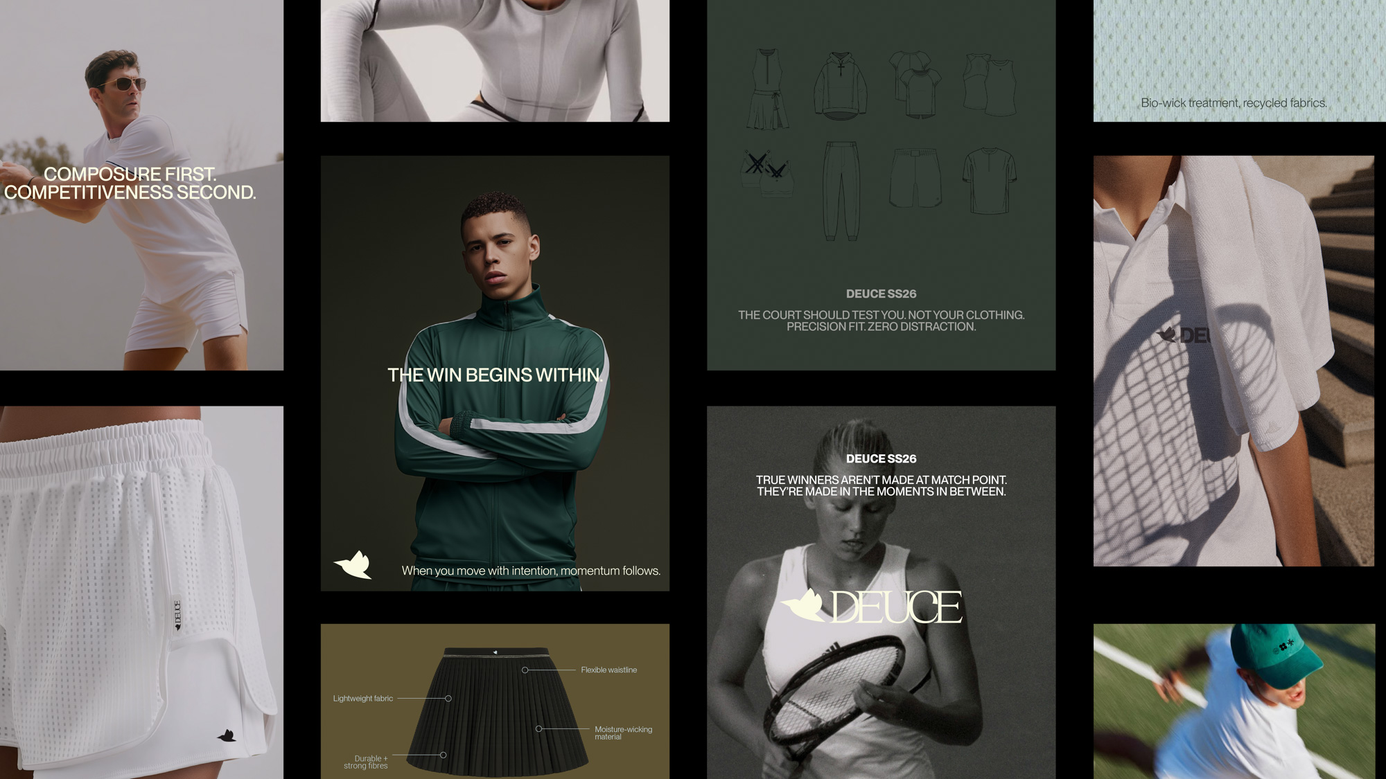
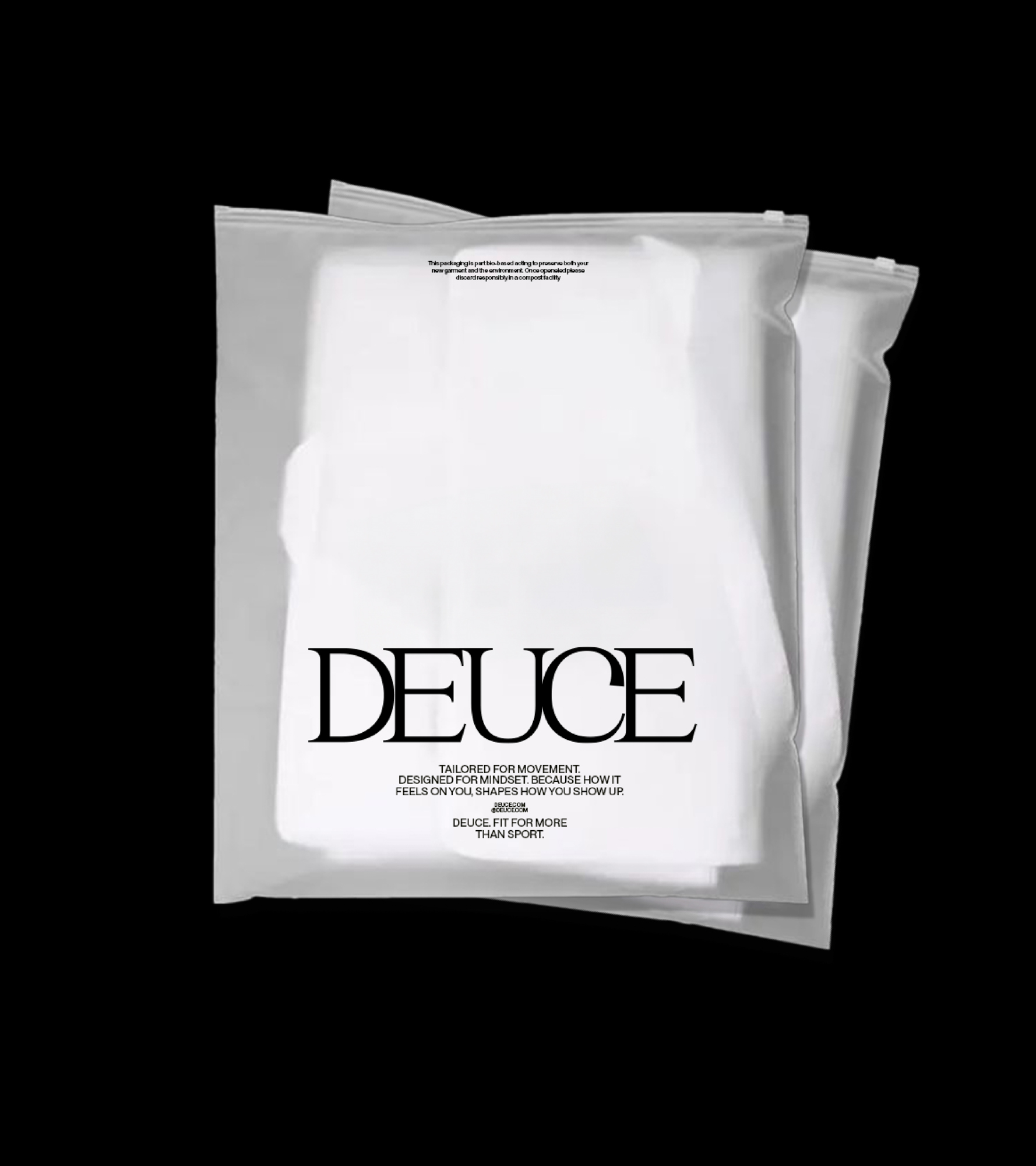
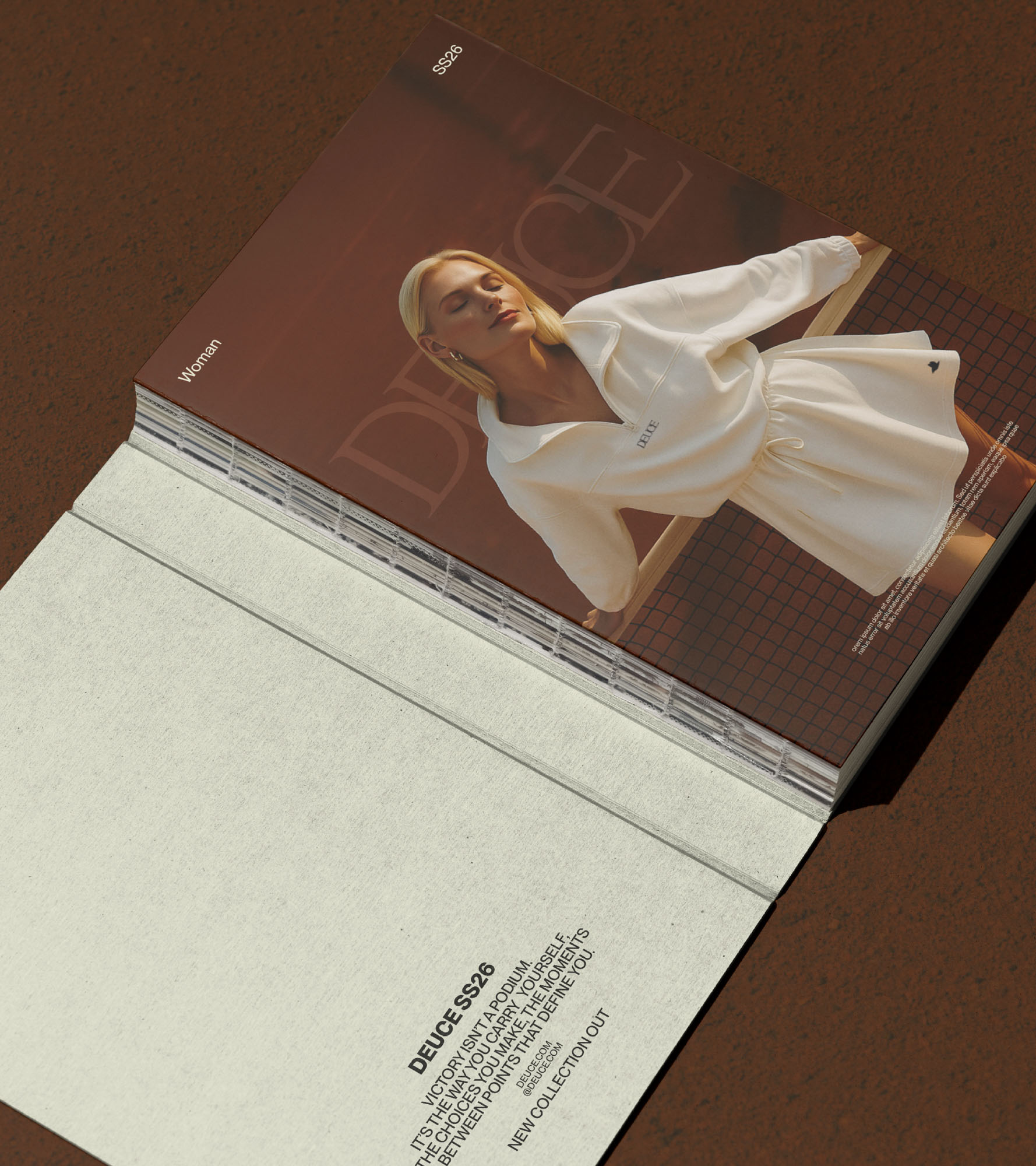
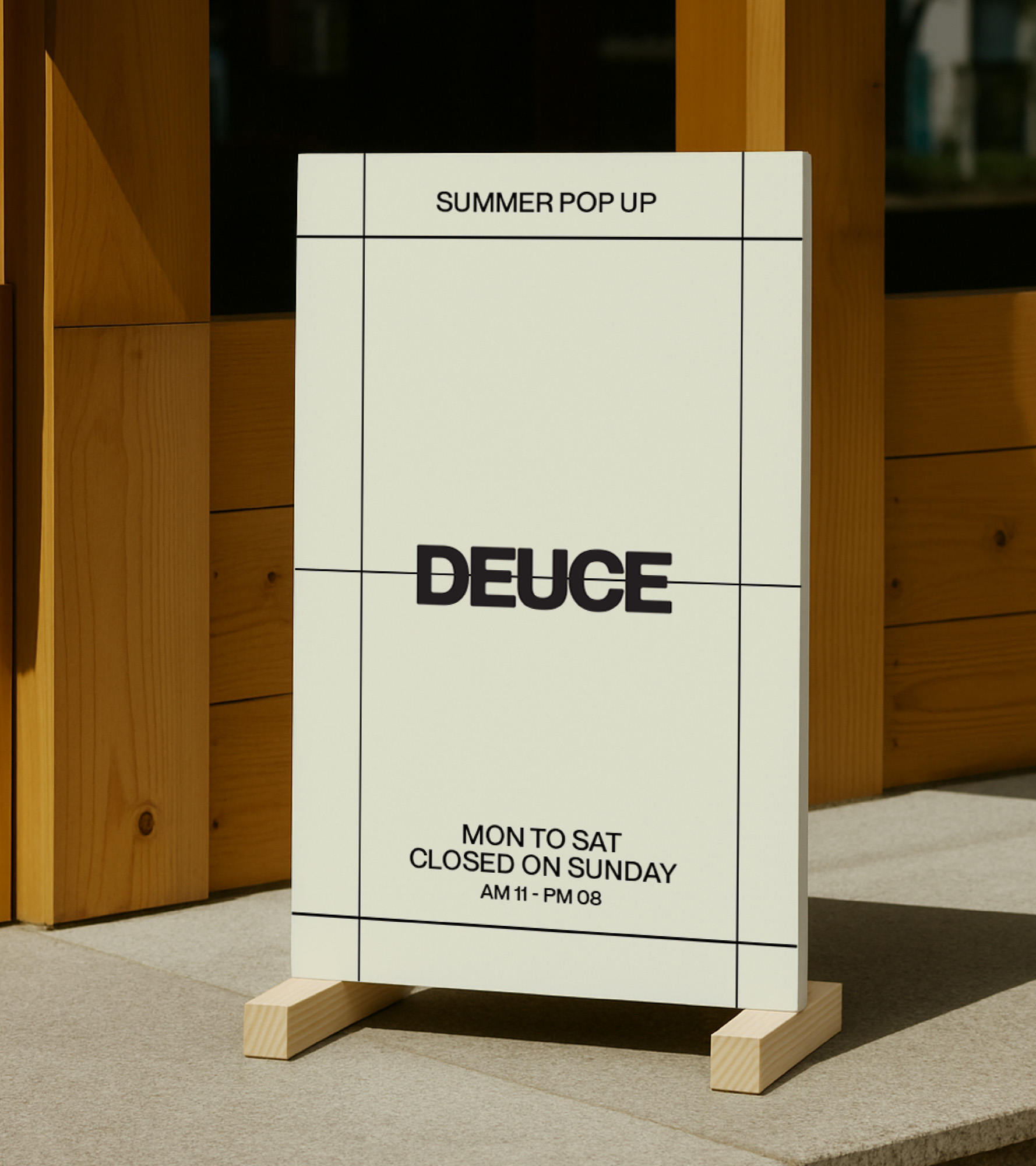
We built Deuce as a brand that could live at the intersection of heritage and innovation, blending technical credibility with cultural clout. Every element was crafted to reflect where classic sport cuts meet next-gen functionality, and retro typography plays against sleek minimalism.

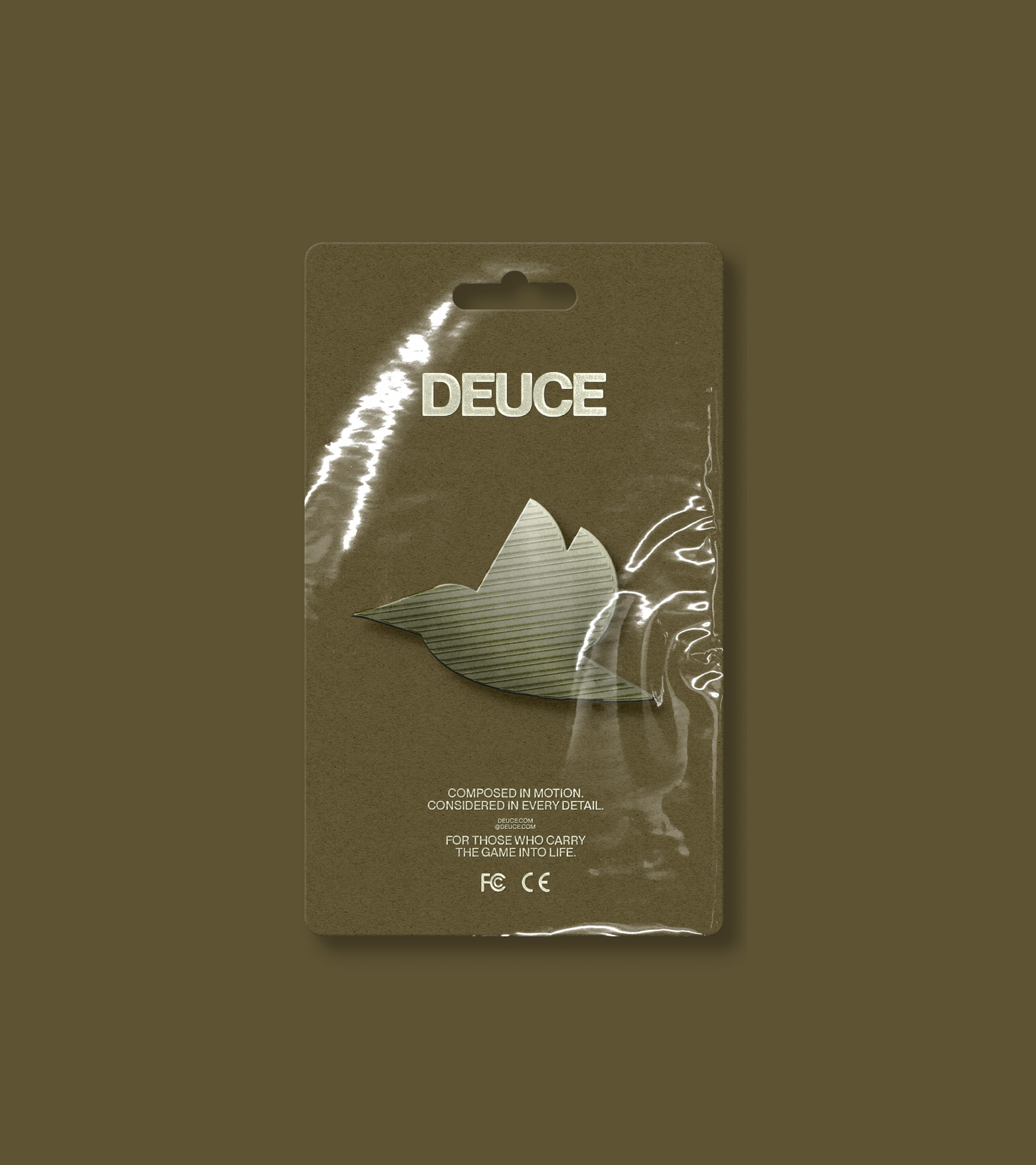
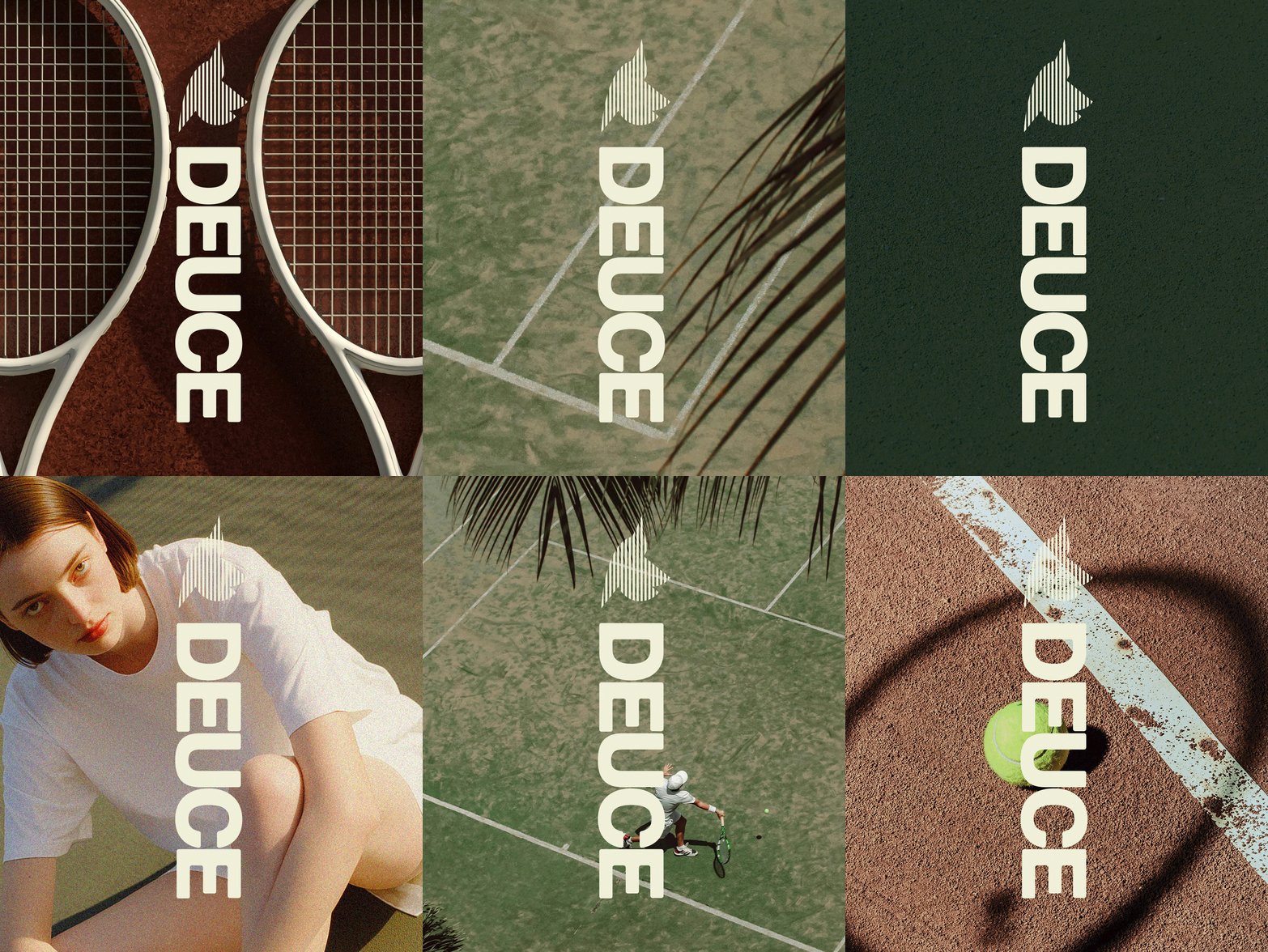
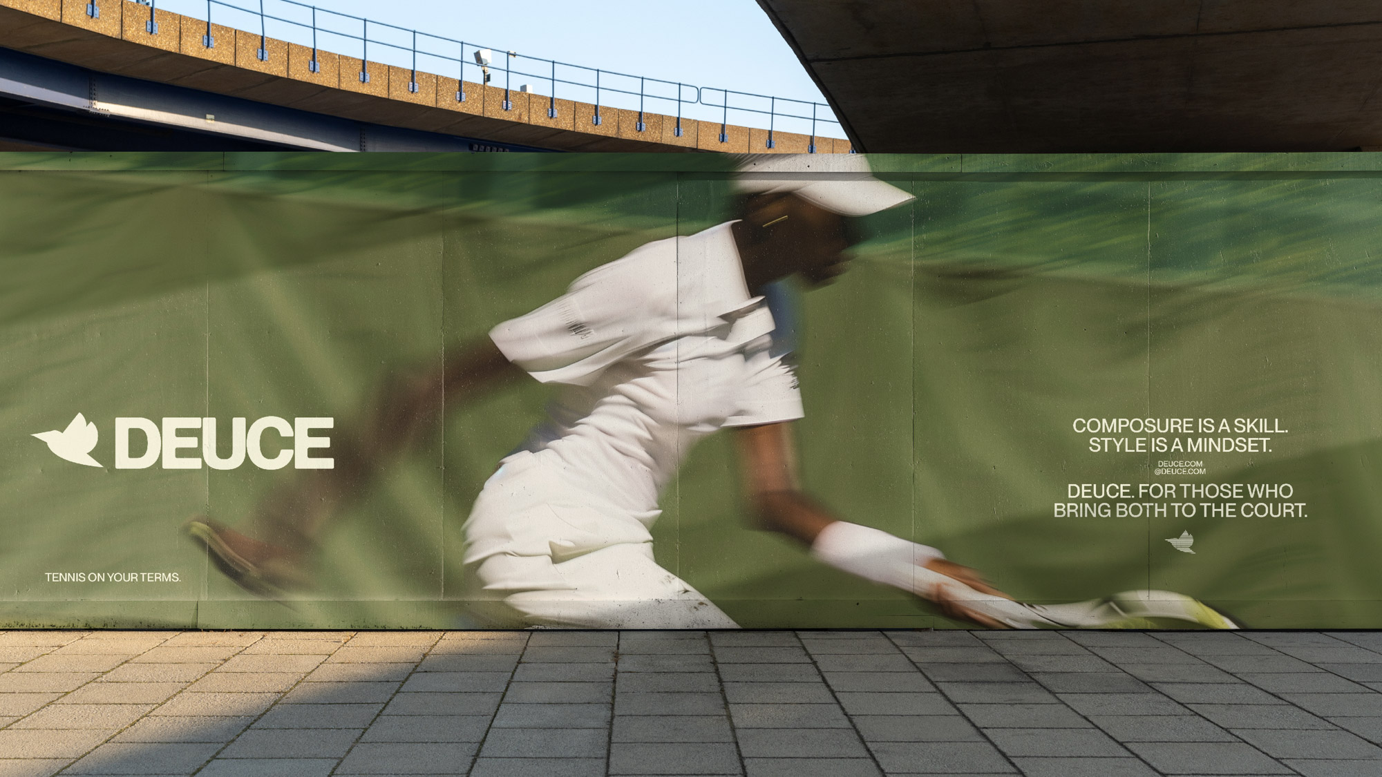
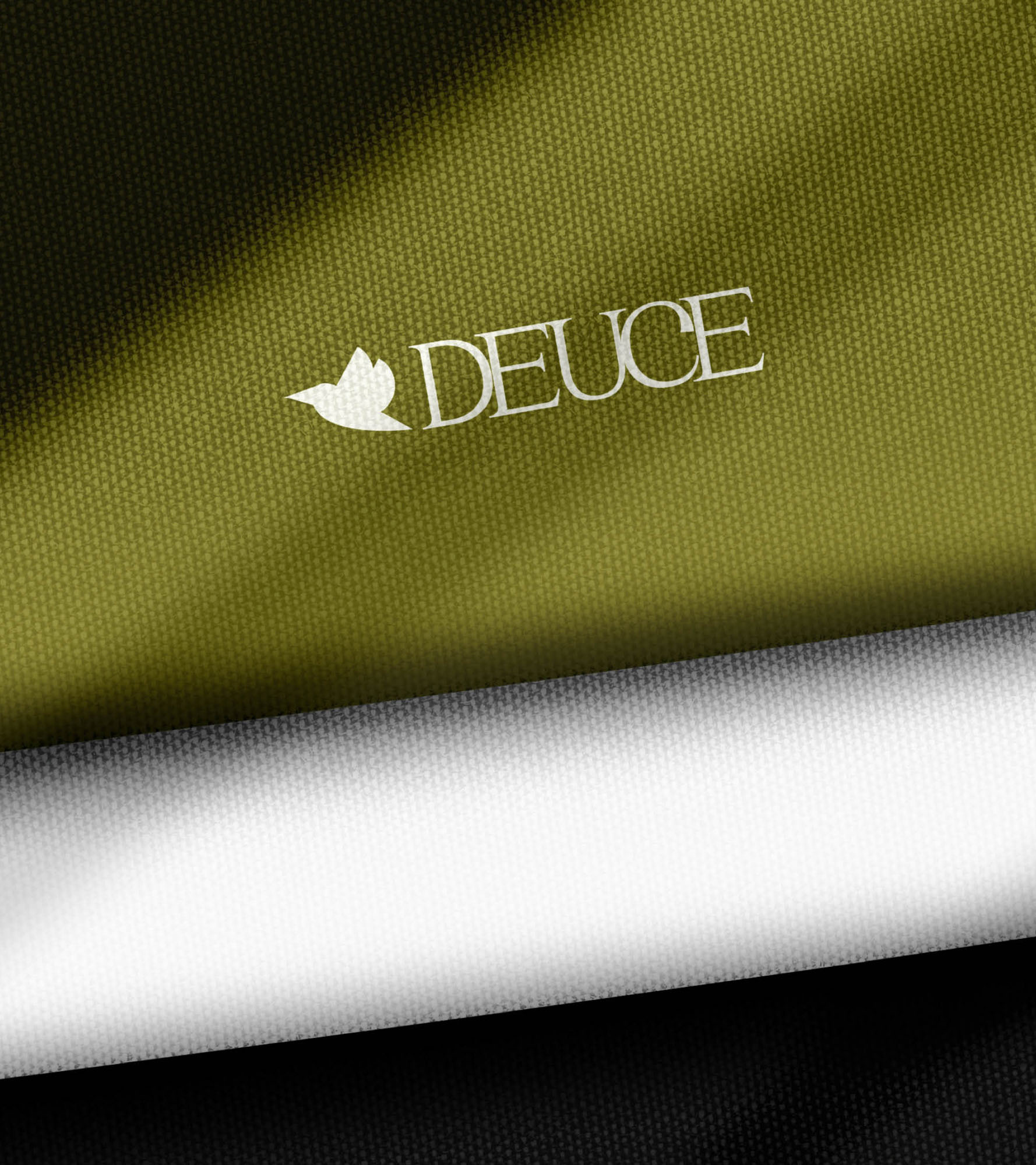
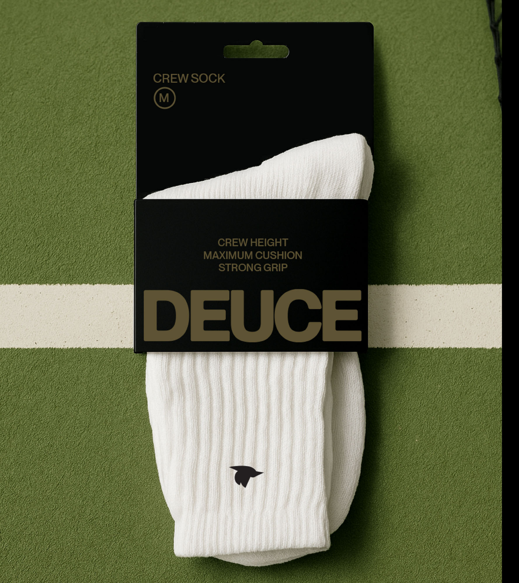
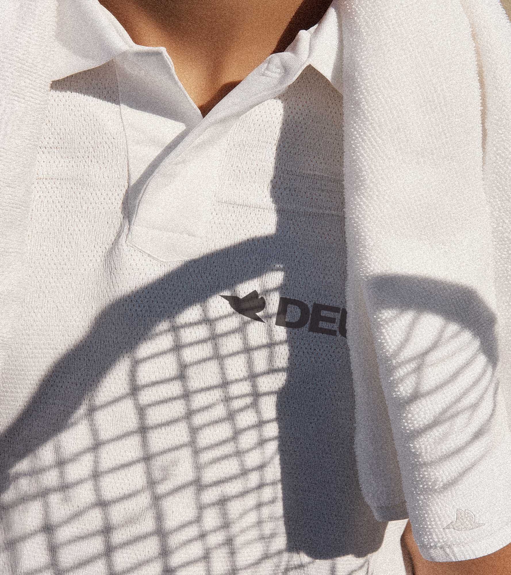
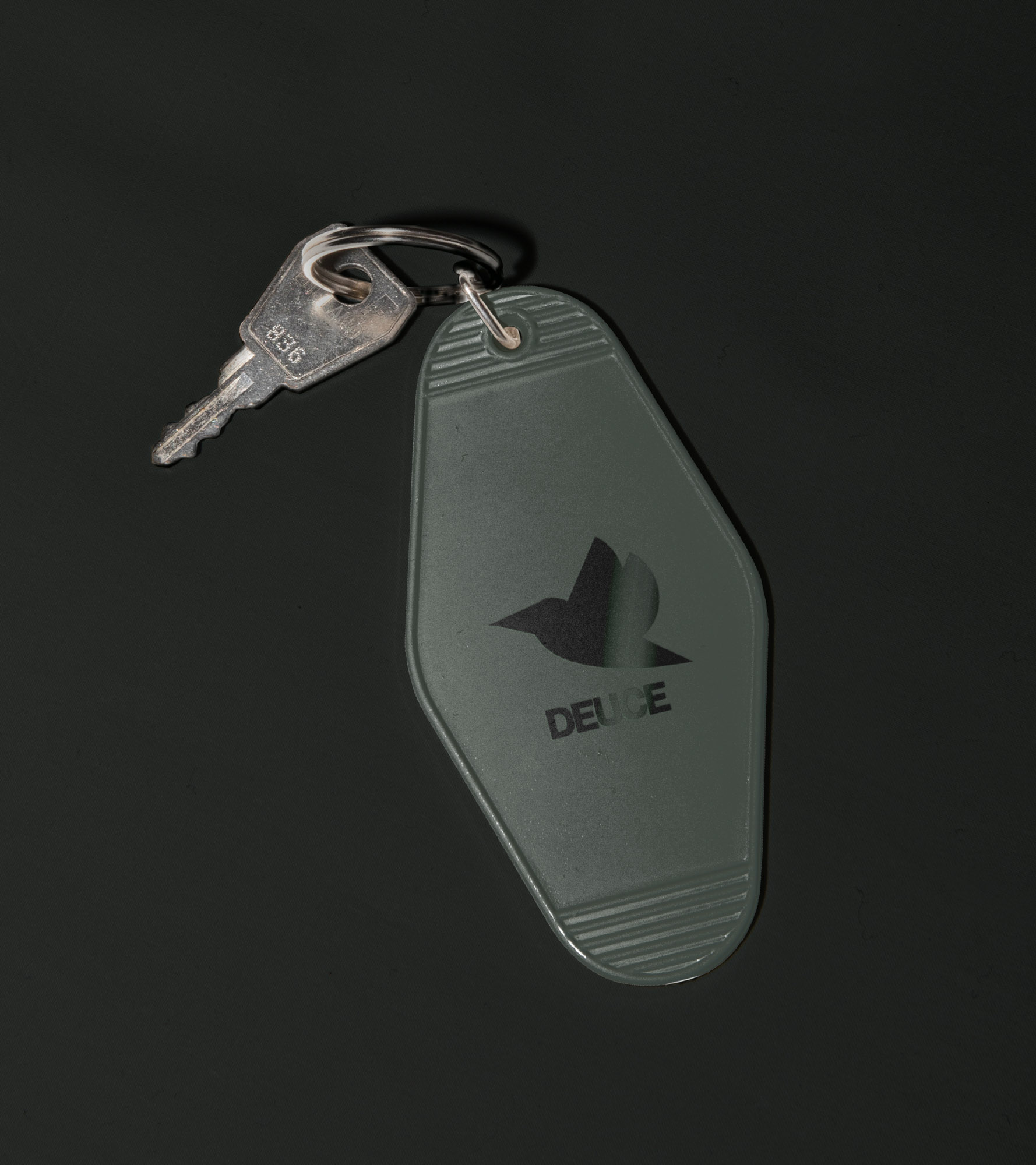
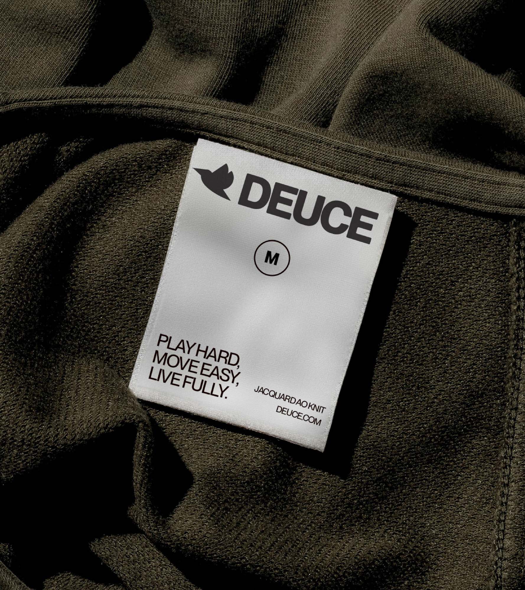
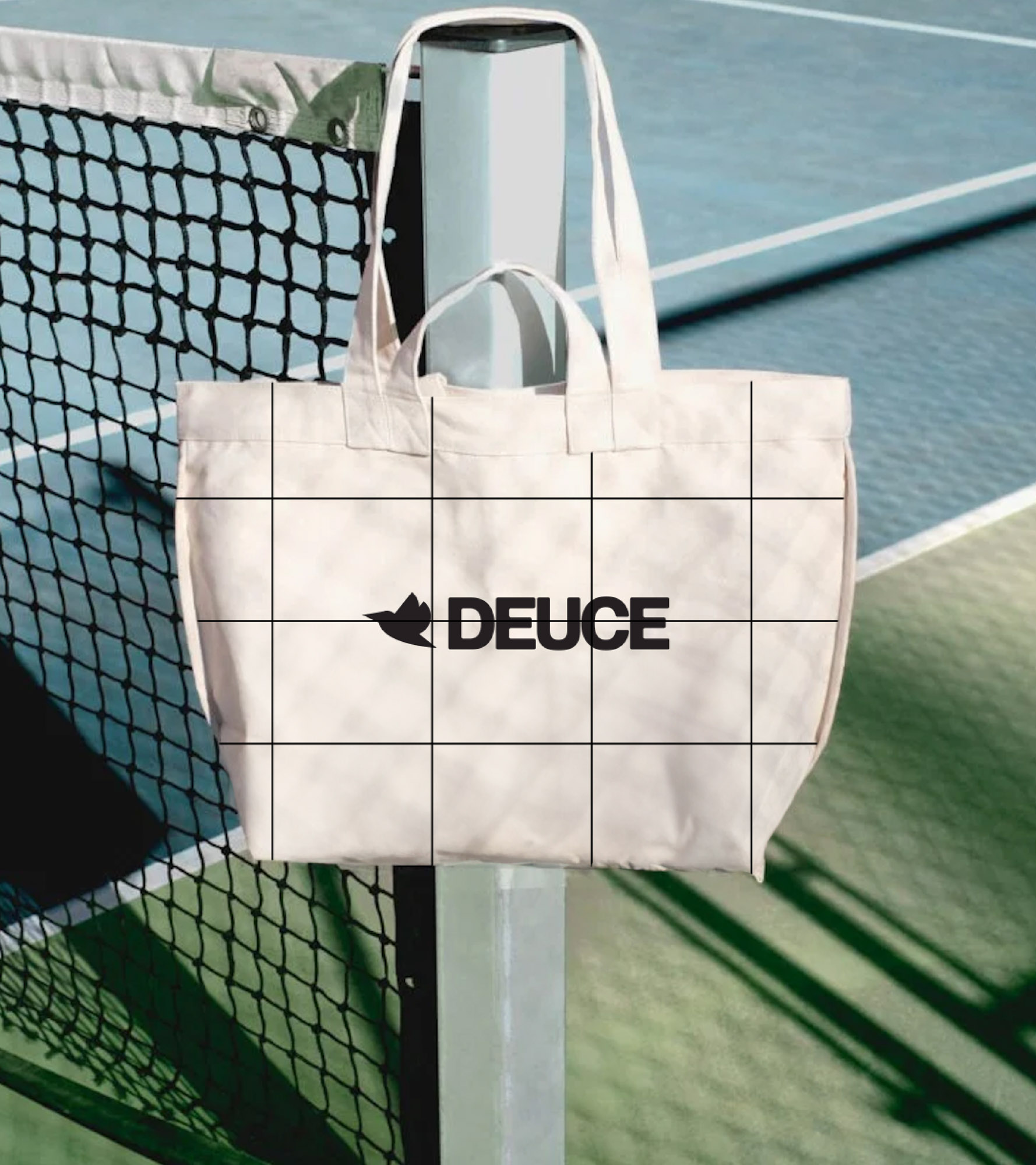
At the heart of the brand lies a mark in motion; the hummingbird. Small but powerful, it represents adaptability, fluidity, and precision: qualities essential not only to sport, but to the Deuce state of mind. Agile enough to change direction mid-air, the hummingbird speaks to athletes who pivot with intention and move through challenge with grace. Inspired by the legacy of animal iconography in heritage sports brands, the symbol pays homage to tradition while nodding to a new era, one that moves differently, plays differently, and lives without limits.
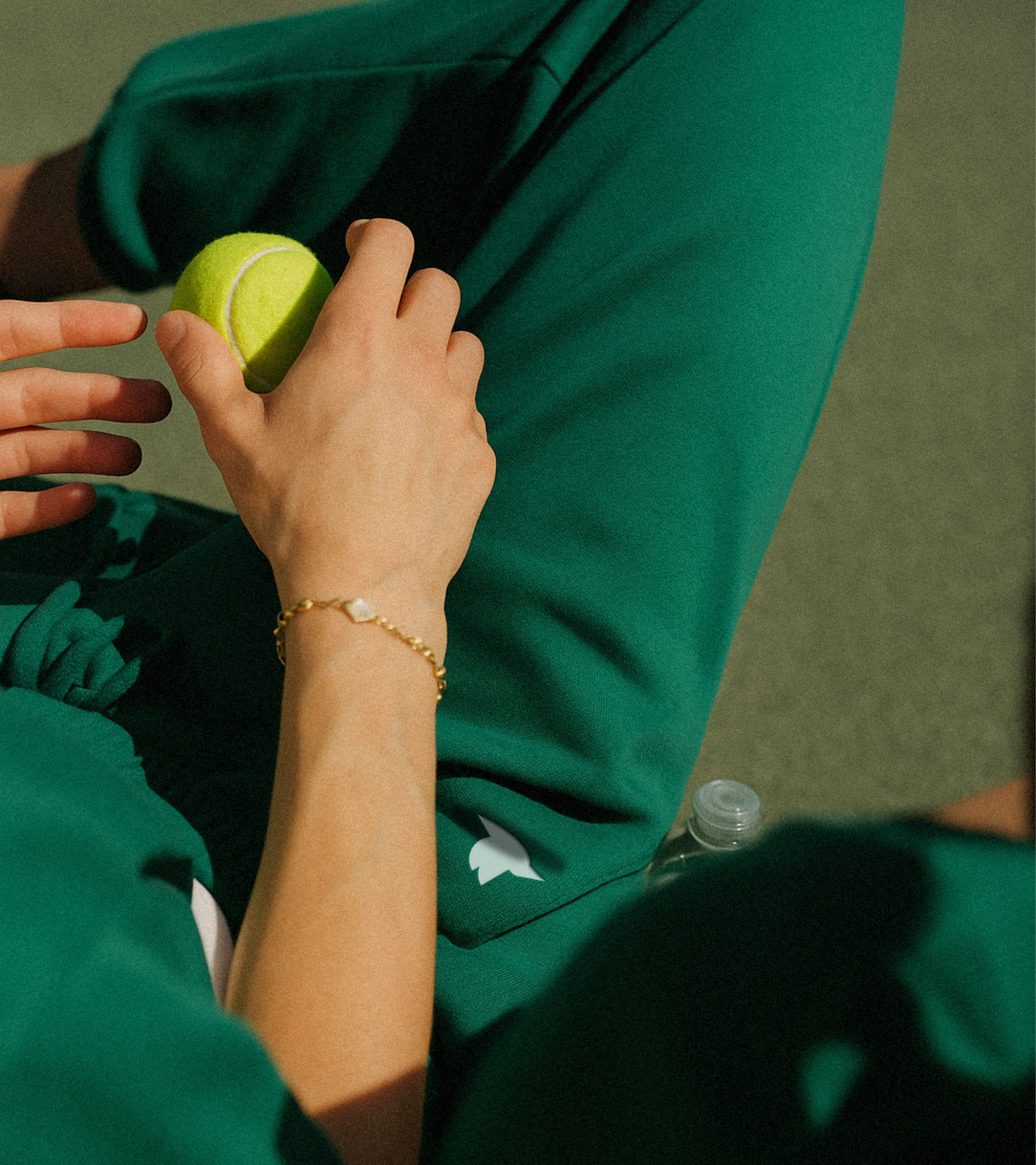
The palette draws from courts and cool minds, a refined suite of tonal earths, with accents that punch in all the right places. Typography is clean but not cold. Confident, not overbearing. Every asset flexes between quiet strength and athletic ease, from campaign styling to digital interactions. A brand system designed to stretch, move, and elevate without ego.
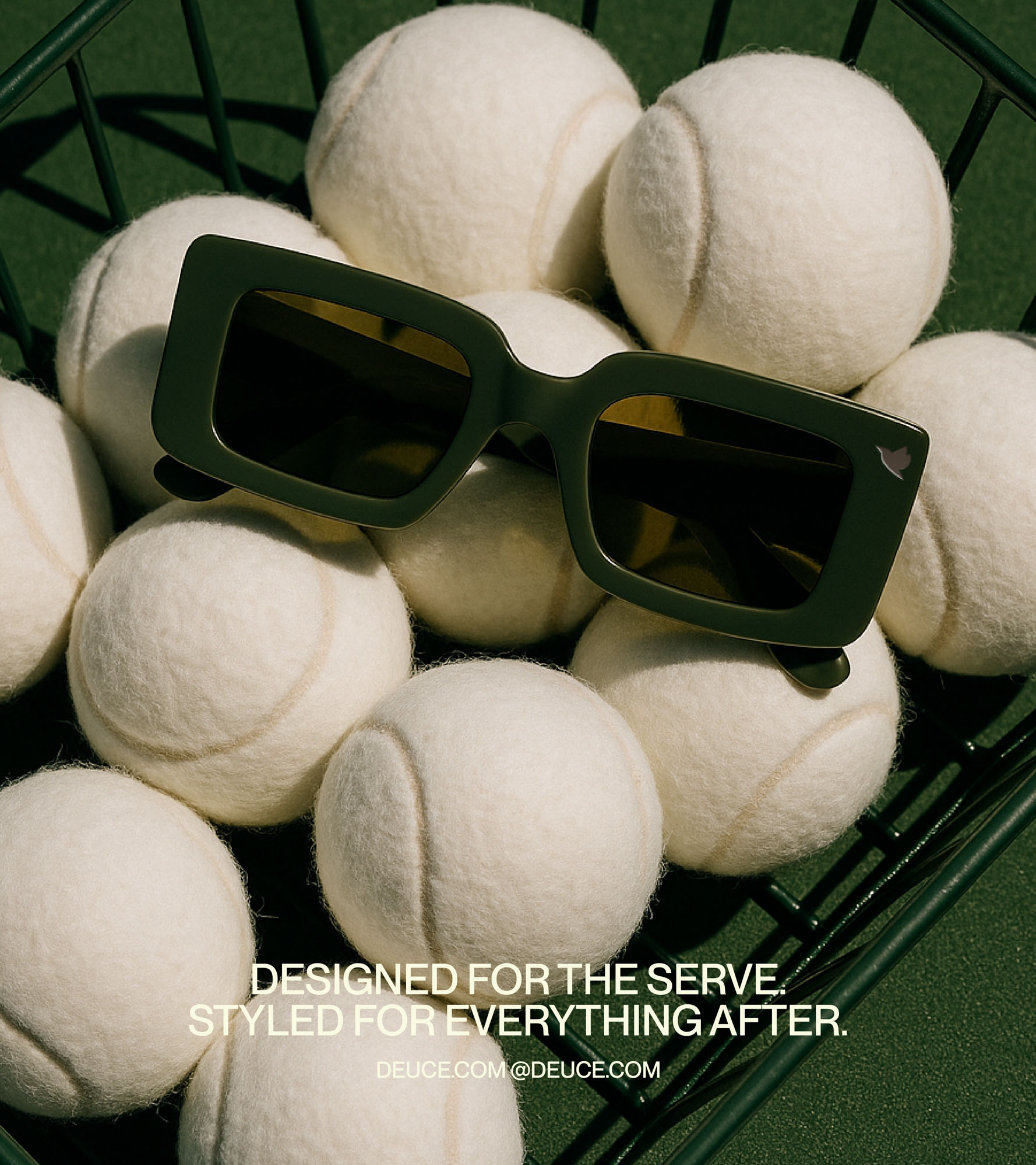
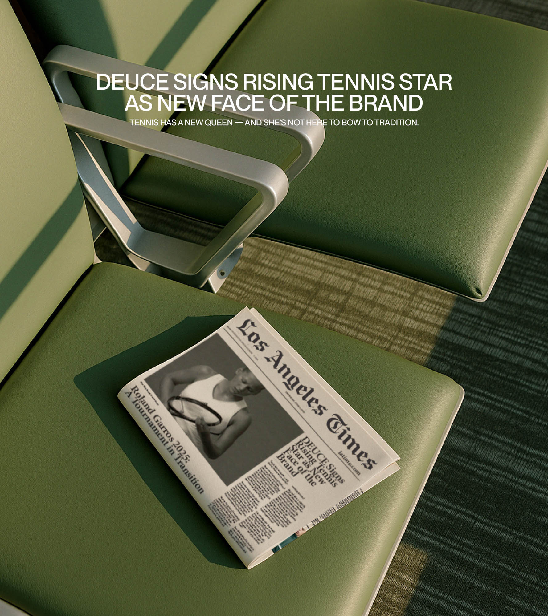

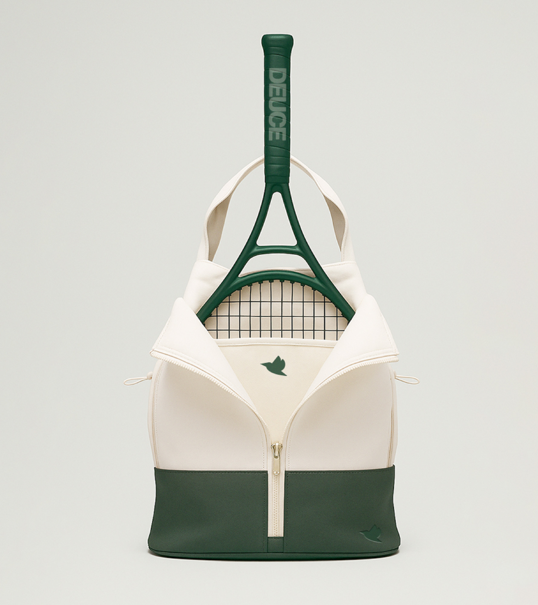
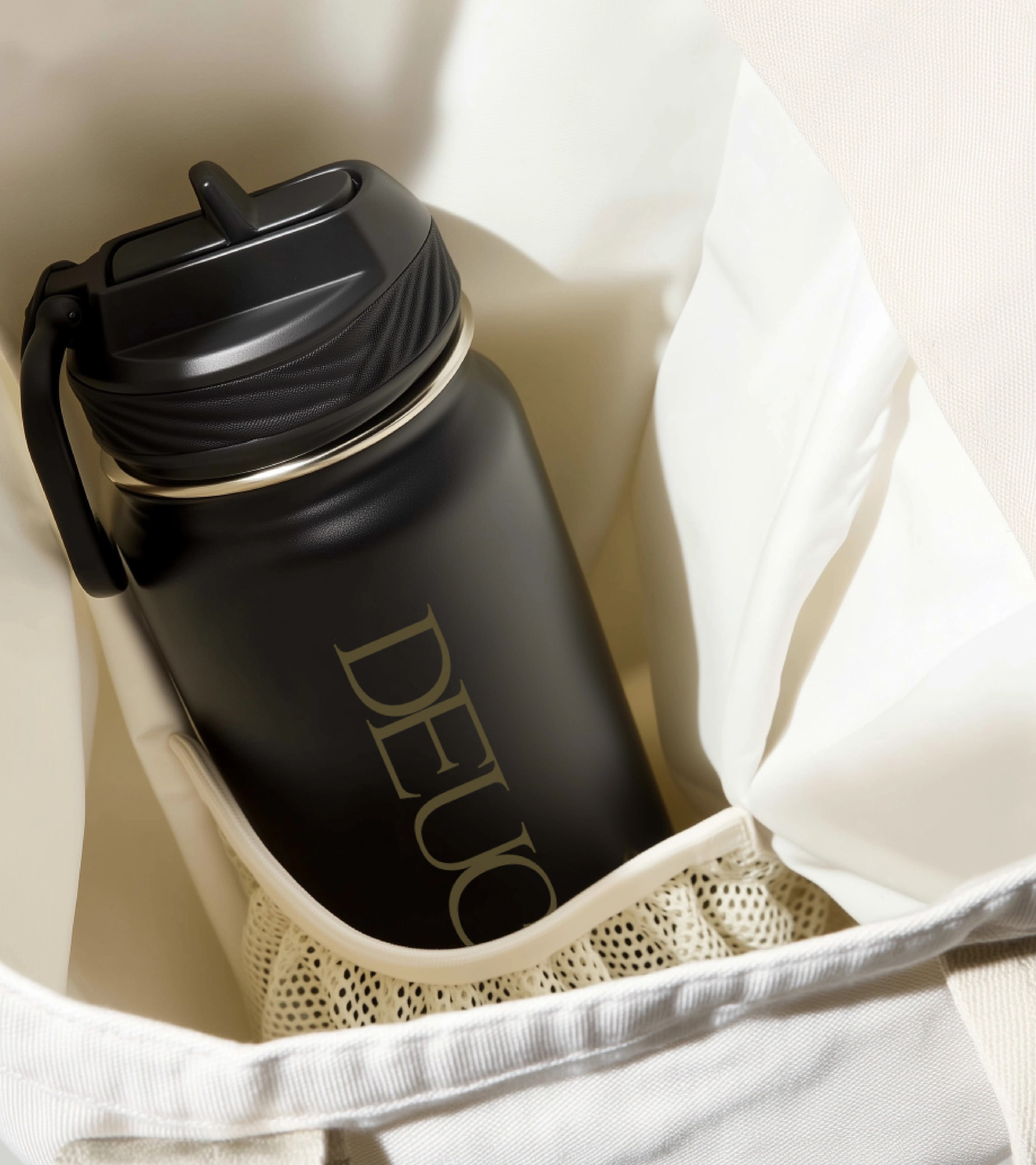
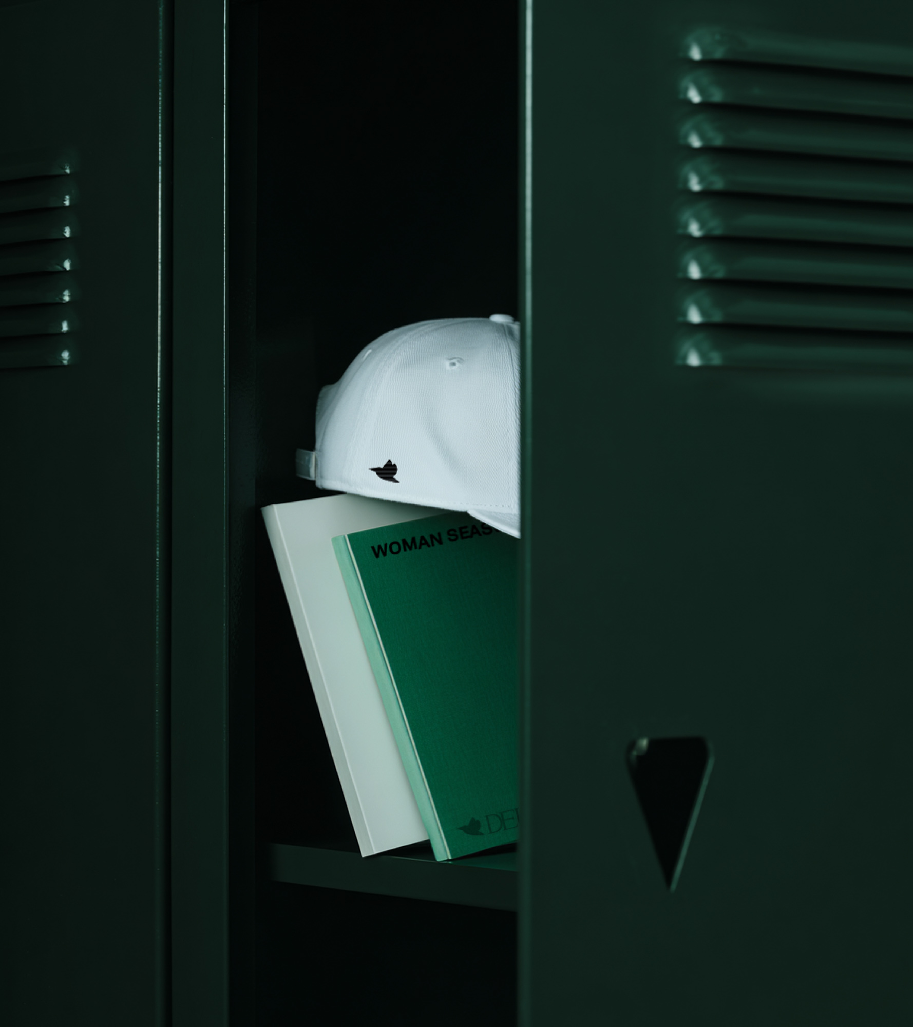
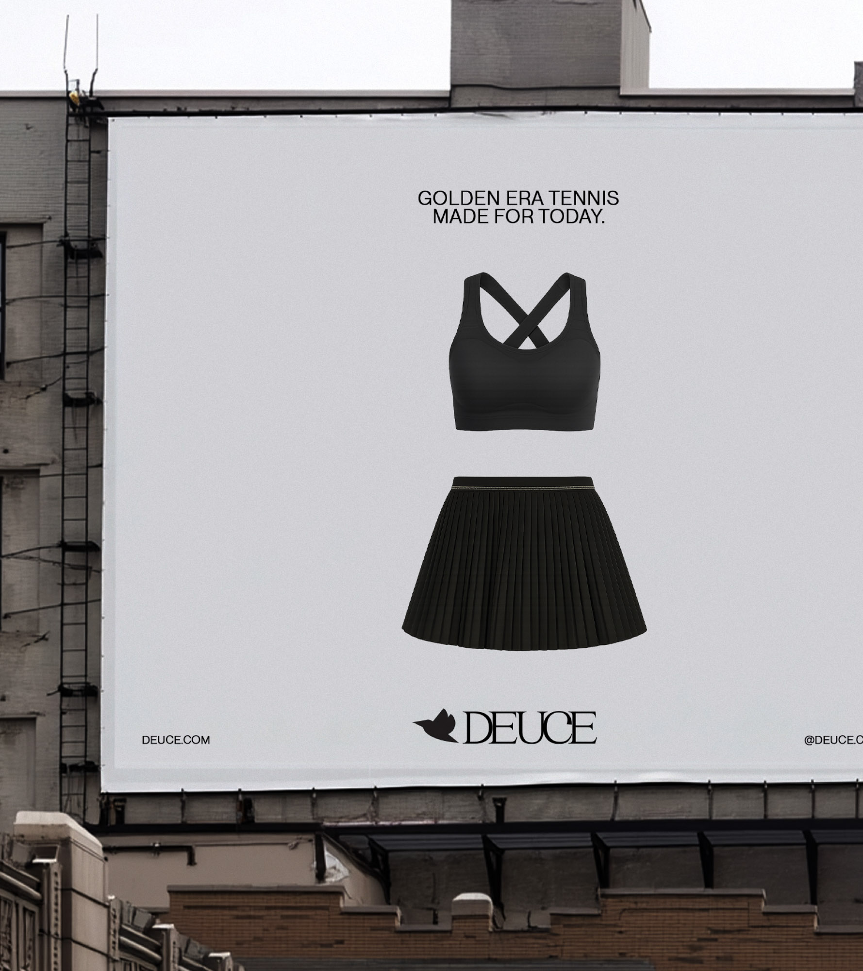
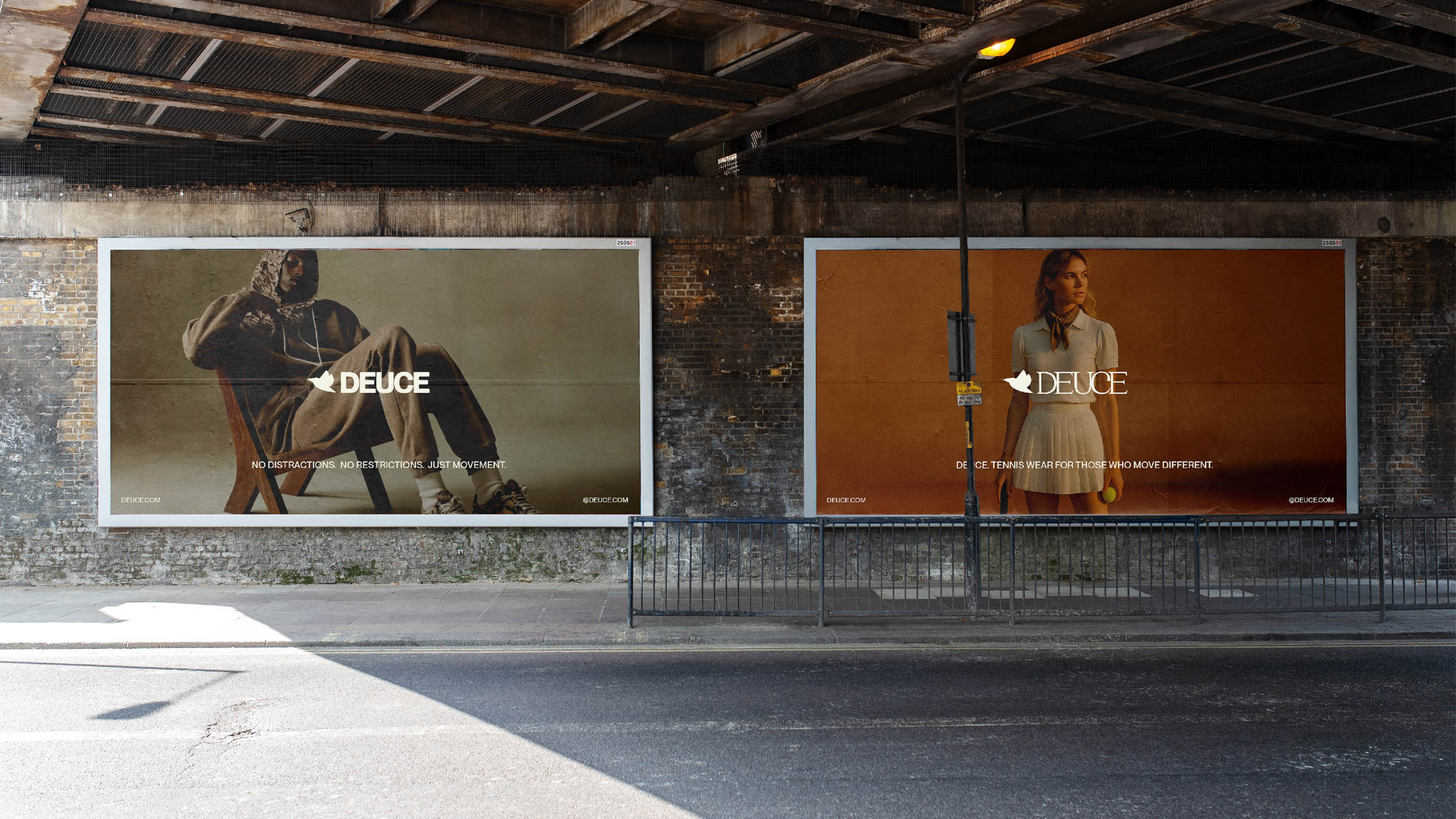
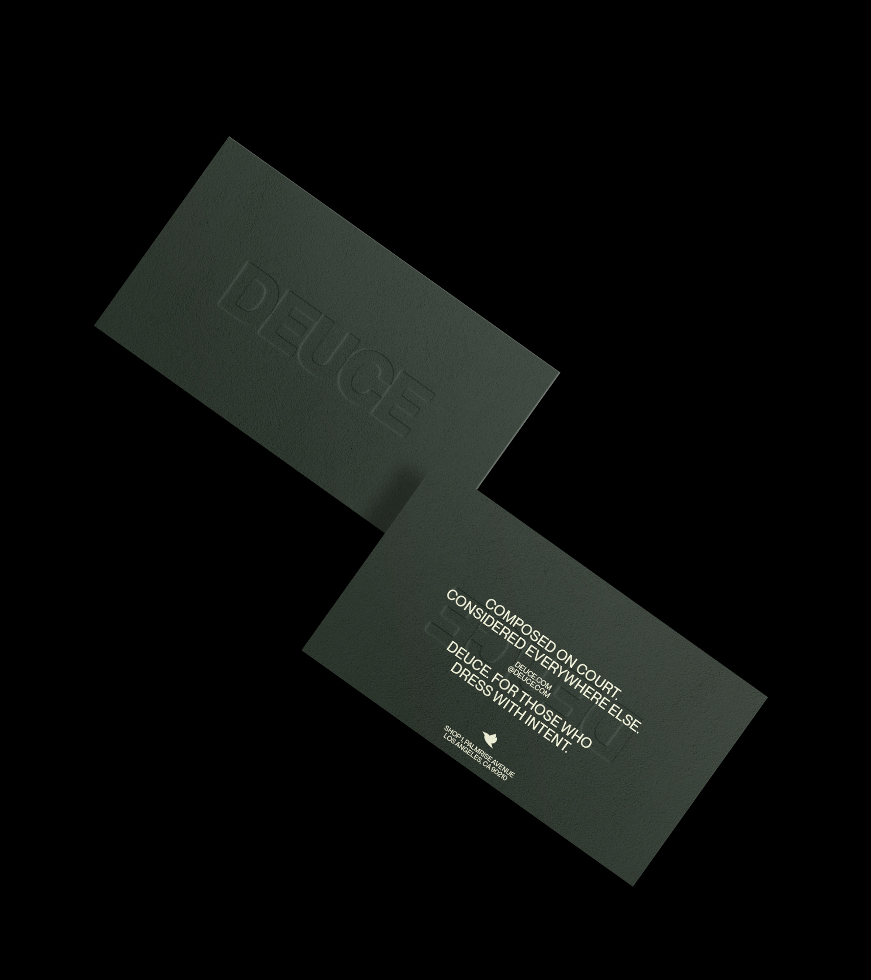
The Deuce voice sets the tone with clarity and conviction, providing steadiness. Built on rhythm and resolve, it speaks to the athlete’s inner world as much as their outer performance.
We designed a brand language that centres resilience, celebrates small wins, and makes showing up look aspirational again. Every line is designed to motivate without cliché, trading hype for depth, and ego for edge.
It’s a tone that plays well in locker rooms, lookbooks, and launch campaigns alike. Sporty, yes, but always strategic. Because Deuce doesn’t sell sweat. It sells self-respect, and the kind of slow-earned confidence that never goes out of style.
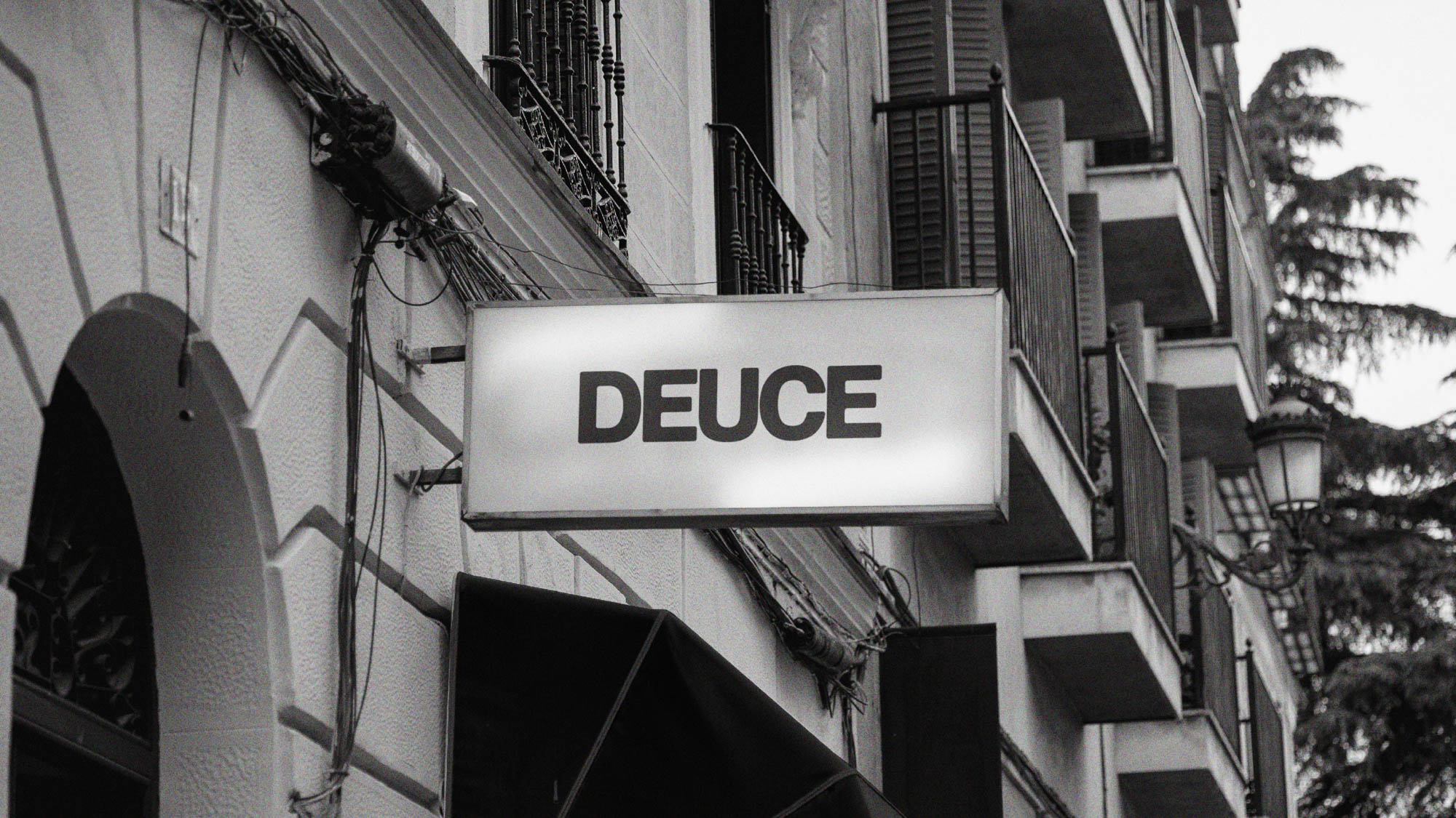
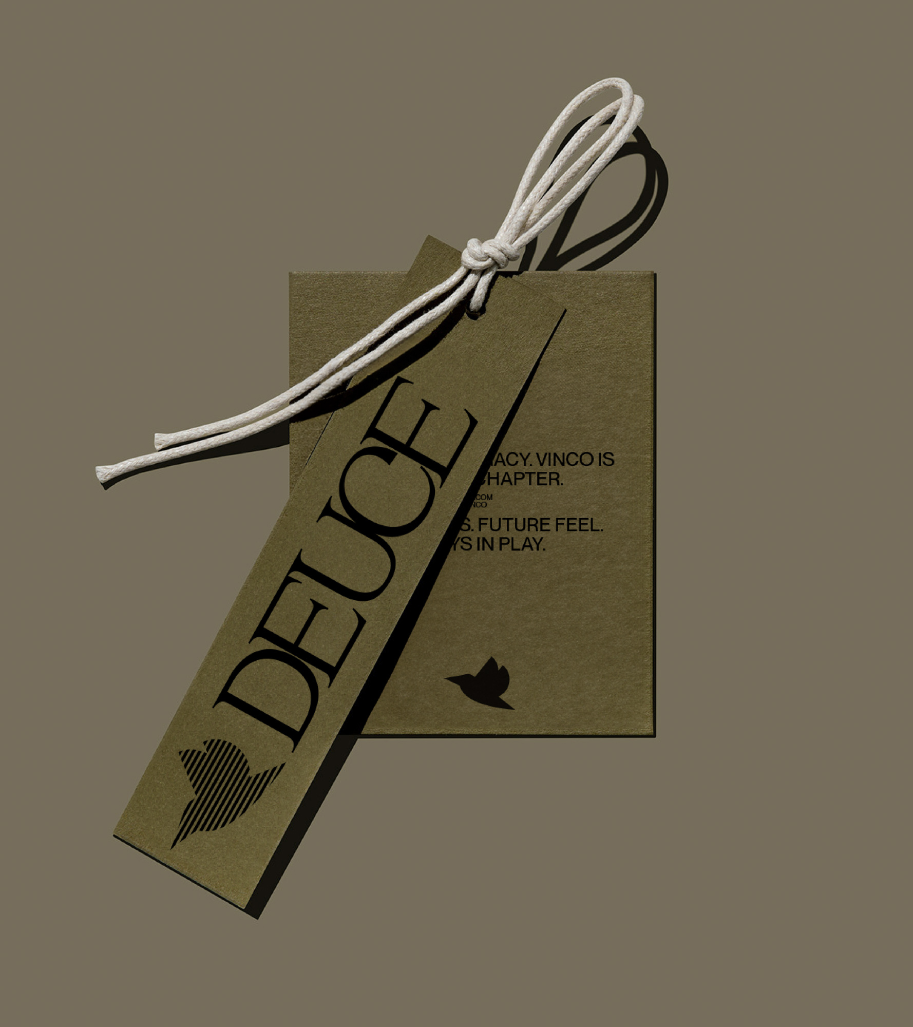
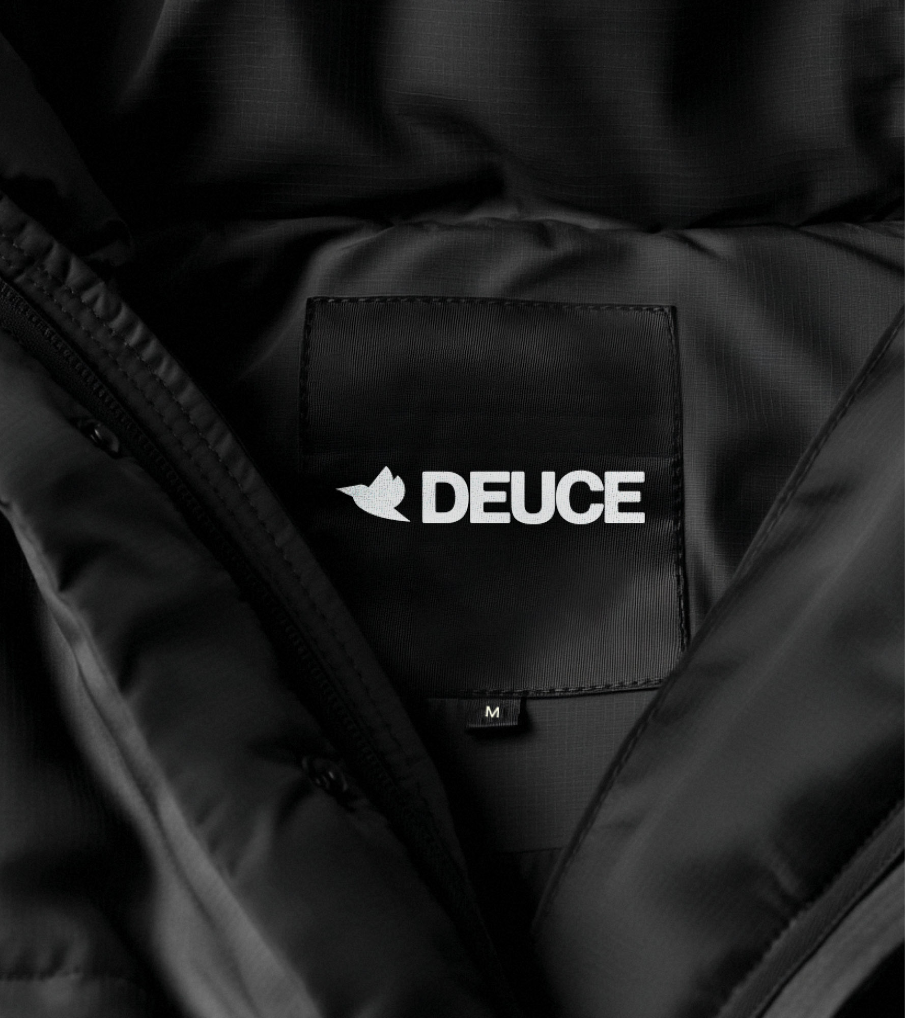

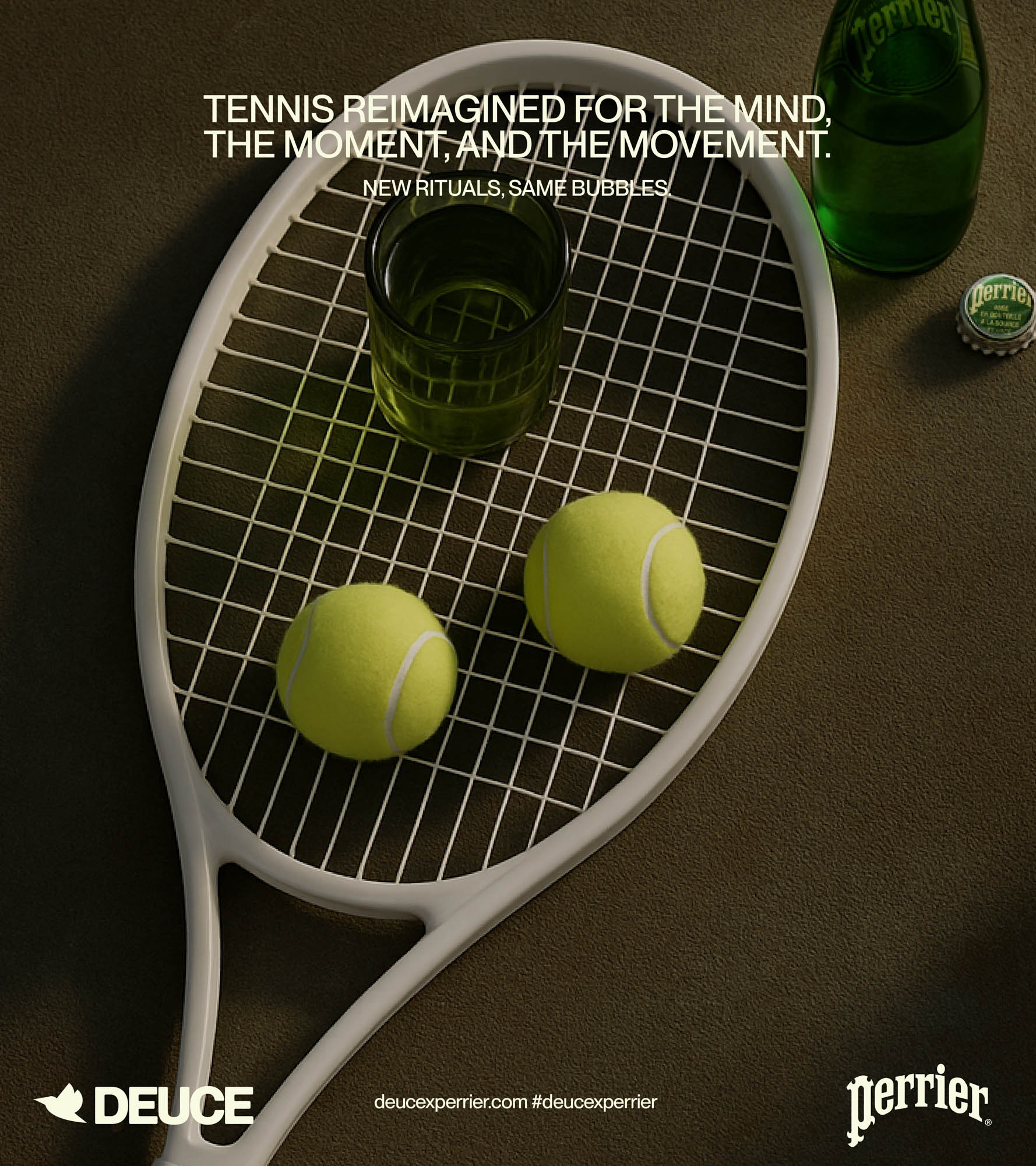
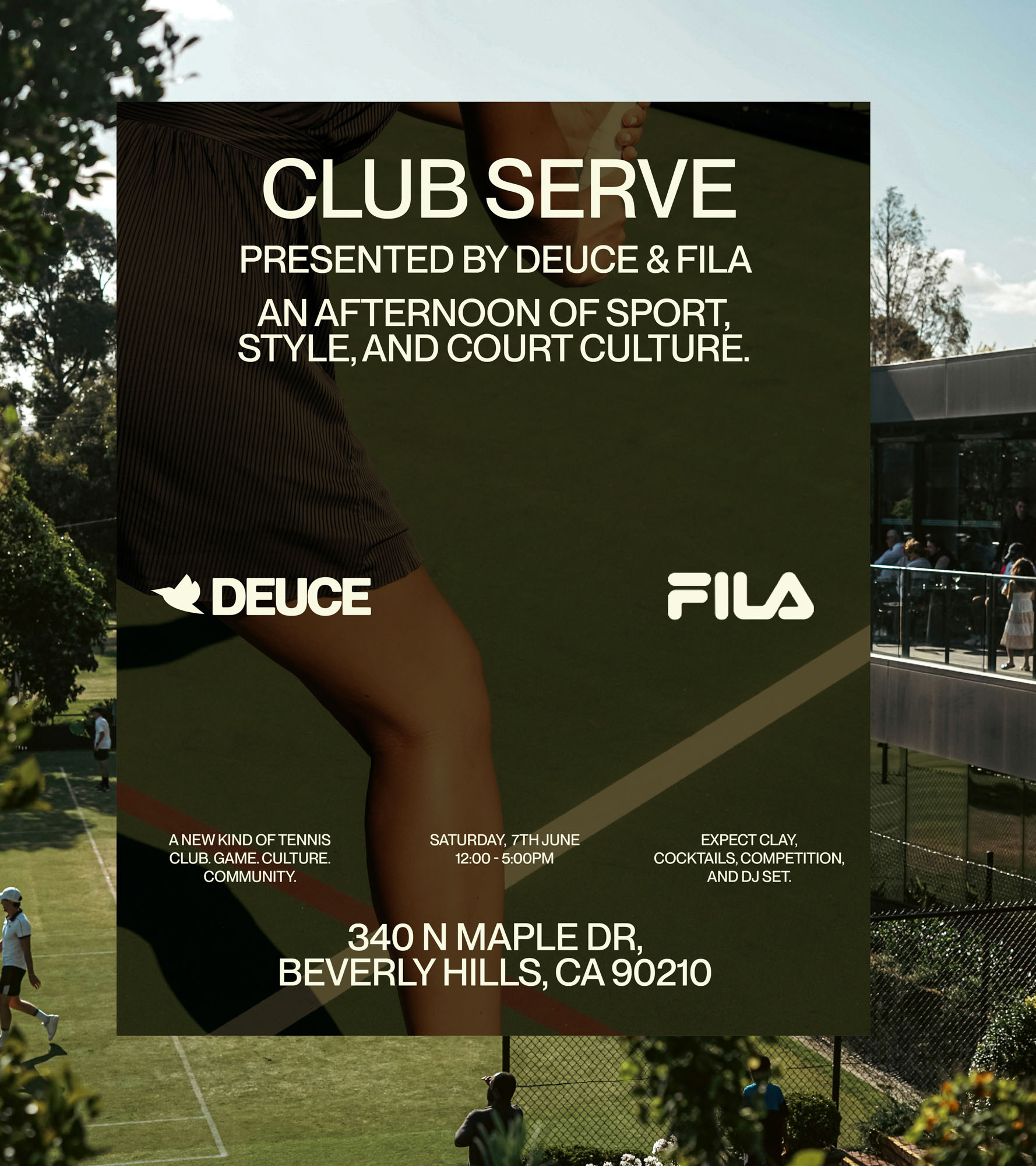
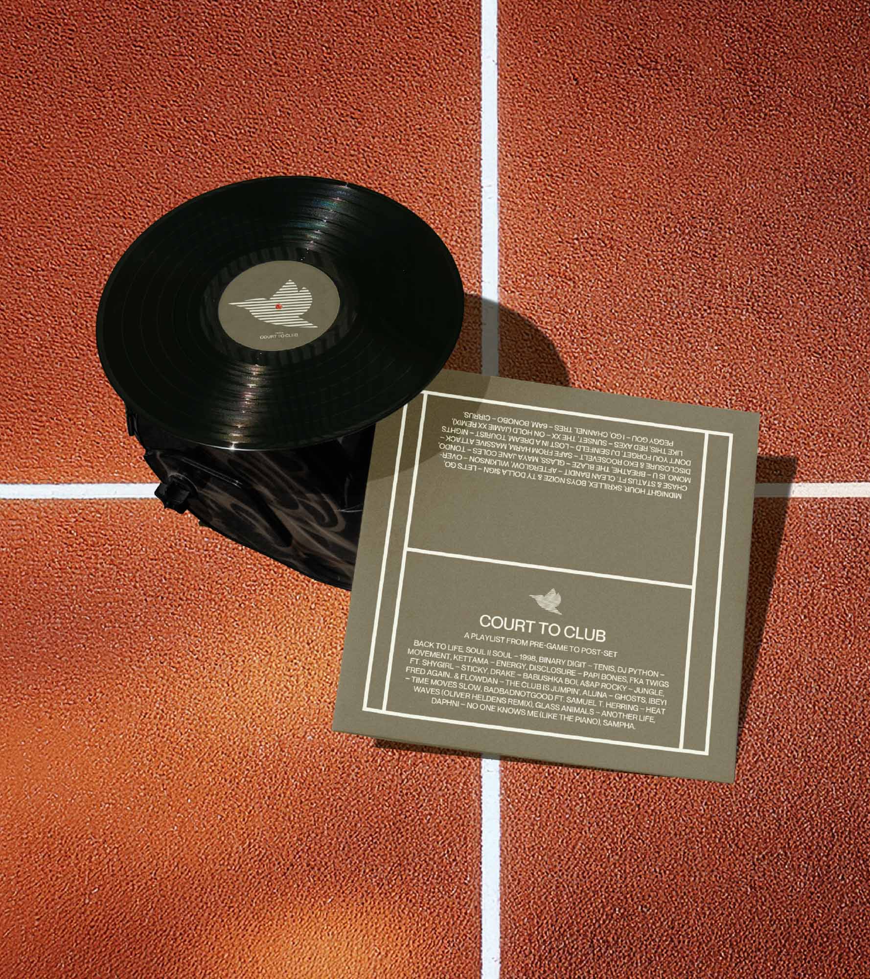
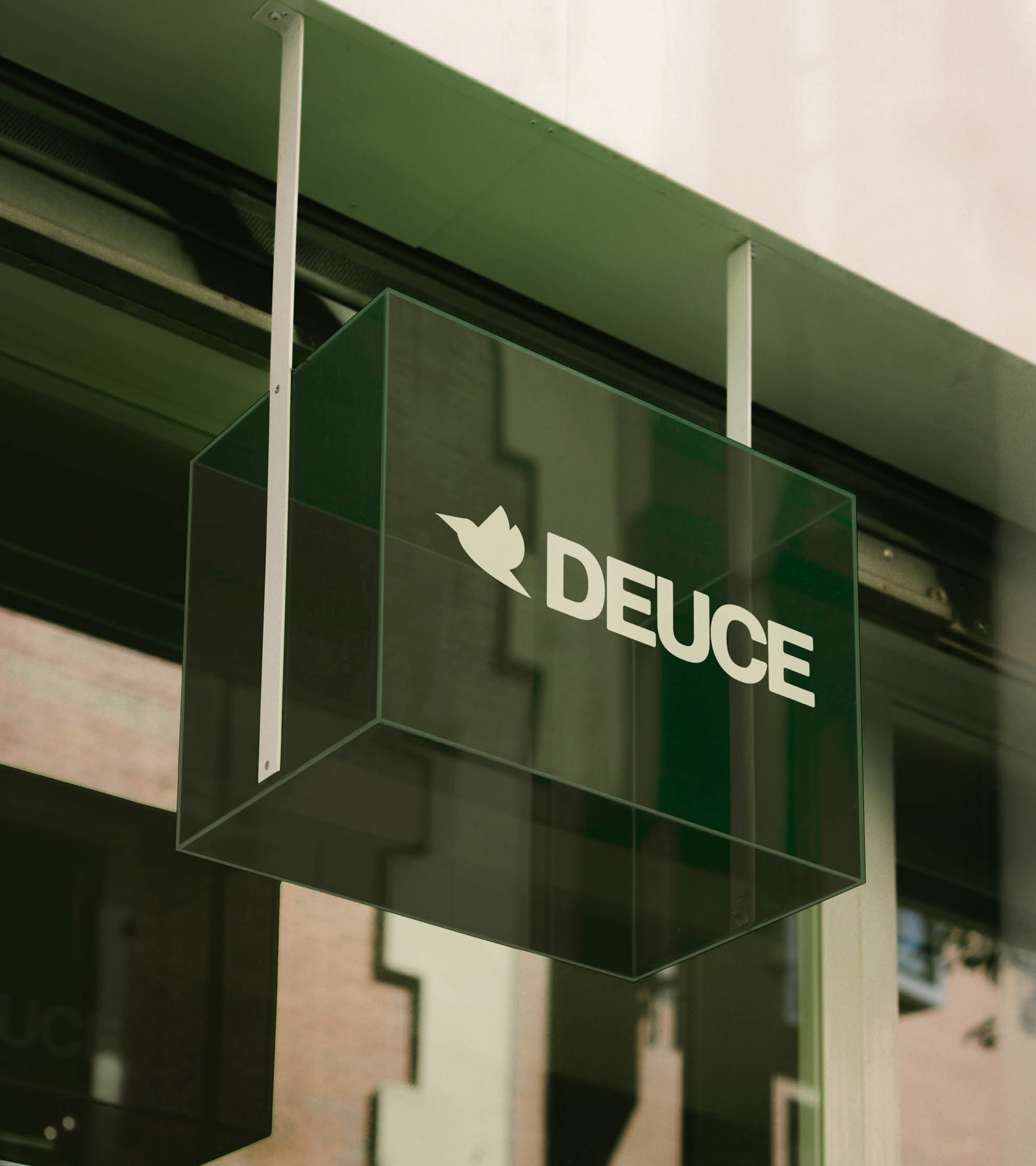
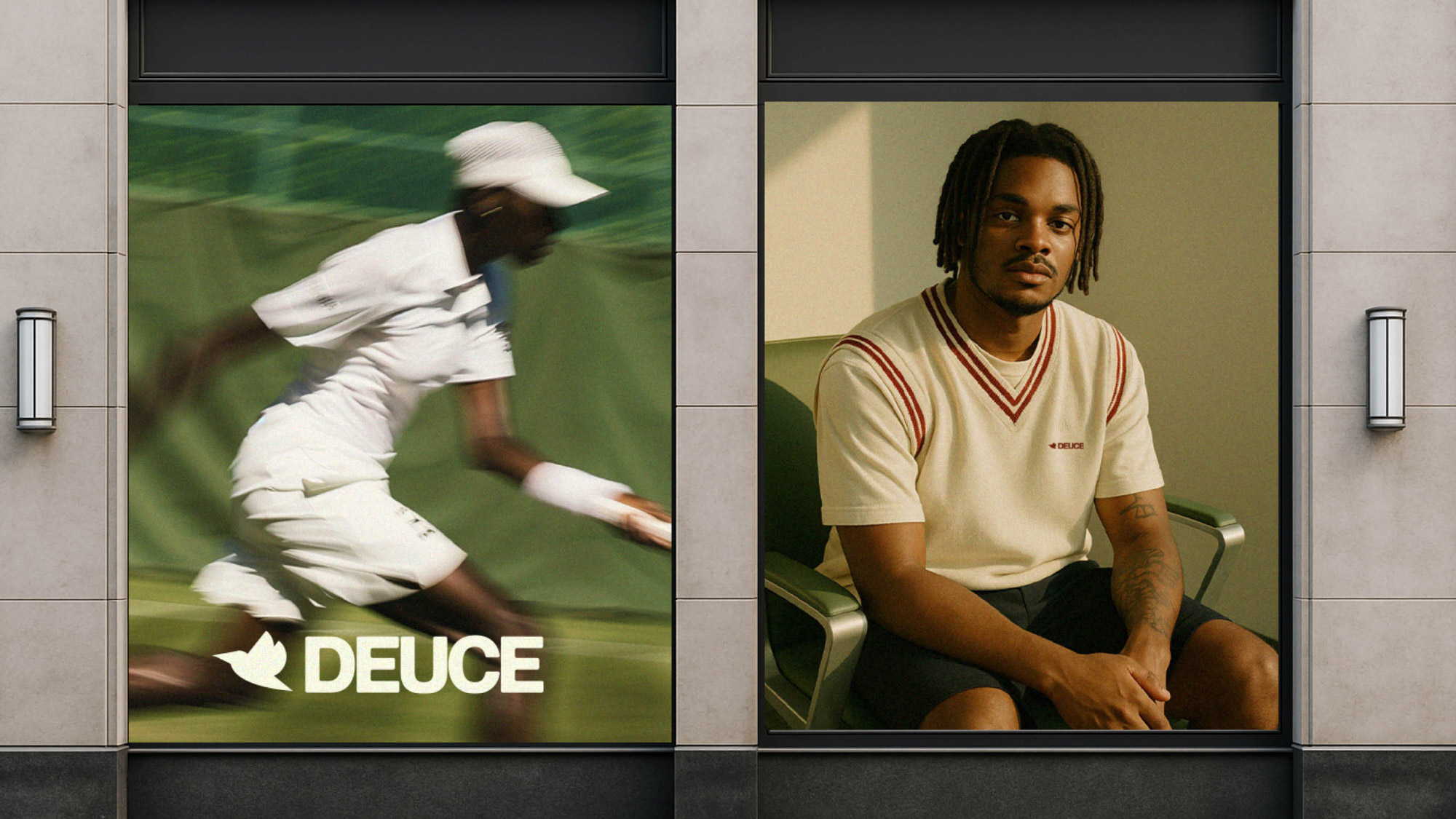
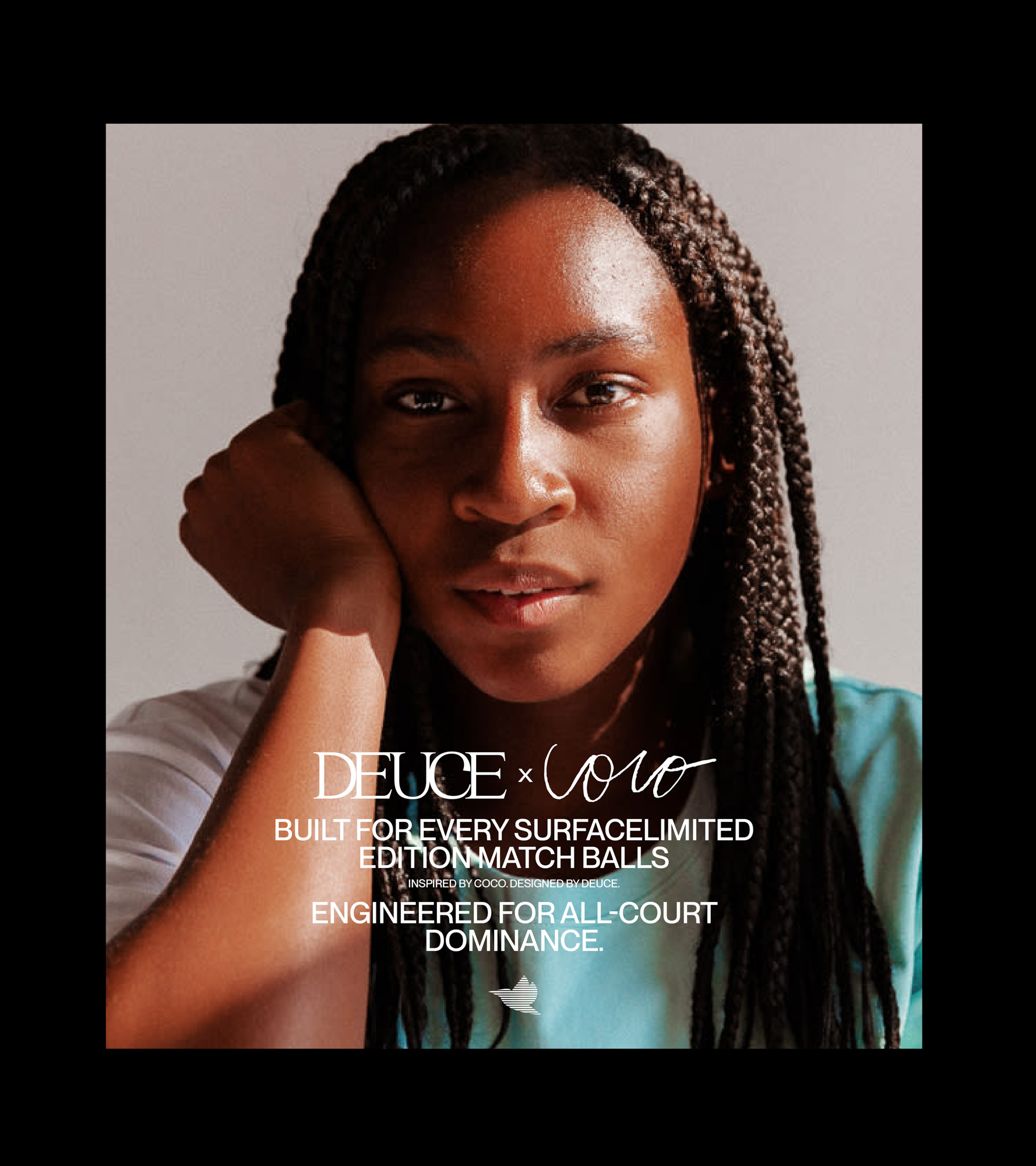
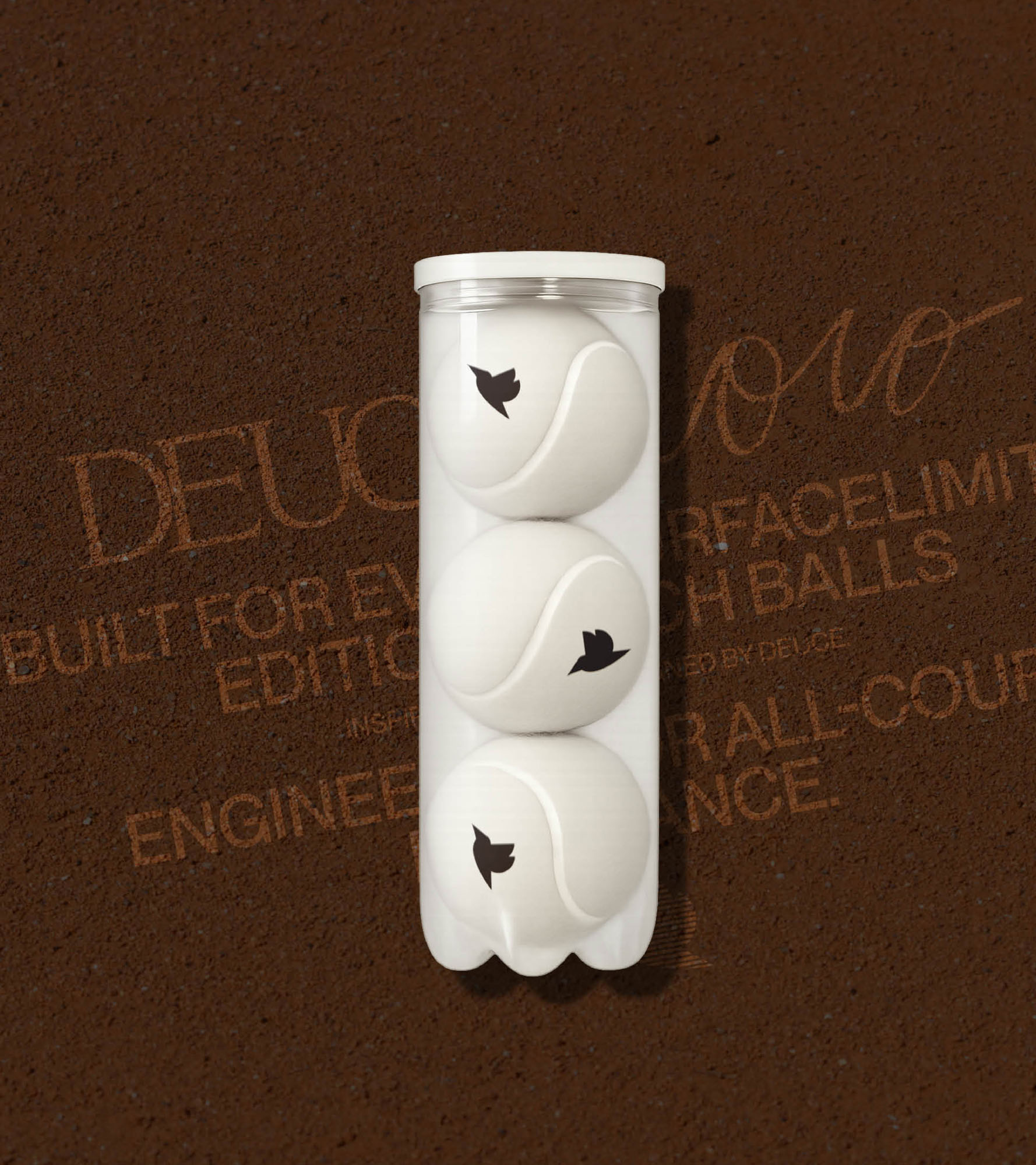
More than product, Deuce was created as a platform. A brand that rallies community and cultivates performance, not just through what you wear, but through how you move.
We took a future-forward view of the athlete. Not just someone chasing podiums, but someone practising patience. We designed every asset to support that perspective, from fabric innovations to brand symbolism.
Deuce stands as a refined rebellion against fast wins and short cuts. It plays the long game. And in doing so, redefines what it means to win.
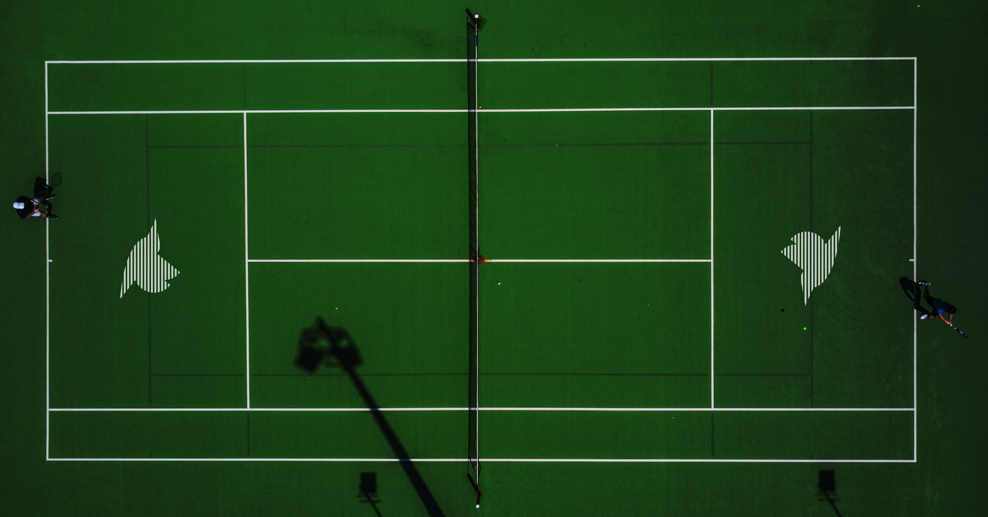
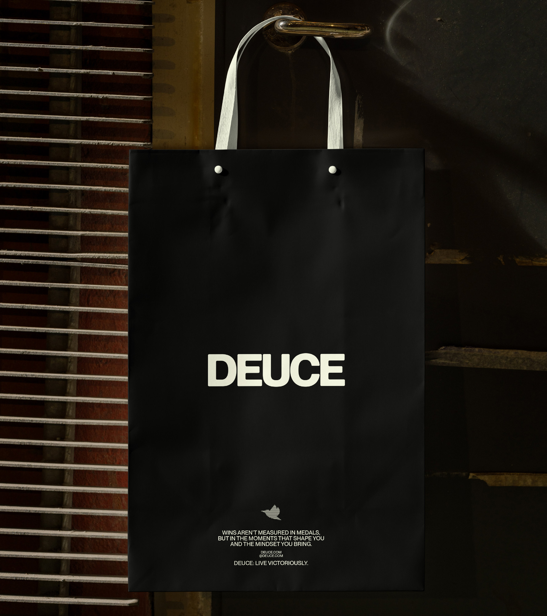
Deuce arrives not as a disruptor, but as a necessary recalibration. A brand for modern athletes who train as much for their mindset as for their muscle. Every detail reinforces a philosophy of steady progression and purposeful presence.
It’s technical. It’s thoughtful. And above all, it’s built to last.
Because when the pressure’s on and the score is even, Deuce is where you find out who you really are.
